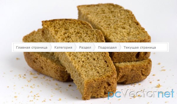
Breadcrumbs на CSS
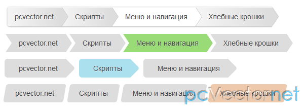
Хлебные крошки сделанные с помощью CSS3 - breadcrumbs. Иерархическая структура навигации позволяющая пользователю определить, как глубоко он находится в структуре сайта.
HTML
Универсальная разметка для всех вариантов - неупорядоченный список:
    <ul id="breadcrumbs-one">
        <li><a href="">pcvector.net</a></li>
        <li><a href="">Скрипты</a></li>
        <li><a href="">Меню и навигация</a></li>
        <li><a href="">Хлебные крошки</a></li>
        <li><a href="" class="current">Хлебные крошки на CSS3</a></li>
    </ul>
CSS
В начале добавим небольшой reset стилей для нашего списка:
    ul{
      margin: 0;
      padding: 0;
      list-style: none;
    }
C помощью псевдо элементов получаем вот такой вот breadcrumb:
    #breadcrumbs-one{
      background: #eee;
      border-width: 1px;
      border-style: solid;
      border-color: #f5f5f5 #e5e5e5 #ccc;
      -moz-border-radius: 5px;
      -webkit-border-radius: 5px;
      border-radius: 5px;
      -moz-box-shadow: 0 0 2px rgba(0,0,0,.2);
      -webkit-box-shadow: 0 0 2px rgba(0,0,0,.2);
      box-shadow: 0 0 2px rgba(0,0,0,.2);
      /* Clear floats */
      overflow: hidden;
      width: 100%;
    }

    #breadcrumbs-one li{
      float: left;
    }

    #breadcrumbs-one a{
      padding: .7em 1em .7em 2em;
      float: left;
      text-decoration: none;
      color: #444;
      position: relative;
      text-shadow: 0 1px 0 rgba(255,255,255,.5);
      background-color: #ddd;
      background-image: -webkit-gradient(linear, left top, right bottom, from(#f5f5f5), to(#ddd));
      background-image: -webkit-linear-gradient(left, #f5f5f5, #ddd);
      background-image: -moz-linear-gradient(left, #f5f5f5, #ddd);
      background-image: -ms-linear-gradient(left, #f5f5f5, #ddd);
      background-image: -o-linear-gradient(left, #f5f5f5, #ddd);
      background-image: linear-gradient(to right, #f5f5f5, #ddd);
    }

    #breadcrumbs-one li:first-child a{
      padding-left: 1em;
      -moz-border-radius: 5px 0 0 5px;
      -webkit-border-radius: 5px 0 0 5px;
      border-radius: 5px 0 0 5px;
    }

    #breadcrumbs-one a:hover{
      background: #fff;
    }

    #breadcrumbs-one a::after,
    #breadcrumbs-one a::before{
      content: "";
      position: absolute;
      top: 50%;
      margin-top: -1.5em;
      border-top: 1.5em solid transparent;
      border-bottom: 1.5em solid transparent;
      border-left: 1em solid;
      right: -1em;
    }

    #breadcrumbs-one a::after{
      z-index: 2;
      border-left-color: #ddd;
    }

    #breadcrumbs-one a::before{
      border-left-color: #ccc;
      right: -1.1em;
      z-index: 1;
    }

    #breadcrumbs-one a:hover::after{
      border-left-color: #fff;
    }

    #breadcrumbs-one .current,
    #breadcrumbs-one .current:hover{
      font-weight: bold;
      background: none;
    }

    #breadcrumbs-one .current::after,
    #breadcrumbs-one .current::before{
      content: normal;
} 
    #breadcrumbs-two{
      /* Clear floats */
      overflow: hidden;
      width: 100%;
    }

    #breadcrumbs-two li{
      float: left;
      margin: 0 .5em 0 1em;
    }

    #breadcrumbs-two a{
      background: #ddd;
      padding: .7em 1em;
      float: left;
      text-decoration: none;
      color: #444;
      text-shadow: 0 1px 0 rgba(255,255,255,.5);
      position: relative;
    }

    #breadcrumbs-two a:hover{
      background: #99db76;
    }

    #breadcrumbs-two a::before{
      content: "";
      position: absolute;
      top: 50%;
      margin-top: -1.5em;
      border-width: 1.5em 0 1.5em 1em;
      border-style: solid;
      border-color: #ddd #ddd #ddd transparent;
      left: -1em;
    }

    #breadcrumbs-two a:hover::before{
      border-color: #99db76 #99db76 #99db76 transparent;
    }

    #breadcrumbs-two a::after{
      content: "";
      position: absolute;
      top: 50%;
      margin-top: -1.5em;
      border-top: 1.5em solid transparent;
      border-bottom: 1.5em solid transparent;
      border-left: 1em solid #ddd;
      right: -1em;
    }

    #breadcrumbs-two a:hover::after{
      border-left-color: #99db76;
    }

    #breadcrumbs-two .current,
    #breadcrumbs-two .current:hover{
      font-weight: bold;
      background: none;
    }

    #breadcrumbs-two .current::after,
    #breadcrumbs-two .current::before{
      content: normal;
    }
Тут слегка скругляем:
    #breadcrumbs-three{
      /* Clear floats */
      overflow: hidden;
      width: 100%;
    }

    #breadcrumbs-three li{
      float: left;
      margin: 0 2em 0 0;
    }

    #breadcrumbs-three a{
      padding: .7em 1em .7em 2em;
      float: left;
      text-decoration: none;
      color: #444;
      background: #ddd;
      position: relative;
      z-index: 1;
      text-shadow: 0 1px 0 rgba(255,255,255,.5);
      -moz-border-radius: .4em 0 0 .4em;
      -webkit-border-radius: .4em 0 0 .4em;
      border-radius: .4em 0 0 .4em;
    }

    #breadcrumbs-three a:hover{
      background: #abe0ef;
    }

    #breadcrumbs-three a::after{
      background: #ddd;
      content: "";
      height: 2.5em;
      margin-top: -1.25em;
      position: absolute;
      right: -1em;
      top: 50%;
      width: 2.5em;
      z-index: -1;
      -webkit-transform: rotate(45deg);
      -moz-transform: rotate(45deg);
      -ms-transform: rotate(45deg);
      -o-transform: rotate(45deg);
      transform: rotate(45deg);
      -moz-border-radius: .4em;
      -webkit-border-radius: .4em;
      border-radius: .4em;
    }

    #breadcrumbs-three a:hover::after{
      background: #abe0ef;
    }

    #breadcrumbs-three .current,
    #breadcrumbs-three .current:hover{
      font-weight: bold;
      background: none;
    }

    #breadcrumbs-three .current::after{
      content: normal;
    }
    #breadcrumbs-four{
      /* Clear floats */
      overflow: hidden;
      width: 100%;
    }

    #breadcrumbs-four li{
      float: left;
      margin: 0 .5em 0 1em;
    }

    #breadcrumbs-four a{
      background: #ddd;
      padding: .7em 1em;
      float: left;
      text-decoration: none;
      color: #444;
      text-shadow: 0 1px 0 rgba(255,255,255,.5);
      position: relative;
    }

    #breadcrumbs-four a:hover{
      background: #efc9ab;
    }

    #breadcrumbs-four a::before,
    #breadcrumbs-four a::after{
      content:'';
      position:absolute;
      top: 0;
      bottom: 0;
      width: 1em;
      background: #ddd;
      -webkit-transform: skew(-10deg);
      -moz-transform: skew(-10deg);
      -ms-transform: skew(-10deg);
      -o-transform: skew(-10deg);
      transform: skew(-10deg);
    }

    #breadcrumbs-four a::before{

      left: -.5em;
      -webkit-border-radius: 5px 0 0 5px;
      -moz-border-radius: 5px 0 0 5px;
      border-radius: 5px 0 0 5px;
    }

    #breadcrumbs-four a:hover::before{
      background: #efc9ab;
    }

    #breadcrumbs-four a::after{
      right: -.5em;
      -webkit-border-radius: 0 5px 5px 0;
      -moz-border-radius: 0 5px 5px 0;
      border-radius: 0 5px 5px 0;
    }

    #breadcrumbs-four a:hover::after{
      background: #efc9ab;
    }

    #breadcrumbs-four .current,
    #breadcrumbs-four .current:hover{
      font-weight: bold;
      background: none;
    }

    #breadcrumbs-four .current::after,
    #breadcrumbs-four .current::before{
      content: normal;
}Ссылки