Анимированная поисковая форма
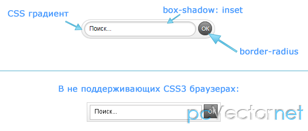
Очень привлекательная по внешнему виду форма поиска анимированная с помощью css3 и jQuery. Использование css3 конечно отражается на кроссбраузерности, корректно форма работает только в последних версиях safari, chrome и firefox.
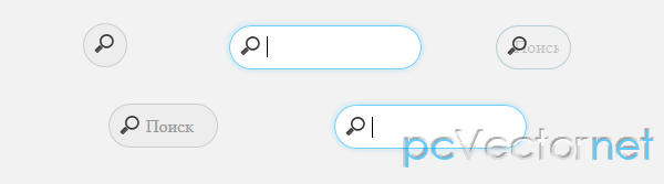
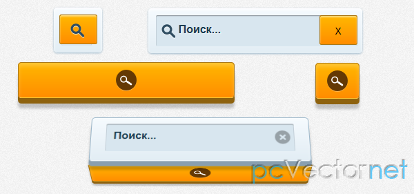
Простой стиль
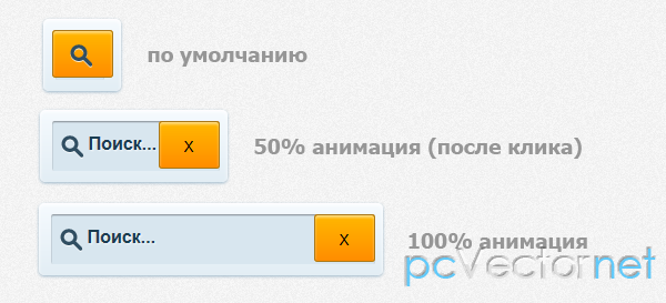
Показывает только одну иконку поиска, но по клику мышкой происходит плавное появление поля ввода с кнопкой закрытия X (значение указывается в jаvascript ).
HTML
    <div class="wrapper-simple">
        <input type="text" placeholder="Поиск..." />
        <input type="submit" value="" />
        <img src="images/search-icon-big.png" />
    </div>
CSS
.wrapper-simple {
    text-align: center;
    margin: 0 auto;
    display: block;
    width: 60px;
    height: 45px;
    padding: 10px 5px;
    background: -webkit-gradient(linear, left top, left bottom, from(#f5fafe), to(#e2edf4));
    border-radius: 5px;
    box-shadow: inset rgba(255, 254, 255, 1) 0 0.1em 2px,
                    #9bb6c9 0 1px 2px;
    position: relative;
}
.wrapper-simple input[type=submit] {
    margin-top: .2em;
    z-index: 2;
    position: relative;
    vertical-align: top;
    height: 43px;
    min-width: 55px;
    border-radius: 3px;
    border: 1px solid #aa7818;
    background: -webkit-gradient(linear, left top, left bottom, from(#ffb700), to(#ff8c00));
    box-shadow: inset rgba(255, 255, 255, .5) 0 0.1em 0.1em;
    cursor: pointer;
}
    .wrapper-simple input[type=submit]:active {
        box-shadow: inset rgba(0,0,0,.4) 0 1px 1px;
    }
    .wrapper-simple input[type=submit]:hover {
        background: -webkit-gradient(linear, left top, left bottom, from(#ffcb48), to(#ff9c23));
    }
.wrapper-simple input[type=text] {
    font-family: Arial;
    font-weight: bold;
    color: #1a3d51;
    background: #d8e6ef;
    border-radius:2px;
    padding: 10px 10px 15px 10px;
    width: 250px;
    border: 0;
    font-size: 16px;
    text-shadow: rgba(255, 255, 255, 0.7) 1px 1px 1px;
    box-shadow: inset rgba(0,0,0,.4) 0 1px 1px;
    position: absolute;
    width: 1px;
    z-index: 2;
    padding-left: 2em;
    margin-left: .2em;
}
.wrapper-simple img {
    position: absolute;
    top: 1.5em;
    left: 1.5em;
    z-index: 4;
}
JS
Во всех вариантах первоначально подключаем jQuery библиотеку:
<script type="text/jаvascript" src="http://ajax.googleapis.com/ajax/libs/jquery/1.7.2/jquery.min.js"></script>Далее скрипт к форме поиска с простым стилем:
$('.wrapper-simple input[type=submit]').toggle(function(){
    $('.wrapper-simple').animate({'width':'300px'})
      .end().find('.wrapper-simple input[type=text]').animate({'width': '250px'})
      .end().find('.wrapper-simple img').animate({'marginLeft': '-5px'})
      .end().find(this).animate({'marginLeft':'22em'}).attr('value', 'X');
}, function() {
    $('.wrapper-simple').animate({'width':'60px'})
      .end().find('.wrapper-simple input[type=text]').animate({'width': '1px'})
      .end().find('.wrapper-simple img').animate({'marginLeft': '0'})
      .end().find(this).animate({'marginLeft':'0'}).attr('value', '');
});
Кубический стиль
А как насчет более сложного варианта отображения поисковой формы?
Анимация будет выглядеть, как вращение куба с формой поиска. (см. Демо)
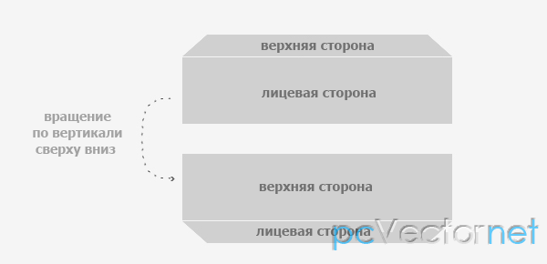
Создание куба уже несколько сложнее, чем предыдущий пример.
HTML
    <div class="wrapper1">
        <div class="content-wrapper1">
            <div class="search-button1">
                <span><img src="images/search-icon.png" /></span>
            </div>
            <div class="search-box1">
                <input type="text" placeholder="Поиск..." />
                <img src="images/close.png" />
            </div>
        </div>
    </div>
CSS
.wrapper1 {
    display: block;
    width: 300px;
    margin: 0 auto;
    -webkit-perspective : 1200px;
}
    .search-button1 span {
        display: block;
        margin: 0 auto;
        background: #643904;
        border-radius: 30px;
        width: 30px;
        height: 30px;
        box-shadow: rgba(255,255,255,.3) 0 1px 0px;
    }
        .search-button1 span img {
            vertical-align: middle;
            padding-top: 7px;
        }
    .search-button1:hover {
        background: -webkit-gradient(linear, left top, left bottom, from(#ffcb48), to(#ff9c23));
    }
    .search-button1:active {
        margin-top: 0.2em;
        box-shadow: inset rgba(255, 254, 255, 0.2) 0 0.3em .3em,
                        #8e620e 0 0.3em 0,
                        rgba(0, 0, 0, 0.2) 0 0.5em 3px;
    }
.search-box1 {
    margin-top: -.6em;
    display: none;
    position: absolute;
    width: 300px;
    height: 50px;
    padding: 10px 6px;
    background: -webkit-gradient(linear, left top, left bottom, from(#f5fafe), to(#e2edf4));
    border: 1px solid #9bb6c9;
    border-bottom: 1px solid rgba(255,255,255,0.2);
    border-radius: 5px;
    box-shadow: inset rgba(255, 254, 255, 0.2) 0 0.3em .3em,
                    #899faf 0 .5em 0px,
                    rgba(0, 0, 0, 0.2) 0 .9em 3px;
    -webkit-transform:    rotate3d(1,0,0,90deg)
                                translateZ(20px);
}
    .search-box1 input {
        font-family: Arial;
        font-weight: bold;
        color: #1a3d51;
        background: #d8e6ef;
        border-radius:2px;
        padding: 10px 10px 15px 10px;
        width: 250px;
        border: 0;
        font-size: 16px;
        text-shadow: rgba(255, 255, 255, 0.7) 1px 1px 1px;
        box-shadow: inset rgba(0,0,0,.4) 0 1px 1px;
    }
        .search-box1 input:focus {
            outline: none;
        }
    .search-box1 img {
        opacity: .5;
        position: absolute;
        margin: .6em 0 0 -2em;
        cursor: pointer;
        -webkit-transition: 0.5s linear;
    }
        .search-box1 img:hover {
            opacity: 1;
        }
.hide-search-button {
    display: none;
}
.show-search-button {
    display: block;
}
.show-search-box {
    display: block;
}
.showed-search-box {
    display: block;
    -webkit-transform: rotate3d(1,0,0,0deg);
}
.hidden-search-box {
    -webkit-transform:    rotate3d(1,0,0,90deg)
                                translateZ(25px);
}
.switch-show {
    height: 50px;
    -webkit-transform-style: preserve-3d;
    -webkit-animation: showBox 0.5s ease-in-out;
}
.switch-hide {
    height: 50px;
    -webkit-transform-style: preserve-3d;
    -webkit-animation: hideBox 0.5s ease-in-out;
}
.switch-show {
    height: 50px;
    -webkit-transform-style: preserve-3d;
    -webkit-animation: showBox 0.5s ease-in-out;
}
.switch-hide {
    height: 50px;
    -webkit-transform-style: preserve-3d;
    -webkit-animation: hideBox 0.5s ease-in-out;
}
@-webkit-keyframes showBox{
    0% { -webkit-transform: rotate3d(1,0,0,0); }
    100% { -webkit-transform: rotate3d(1,0,0,-90deg); }
}
@-webkit-keyframes hideBox{
    0% { -webkit-transform: rotate3d(1,0,0,-90deg); }
    100% { -webkit-transform: rotate3d(1,0,0,0); }
}
JS
Скрипт jquery будет таким:
    /* Кубический стиль */
    $('.search-button1').click(function() {


            $('.content-wrapper1').addClass('switch-show');
            $('.search-box1').addClass('show-search-box');

            setTimeout(function(){

                $('.content-wrapper1').removeClass('switch-show');
                $('.search-button1').removeClass('show-search-button').addClass('hide-search-button');
                $('.search-box1').addClass('showed-search-box');

            },480);
    });

    $('.search-box1 img').click(function() {

        $('.search-button1').removeClass('hide-search-button');
        $('.search-box1').addClass('hidden-search-box');
        $('.content-wrapper1').addClass('switch-hide');


            setTimeout(function(){

                $('.content-wrapper1').removeClass('switch-hide');
                $('.search-button1').removeClass('show-search-button');
                $('.search-box1').removeClass('show-search-box showed-search-box hidden-search-box');

            },480);

    });
Кубический стиль с анимацией
Несколько усложненный предыдущий вариант поисковой формы.
HTML
    <div class="wrapper2">
        <div class="content-wrapper2">
            <div class="search-button2">
                <span><img src="images/search-icon.png" /></span>
            </div>
            <div class="search-box2">
                <input type="text" placeholder="Поиск..." />
                <img src="images/close.png" />
            </div>
        </div>
    </div>
JS
    $('.search-box2 img').click(function() {

        $('.search-button2').removeClass('hide-search-button');
        $('.search-box2').addClass('hidden-search-box');
        $('.content-wrapper2').addClass('switch-hide');

        $('.search-button2').addClass('show-search-button').stop().delay(500).animate({'width':'50px'}, 500, function() {

            $('.content-wrapper2').removeClass('switch-hide');
            $('.search-button2').removeClass('show-search-button');
            $('.search-box2').removeClass('show-search-box showed-search-box hidden-search-box');

            $('.arrow').show();

        });
    });