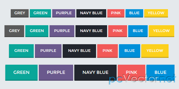
Кнопки с градиентом на CSS3
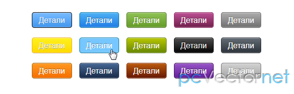
Очередная порция CSS3 кнопок с готовым набором градиентов разных цветов.
HTML
К ссылкам применены классы с разными цветами:
<a href="#" class="pcv_button">Детали</a>
<a href="#" class="pcv_button yellow">Детали</a>
<a href="#" class="pcv_button orange">Детали</a>
<a href="#" class="pcv_button blue">Детали</a>
<a href="#" class="pcv_button lightblue">Детали</a>
<a href="#" class="pcv_button darkblue">Детали</a>
<a href="#" class="pcv_button green">Детали</a>
<a href="#" class="pcv_button limegreen">Детали</a>
<a href="#" class="pcv_button saddlebrown">Детали</a>
<a href="#" class="pcv_button pink">Детали</a>
<a href="#" class="pcv_button black">Детали</a>
<a href="#" class="pcv_button purple">Детали</a>
<a href="#" class="pcv_button gray">Детали</a>
<a href="#" class="pcv_button darkgray">Детали</a>
<a href="#" class="pcv_button silver">Детали</a>
CSS
А вот сами стили:
.pcv_button {
  display: inline-block;
  padding: 5px 13px!important;
  margin: 10px 5px!important;
  margin-right: 0!important;
  border: solid 1px #000;
  background: #7abcff;
  background: -moz-linear-gradient(top, #7abcff 0, #60abf8 44%, #4096ee 100%);
  background: -webkit-gradient(linear, left top, left bottom, color-stop(0%, #7abcff), color-stop(44%, #60abf8), color-stop(100%, #4096ee));
  background: -webkit-linear-gradient(top, #7abcff 0, #60abf8 44%, #4096ee 100%);
  background: -o-linear-gradient(top, #7abcff 0, #60abf8 44%, #4096ee 100%);
  background: -ms-linear-gradient(top, #7abcff 0, #60abf8 44%, #4096ee 100%);
  background: linear-gradient(top, #7abcff 0, #60abf8 44%, #4096ee 100%);
  filter: progid:DXImageTransform.Microsoft.gradient(startColorstr='#7abcff', endColorstr='#4096ee', GradientType=0);
  color: #eee;
  font: 100% Arial, Helvetica, sans-serif;
  text-align: center;
  text-shadow: 0 1px 0 rgba(55, 121, 188, .5);
  text-decoration: none!important;
  vertical-align: middle;
  zoom: 1;
  *display: inline;
  -webkit-border-radius: 5px;
  -moz-border-radius: 5px;
  border-radius: 5px;
  -webkit-box-shadow: 0 1px 0 rgba(0, 0, 0, .1), inset 0 1px 0 rgba(255, 255, 255, .5), inset 0 -1px 0 rgba(255, 255, 255, .3);
  -moz-box-shadow: 0 1px 0 rgba(0, 0, 0, .1), inset 0 1px 0 rgba(255, 255, 255, .5), inset 0 -1px 0 rgba(255, 255, 255, .3);
  box-shadow: 0 1px 0 rgba(0, 0, 0, .1), inset 0 1px 0 rgba(255, 255, 255, .5), inset 0 -1px 0 rgba(255, 255, 255, .3)
}
.pcv_button:hover {
  background: #469cf2
}
.pcv_button.yellow {
  border-color: #edad14;
  background: #ffe20b;
  background: -moz-linear-gradient(top, #fff21e 0, #ffd901 100%);
  background: -webkit-gradient(linear, left top, left bottom, color-stop(0%, #fff21e), color-stop(100%, #ffd901));
  background: -webkit-linear-gradient(top, #fff21e 0, #ffd901 100%);
  background: -o-linear-gradient(top, #fff21e 0, #ffd901 100%);
  background: -ms-linear-gradient(top, #fff21e 0, #ffd901 100%);
  filter: progid:DXImageTransform.Microsoft.gradient(startColorstr='#fff21e', endColorstr='#ffd901', GradientType=0);
  background: linear-gradient(top, #fff21e 0, #ffd901 100%)
}
.pcv_button.yellow:hover {
  background: #fff21e
}
.pcv_button.orange {
  border-color: #a3620a;
  background: #f9800f;
  background: -moz-linear-gradient(top, #ff9a22 0, #f46e01 100%);
  background: -webkit-gradient(linear, left top, left bottom, color-stop(0%, #ff9a22), color-stop(100%, #f46e01));
  background: -webkit-linear-gradient(top, #ff9a22 0, #f46e01 100%);
  background: -o-linear-gradient(top, #ff9a22 0, #f46e01 100%);
  background: -ms-linear-gradient(top, #ff9a22 0, #f46e01 100%);
  filter: progid:DXImageTransform.Microsoft.gradient(startColorstr='#ff9a22', endColorstr='#f46e01', GradientType=0);
  background: linear-gradient(top, #ff9a22 0, #f46e01 100%);
  color: #fff!important;
  text-shadow: 0 -1px 0 rgba(0, 0, 0, .4)
}
.pcv_button.orange:hover {
  background: #ff9a22
}
.pcv_button.blue {
  border-color: #0076a9;
  background: #4eb2f4;
  background: -moz-linear-gradient(top, #4eb2f4 0, #207ce5 100%);
  background: -webkit-gradient(linear, left top, left bottom, color-stop(0%, #4eb2f4), color-stop(100%, #207ce5));
  background: -webkit-linear-gradient(top, #4eb2f4 0, #207ce5 100%);
  background: -o-linear-gradient(top, #4eb2f4 0, #207ce5 100%);
  background: -ms-linear-gradient(top, #4eb2f4 0, #207ce5 100%);
  background: linear-gradient(top, #4eb2f4 0, #207ce5 100%);
  filter: progid:DXImageTransform.Microsoft.gradient(startColorstr='#4eb2f4', endColorstr='#207ce5', GradientType=0);
  color: #fff!important;
  text-shadow: 0 -1px 0 rgba(0, 0, 0, .4)
}
.pcv_button.blue:hover {
  background: #499bea
}
.pcv_button.lightblue {
  border-color: #0076a3;
  background: #49b3fc;
  background: -moz-linear-gradient(top, #76c7ff 0, #1da0fa 100%);
  background: -webkit-gradient(linear, left top, left bottom, color-stop(0%, #76c7ff), color-stop(100%, #1da0fa));
  background: -webkit-linear-gradient(top, #76c7ff 0, #1da0fa 100%);
  background: -o-linear-gradient(top, #76c7ff 0, #1da0fa 100%);
  background: -ms-linear-gradient(top, #76c7ff 0, #1da0fa 100%);
  filter: progid:DXImageTransform.Microsoft.gradient(startColorstr='#76c7ff', endColorstr='#1da0fa', GradientType=0);
  background: linear-gradient(top, #76c7ff 0, #1da0fa 100%);
  color: #fff!important;
  text-shadow: 0 -1px 0 rgba(0, 0, 0, .4)
}
.pcv_button.lightblue:hover {
  background: #76c7ff
}
.pcv_button.darkblue {
  border-color: #1c2e4d;
  background: #446693;
  background: -moz-linear-gradient(top, #446693 0, #192b49 100%);
  background: -webkit-gradient(linear, left top, left bottom, color-stop(0%, #446693), color-stop(100%, #192b49));
  background: -webkit-linear-gradient(top, #446693 0, #192b49 100%);
  background: -o-linear-gradient(top, #446693 0, #192b49 100%);
  background: -ms-linear-gradient(top, #446693 0, #192b49 100%);
  background: linear-gradient(top, #446693 0, #192b49 100%);
  filter: progid:DXImageTransform.Microsoft.gradient(startColorstr='#446693', endColorstr='#192b49', GradientType=0);
  color: #fff!important;
  text-shadow: 0 -1px 0 rgba(0, 0, 0, .4)
}
.pcv_button.darkblue:hover {
  background: #436490
}
.pcv_button.green {
  border-color: #4e7521;
  background: #76ab3b;
  background: -moz-linear-gradient(top, #90c356 0, #649a27 100%);
  background: -webkit-gradient(linear, left top, left bottom, color-stop(0%, #90c356), color-stop(100%, #649a27));
  background: -webkit-linear-gradient(top, #90c356 0, #649a27 100%);
  background: -o-linear-gradient(top, #90c356 0, #649a27 100%);
  background: -ms-linear-gradient(top, #90c356 0, #649a27 100%);
  filter: progid:DXImageTransform.Microsoft.gradient(startColorstr='#90c356', endColorstr='#649a27', GradientType=0);
  background: linear-gradient(top, #90c356 0, #649a27 100%);
  color: #fff!important;
  text-shadow: 0 -1px 0 rgba(0, 0, 0, .4)
}
.pcv_button.green:hover {
  background: #90c356
}
.pcv_button.limegreen {
  border-color: #5e7e00;
  background: #b9c701;
  background: -moz-linear-gradient(top, #b9c701 0, #678700 100%);
  background: -webkit-gradient(linear, left top, left bottom, color-stop(0%, #b9c701), color-stop(100%, #678700));
  background: -webkit-linear-gradient(top, #b9c701 0, #678700 100%);
  background: -o-linear-gradient(top, #b9c701 0, #678700 100%);
  background: -ms-linear-gradient(top, #b9c701 0, #678700 100%);
  background: linear-gradient(top, #b9c701 0, #678700 100%);
  filter: progid:DXImageTransform.Microsoft.gradient(startColorstr='#b9c701', endColorstr='#678700', GradientType=0);
  color: #fff!important;
  text-shadow: 0 -1px 0 rgba(0, 0, 0, .4)
}
.pcv_button.limegreen:hover {
  background: #a9ba00
}
.pcv_button.saddlebrown {
  border-color: #7d2906;
  background: #bb5a0c;
  background: -moz-linear-gradient(top, #bb5a0c 0, #661704 100%);
  background: -webkit-gradient(linear, left top, left bottom, color-stop(0%, #bb5a0c), color-stop(100%, #661704));
  background: -webkit-linear-gradient(top, #bb5a0c 0, #661704 100%);
  background: -o-linear-gradient(top, #bb5a0c 0, #661704 100%);
  background: -ms-linear-gradient(top, #bb5a0c 0, #661704 100%);
  background: linear-gradient(top, #bb5a0c 0, #661704 100%);
  filter: progid:DXImageTransform.Microsoft.gradient(startColorstr='#bb5a0c', endColorstr='#661704', GradientType=0);
  color: #fff!important;
  text-shadow: 0 -1px 0 rgba(0, 0, 0, .4)
}
.pcv_button.saddlebrown:hover {
  background: #bb5a0c
}
.pcv_button.red {
  border-color: #9e0b0f;
  background: #e41d24;
  background: -moz-linear-gradient(top, #fb4e55 0, #d7020a 100%);
  background: -webkit-gradient(linear, left top, left bottom, color-stop(0%, #fb4e55), color-stop(100%, #d7020a));
  background: -webkit-linear-gradient(top, #fb4e55 0, #d7020a 100%);
  background: -o-linear-gradient(top, #fb4e55 0, #d7020a 100%);
  background: -ms-linear-gradient(top, #fb4e55 0, #d7020a 100%);
  filter: progid:DXImageTransform.Microsoft.gradient(startColorstr='#fb4e55', endColorstr='#d7020a', GradientType=0);
  background: linear-gradient(top, #fb4e55 0, #d7020a 100%);
  color: #fff!important;
  text-shadow: 0 -1px 0 rgba(0, 0, 0, .4)
}
.pcv_button.red:hover {
  background: #fb4e55
}
.pcv_button.darkred {
  border-color: #810b01;
  background: #bc1a02;
  background: -moz-linear-gradient(top, #bc1a02 0, #660500 100%);
  background: -webkit-gradient(linear, left top, left bottom, color-stop(0%, #bc1a02), color-stop(100%, #660500));
  background: -webkit-linear-gradient(top, #bc1a02 0, #660500 100%);
  background: -o-linear-gradient(top, #bc1a02 0, #660500 100%);
  background: -ms-linear-gradient(top, #bc1a02 0, #660500 100%);
  background: linear-gradient(top, #bc1a02 0, #660500 100%);
  filter: progid:DXImageTransform.Microsoft.gradient(startColorstr='#bc1a02', endColorstr='#660500', GradientType=0);
  color: #fff!important;
  text-shadow: 0 -1px 0 rgba(0, 0, 0, .4)
}
.pcv_button.darkred:hover {
  background: #bc1a02
}
.pcv_button.pink {
  border-color: #8f2761;
  background: #bd5094;
  background: -moz-linear-gradient(top, #bd5094 0, #70204c 100%);
  background: -webkit-gradient(linear, left top, left bottom, color-stop(0%, #bd5094), color-stop(100%, #70204c));
  background: -webkit-linear-gradient(top, #bd5094 0, #70204c 100%);
  background: -o-linear-gradient(top, #bd5094 0, #70204c 100%);
  background: -ms-linear-gradient(top, #bd5094 0, #70204c 100%);
  background: linear-gradient(top, #bd5094 0, #70204c 100%);
  filter: progid:DXImageTransform.Microsoft.gradient(startColorstr='#bd5094', endColorstr='#70204c', GradientType=0);
  color: #fff!important;
  text-shadow: 0 -1px 0 rgba(0, 0, 0, .4)
}
.pcv_button.pink:hover {
  background: #bd5094
}
.pcv_button.black {
  border-color: #000;
  background: #111;
  background: -moz-linear-gradient(top, #4f4f4f 0, #030303 100%);
  background: -webkit-gradient(linear, left top, left bottom, color-stop(0%, #4f4f4f), color-stop(100%, #030303));
  background: -webkit-linear-gradient(top, #4f4f4f 0, #030303 100%);
  background: -o-linear-gradient(top, #4f4f4f 0, #030303 100%);
  background: -ms-linear-gradient(top, #4f4f4f 0, #030303 100%);
  filter: progid:DXImageTransform.Microsoft.gradient(startColorstr='#4f4f4f', endColorstr='#030303', GradientType=0);
  background: linear-gradient(top, #4f4f4f 0, #030303 100%);
  color: #eee!important;
  text-shadow: 0 -1px 0 rgba(0, 0, 0, .8)
}
.pcv_button.black:hover {
  background: #4f4f4f
}
.pcv_button.purple {
  border-color: #350d4c;
  background: #7933ac;
  background: -moz-linear-gradient(top, #9655c6 0, #661e9b 100%);
  background: -webkit-gradient(linear, left top, left bottom, color-stop(0%, #9655c6), color-stop(100%, #661e9b));
  background: -webkit-linear-gradient(top, #9655c6 0, #661e9b 100%);
  background: -o-linear-gradient(top, #9655c6 0, #661e9b 100%);
  background: -ms-linear-gradient(top, #9655c6 0, #661e9b 100%);
  filter: progid:DXImageTransform.Microsoft.gradient(startColorstr='#9655c6', endColorstr='#661e9b', GradientType=0);
  background: linear-gradient(top, #9655c6 0, #661e9b 100%);
  color: #fff!important;
  text-shadow: 0 -1px 0 rgba(0, 0, 0, .6)
}
.pcv_button.purple:hover {
  background: #9655c6
}
.pcv_button.gray {
  border-color: #656565;
  background: #888;
  background: -moz-linear-gradient(top, #adadad 0, #707070 100%);
  background: -webkit-gradient(linear, left top, left bottom, color-stop(0%, #adadad), color-stop(100%, #707070));
  background: -webkit-linear-gradient(top, #adadad 0, #707070 100%);
  background: -o-linear-gradient(top, #adadad 0, #707070 100%);
  background: -ms-linear-gradient(top, #adadad 0, #707070 100%);
  filter: progid:DXImageTransform.Microsoft.gradient(startColorstr='#adadad', endColorstr='#707070', GradientType=0);
  background: linear-gradient(top, #adadad 0, #707070 100%);
  color: #fff!important;
  text-shadow: 0 -1px 0 rgba(0, 0, 0, .3)
}
.pcv_button.gray:hover {
  background: #adadad
}
.pcv_button.darkgray {
  border-color: #21272d;
  background: #646c75;
  background: -moz-linear-gradient(top, #646c75 0, #2c333a 100%);
  background: -webkit-gradient(linear, left top, left bottom, color-stop(0%, #646c75), color-stop(100%, #2c333a));
  background: -webkit-linear-gradient(top, #646c75 0, #2c333a 100%);
  background: -o-linear-gradient(top, #646c75 0, #2c333a 100%);
  background: -ms-linear-gradient(top, #646c75 0, #2c333a 100%);
  background: linear-gradient(top, #646c75 0, #2c333a 100%);
  filter: progid:DXImageTransform.Microsoft.gradient(startColorstr='#646c75', endColorstr='#2c333a', GradientType=0);
  color: #fff!important;
  text-shadow: 0 -1px 0 rgba(0, 0, 0, .3)
}
.pcv_button.darkgray:hover {
  background: #646c75
}
.pcv_button.silver {
  border-color: #727272;
  background: #d2d2d2;
  background: -moz-linear-gradient(top, #d2d2d2 0, #a5a5a5 100%);
  background: -webkit-gradient(linear, left top, left bottom, color-stop(0%, #d2d2d2), color-stop(100%, #a5a5a5));
  background: -webkit-linear-gradient(top, #d2d2d2 0, #a5a5a5 100%);
  background: -o-linear-gradient(top, #d2d2d2 0, #a5a5a5 100%);
  background: -ms-linear-gradient(top, #d2d2d2 0, #a5a5a5 100%);
  background: linear-gradient(top, #d2d2d2 0, #a5a5a5 100%);
  filter: progid:DXImageTransform.Microsoft.gradient(startColorstr='#d2d2d2', endColorstr='#a5a5a5', GradientType=0);
  color: #fff!important;
  text-shadow: 0 -1px 0 rgba(0, 0, 0, .3)
}
.pcv_button.silver:hover {
  background: #d2d2d2
}Ссылки