CSS3 кнопки

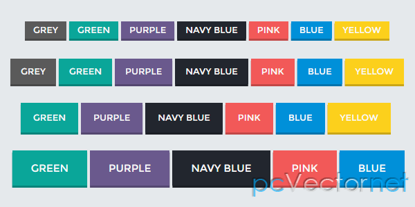
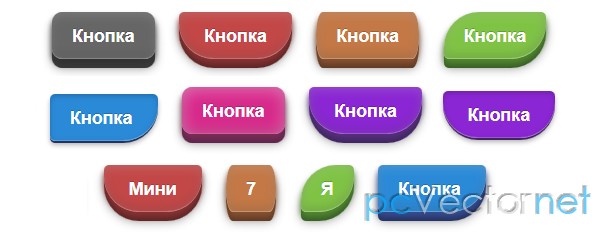
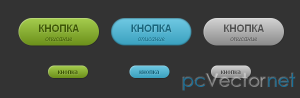
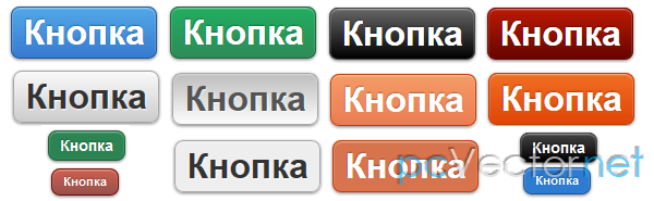
Три наборчика CSS3 кнопочек для вас мои дорогие веб-строители.
HTML
Для первого набора кнопок, варианты использования такие:
<a class="button green small left" href="index.html">Набор 1</a>
<a class="button blue small left" href="index2.html">Набор 2</a>
<a class="button purple small left" href="index3.html">Набор 3</a>
<a class="button green large" href="#">Нажмите</a>
<a class="button green medium" href="#">Нажмите</a>
<a class="button green small" href="#">Нажмите</a>

<a class="button blue large" href="#">Нажмите</a>
<a class="button blue medium" href="#">Нажмите</a>
<a class="button blue small" href="#">Нажмите</a>

<a class="button red large" href="#">Нажмите</a>
<a class="button red medium" href="#">Нажмите</a>
<a class="button red small" href="#">Нажмите</a>

<a class="button orange large" href="#">Нажмите</a>
<a class="button orange medium" href="#">Нажмите</a>
<a class="button orange small" href="#">Нажмите</a>

<a class="button purple large" href="#">Нажмите</a>
<a class="button purple medium" href="#">Нажмите</a>
<a class="button purple small" href="#">Нажмите</a>
CSS
И такой вот CSS код для первого набора кнопок:
.button {
    color : #FFF;
    display: block;
    text-shadow: -1px -1px 1px #000000;
    filter: dropshadow(color=#000000, offx=-1, offy=-1);
    -webkit-box-shadow: inset 0px -2px 2px #666;
    -moz-box-shadow: inset 0px -2px 2px #666;
    box-shadow: inset 0px -2px 2px #666;
    -moz-border-radius: 5px;
    -webkit-border-radius: 5px;
    border-radius: 5px;
    margin: 5px;
    border: solid 1px #666;
}
.button:hover {
        border: solid 1px #333;
}
.button:active {
    -webkit-box-shadow: inset 0px -1px 1px #666;
    -moz-box-shadow: inset 0px -1px 1px #666;
    box-shadow: inset 0px -1px 1px #666;
}
.large {
    height: 75px;
    width: 200px;
    line-height: 75px;
    text-align: center;
    font-size: 36px;
    text-decoration: none;
}
.medium {
    height: 50px;
    width: 135px;
    line-height: 50px;
    text-align: center;
    font-size: 28px;
    text-decoration: none;
}
.small {
    height: 30px;
    width: 100px;
    line-height: 30px;
    text-align: center;
    font-size: 18px;
    text-decoration: none;
}
.blue {
    background: #b8e1fc;
    background: -moz-linear-gradient(top, #b8e1fc 0%, #a9d2f3 10%, #90bae4 25%, #90bcea 37%, #90bff0 50%, #6ba8e5 51%, #a2daf5 83%, #bdf3fd 100%);
    background: -webkit-gradient(linear, left top, left bottom, color-stop(0%,#b8e1fc), color-stop(10%,#a9d2f3), color-stop(25%,#90bae4), color-stop(37%,#90bcea), color-stop(50%,#90bff0), color-stop(51%,#6ba8e5), color-stop(83%,#a2daf5), color-stop(100%,#bdf3fd)); /* webkit */
    filter: progid:DXImageTransform.Microsoft.gradient( startColorstr='#b8e1fc', endColorstr='#bdf3fd',GradientType=0 ); /* ie */
}
.green {
    background: #9dd53a;
    background: -moz-linear-gradient(top, #9dd53a 0%, #a1d54f 50%, #80c217 51%, #7cbc0a 100%); /* firefox */
    background: -webkit-gradient(linear, left top, left bottom, color-stop(0%,#9dd53a), color-stop(50%,#a1d54f), color-stop(51%,#80c217), color-stop(100%,#7cbc0a));
    filter: progid:DXImageTransform.Microsoft.gradient( startColorstr='#9dd53a', endColorstr='#7cbc0a',GradientType=0 ); /* ie */
}
.red {
    background: #f85032; /* old browsers */
background: -moz-linear-gradient(top, #f85032 0%, #f16f5c 50%, #f6290c 51%, #f02f17 71%, #e73827 100%); /* firefox */
background: -webkit-gradient(linear, left top, left bottom, color-stop(0%,#f85032), color-stop(50%,#f16f5c), color-stop(51%,#f6290c), color-stop(71%,#f02f17), color-stop(100%,#e73827)); /* webkit */
filter: progid:DXImageTransform.Microsoft.gradient( startColorstr='#f85032', endColorstr='#e73827',GradientType=0 ); /* ie */
}
.orange {
    background: #fceabb; /* old browsers */
    background: -moz-linear-gradient(top, #fceabb 0%, #fccd4d 50%, #f8b500 51%, #fbdf93 100%); /* firefox */
    background: -webkit-gradient(linear, left top, left bottom, color-stop(0%,#fceabb), color-stop(50%,#fccd4d), color-stop(51%,#f8b500), color-stop(100%,#fbdf93)); /* webkit */
    filter: progid:DXImageTransform.Microsoft.gradient( startColorstr='#fceabb', endColorstr='#fbdf93',GradientType=0 ); /* ie */
}
.purple {
    background: #cb60b3; /* old browsers */
    background: -moz-linear-gradient(top, #cb60b3 0%, #c146a1 50%, #a80077 51%, #db36a4 100%); /* firefox */
    background: -webkit-gradient(linear, left top, left bottom, color-stop(0%,#cb60b3), color-stop(50%,#c146a1), color-stop(51%,#a80077), color-stop(100%,#db36a4)); /* webkit */
    filter: progid:DXImageTransform.Microsoft.gradient( startColorstr='#cb60b3', endColorstr='#db36a4',GradientType=0 ); /* ie */
}
Другие варианты смотрите в исходном коде демок или исходников.
Ссылки