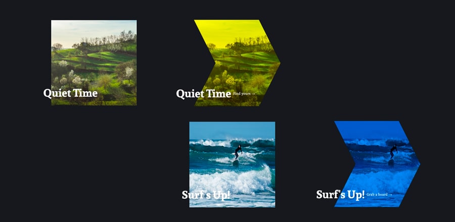
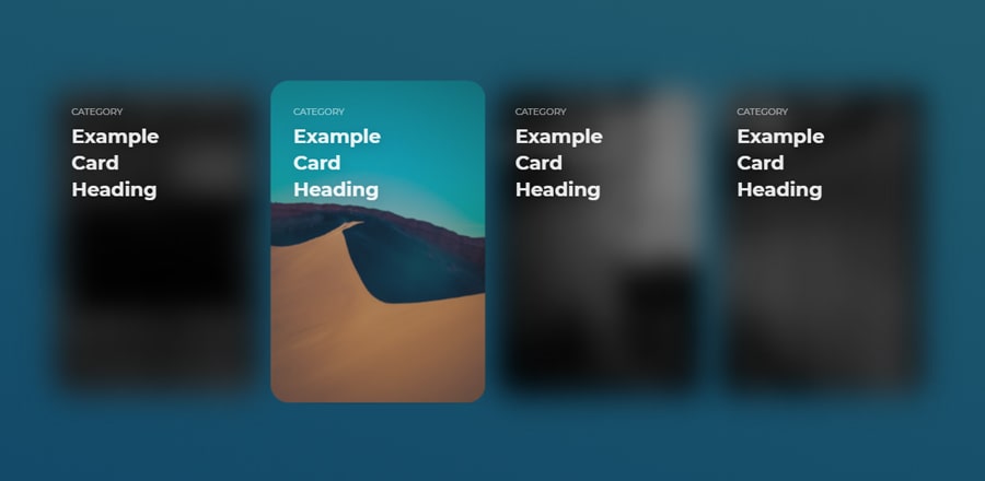
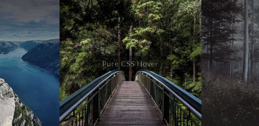
Hover эффекты над изображениями на CSS
 Эффект наведения на блоки с изображениями и текстом
HTML
<div class="container">
<p class="header">Image Hover Effects</p>
<div class="content">
<div class="wrapper">
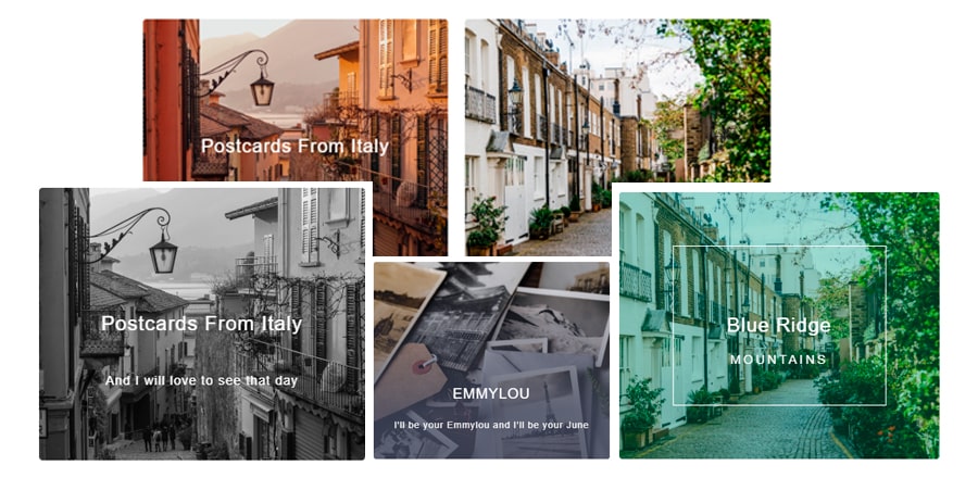
<div class="box vintage">
<img src="https://source.unsplash.com/900x900/?vintage" alt="EMMYLOU">
<h2>EMMYLOU</h2>
<p>I'll be your Emmylou and I'll be your June</p>
</div>
</div>
<div class="wrapper">
<div class="box w-content">
<img src="https://source.unsplash.com/900x900/?art,history
" alt="Jenny of Oldstones">
<div class="frame">
<h2>Jenny of Oldstones</h2>
</div>
</div>
</div>
<div class="wrapper">
<div class="box postcard">
<img src="https://source.unsplash.com/900x900/?ocean,sunset" alt="BOX">
<h2>The Pursuit of <p class="hide">HAPPINESS</p></h2>
</div>
</div>
<div class="wrapper">
<div class="box zoom-in">
<img src="https://source.unsplash.com/900x900/?italy,travel
" alt="Postcards From Italy">
<h2>Postcards From Italy</h2>
<p>And I will love to see that day</p>
</div>
</div>
<div class="wrapper">
<div class="box blury-card" >
<img src="https://source.unsplash.com/900x900/?street,travel
" alt="Blue Ridge Mountains">
<div class="frame">
<h2>Blue Ridge</h2>
<p>MOUNTAINS</p>
</div>
</div>
</div>
<div class="wrapper">
<div class="box zoom-out">
<img src="https://source.unsplash.com/900x900/?photography
" alt="Melody Noir">
<div class="frame">
<h2>MELODY <span>NOIR</span></h2>
<p>Tell me where the wind is blowing 'cause that's where the music's going</p>
</div>
</div>
</div>
</div>
</div>SCSS
@import url('https://fonts.googleapis.com/css?family=DM+Sans:400,500,700&display=swap');
* {
  box-sizing: border-box;
}

body {
  margin: 0;
  width: 100%;
  height: 100vh;
  font-family: 'DM-sans', sans-serif;
}

.header {
  font-size: 24px;
  text-align: center;
}

.container {
  width: 100%;
  max-width: 1200px;
  border-radius: 4px;
  margin: 0 auto;
  padding: 40px 0;
}

.content {
  display: flex;
  flex-wrap: wrap;
  margin-top: 60px;
  padding: 0 30px;
}

.wrapper {
  width: 33.3%;
  height: 100%;
  padding: 10px;
}

.name {
  position: relative;
  font-size: 16px;
  display: inline-block;

  &:after {
    content: '';
    position: absolute;
    width: calc(100% + 10px);
    height: 1px;
    background-color: #000;
    bottom: -4px;
    left: 0;
  }
}

.box {
  position: relative;
  max-height: 300px;
  border-radius: 4px;
  overflow: hidden;
  box-shadow:
  0 1.4px 1.7px rgba(0, 0, 0, 0.017),
  0 3.3px 4px rgba(0, 0, 0, 0.024),
  0 6.3px 7.5px rgba(0, 0, 0, 0.03),
  0 11.2px 13.4px rgba(0, 0, 0, 0.036),
  0 20.9px 25.1px rgba(0, 0, 0, 0.043),
  0 50px 60px rgba(0, 0, 0, 0.06);

  .hide { opacity: 0; }

  .frame {
    position: absolute;
    border: 1px solid #fff;
    z-index: 2;
    top: 50%;
    left: 50%;
    transform: translate(-50%, -50%);
  }

  h2, p {
    position: absolute;
    color: #fff;
    z-index: 2;
    width: 100%;
    transition: opacity 0.2s, transform 0.3s;
  }

  h2 {
    font-weight: 500;
    font-size: 22px;
    margin-bottom: 0;
    letter-spacing: 1px;
  }

  p {
    bottom: 0;
    font-size: 14px;
    letter-spacing: 1px;
  }

  &:hover {
    transition: all .3s ease-in-out;
  }

  &:hover:before {
    transition: all .3s ease-in-out;
  }

  img {
    position:relative;
    width: 100%;
    height: 100%;
    z-index: 1;
    transition: all .3s ease-in-out;

    &:hover {
      transition: all .3s ease-in-out;
    }

    &:after {
      content: '';
      position: absolute;
      background-color: rgba(0,0,0,.6);
      width: 100%;
      height: 100%;
      top: 0;
      left: 0;
      opacity: 0;
    }

    &:hover {
      transition: all .3s ease-in-out;
    }
  }
}

.zoom-in{
  h2 {
    top: 50%;
    transform: translatey(-50%);
    text-align: center;
    margin: 0;
  }

  p {
    text-align: center;
    top: calc(50% + 40px);
    transition: all .3s ease;
    transform: scale(1.8);
    opacity: 0;
  }

  &:hover {
   img {
    transform: scale(1.1);
    filter: grayscale(100%);
   }

    p {
      transform: scale(1);
      transition: all .3s ease;
      opacity: 1;
    }
  }
}

.w-content {
  .frame {
    width: calc(100% - 100px);
    height: calc(100% - 100px);
    top: 50%;
    left: 50%;
    transform: translate(-50%, -50%);
    border-color: transparent;
  }

  h2 {
    margin-top: 0;
    top: 50%;
    transform: translatey(-50%);
    text-align: center;
    letter-spacing: 1px;
  }

  p { transform: translate3d(0, -10px, 0); }

  &:hover {
    .frame {
      border-color: #fff;
      transition: color .3s ease-in-out, all .3s ease-in-out;
      width: calc(100% - 20px);
      height: calc(100% - 20px);
    }

    opacity: .8;
  }
}

.postcard {
  h2 {
    top: 50%;
    text-align: left;
    transform: translate3d(50px, 20px, 0);
  }

  p {
    transform: translate3d(40px, 60px, 0);
    font-size: 24px;
    letter-spacing: 1px;
  }

  &:hover {
    h2 { transform: translate3d(20px, 20px, 0); }
    p { opacity: 1; }

    img {
      filter: opacity(0.7);
      transform: translate3d(-30px, 0, 0);
    }
  }
}

.blury-card {
  .frame {
    width: calc(100% - 40px);
    height: calc(100% - 40px);
    opacity: 0;
    transition: all .3s ease-in-out
  }

  h2 , p {
    text-align: center;
    top: 50%;
    transform: translatey(-50%);
    margin: 0;
    z-index: 3;
  }

  p {
    transform: translatey(30px);
    letter-spacing: 3px;
  }

  span {
    font-size: 24px;
  }

  &:before {
    content:'';
    position: absolute;
    width: 100%;
    height: 100%;
    background: #008E6B;
    z-index: 1;
    left: 0;
    opacity: 0;
    transition: all .3s ease-in-out;
  }

  img {  z-index: 2; }

  &:hover {
    .frame {
      width: calc(100% - 120px);
      height: calc(100% - 120px);
      opacity: 1;
    }

    img { opacity: .7; }

    &:before {
      opacity: 1;
      transition: all .3s ease-in-out;
    }
  }
}

.vintage {
  h2 {
    top: 50%;
    transform: translate3d(0, 60px, 0);
    text-align: center;
  }

  p {
    opacity: 0;
    bottom: 0;
    transform: translate3d(0, -10px, 0);
    font-size: 14px;
    letter-spacing: 1px;
    text-align: center;
  }

  &:before {
    content:'';
    position: absolute;
    width: 100%;
    height: 100%;
    background: linear-gradient(to bottom, rgba(72,76,97,0) 0%, rgba(72,76,97,0.8) 75%);
    z-index: 2;
    bottom: -100%;
    left: 0;
  }

  &:hover:before {
    bottom: 0;
  }

  &:hover {
    h2 {
      bottom: 40px;
      transform: translate3d(0, 20px, 0);
    }

    p {
      opacity: 1;
      transform: translate3d(0, -30px, 0);
    }
  }
}

.zoom-out {
  .frame {
    width: calc(100% - 100px);
    height: calc(100% - 100px);
    top: 50%;
    left: 50%;
    transform: translate(-50%, -50%);
    width: calc(100% - 40px);
    height: calc(100% - 40px);
  }

  h2 {
    font-size: 20px;
    font-weight: 300;
    margin-left: 10px;
    letter-spacing: 1px;
  }
  span { font-size: 24px; font-weight: 500; }

  p {
    max-width: 120px;
    text-align: right;
    margin: 10px;
    right: 0;
  }

  img { transform: scale(1.1); }
  &:hover img {
    transform: scale(1);
    filter: contrast(70%);
  }
}

@media screen and (max-width: 880px) {
  .wrapper {
    width: 50%;
  }
}

@media screen and (max-width: 520px) {
  .wrapper {
    width: 100%;
  }
}