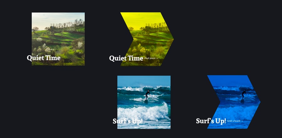
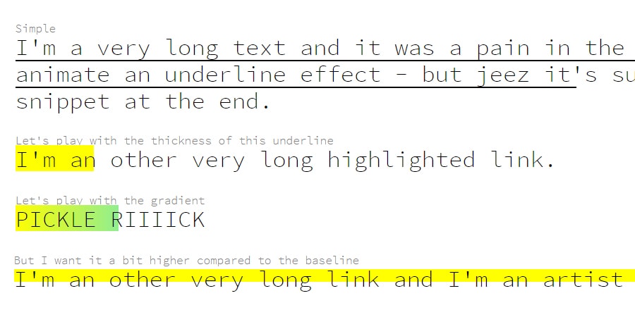
Эффект при наведении на изображение
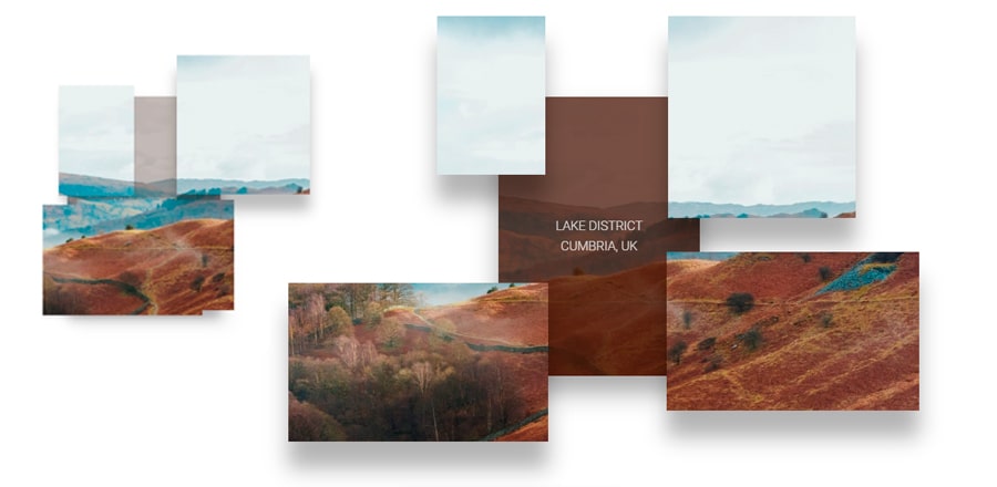 Довольно-таки смелый hover эффект на изображении. При наведении происходит разделение блока на отдельные кусочки с общим фоном - картинкой.
HTML
<div class="image-hover-container">
    <div class='container'>
        <div class='middle'>
            <div class='bg-image lake-district'></div>
            <a href='https://www.cumbriatourism.org/'  target="_blank" class='overlay'>
                <p>Lake District</p>
                <p>Cumbria, uk</p>
                <p class='mobile-link'>Read More</p>
            </a>
        </div>
        <div class='bottom-right'>
            <div class='bg-image lake-district'></div>
        </div>
        <div class='bottom-left'>
            <div class='bg-image lake-district'></div>
        </div>

        <div class='top-left'>
            <div class='bg-image lake-district'></div>
        </div>
        <div class='top-right'>
            <div class='bg-image lake-district'></div>
        </div>
    </div>
</div>
<div class="image-hover-container">
    <div class='container'>
        <div class='middle'>
            <div class='bg-image lancaster'></div>
            <a href='https://www.visitlancashire.com/explore/lancaster' target="_blank" class='overlay'>
                <p>Lancaster</p>
                <p>Lancashire, uk</p>
                <p class='mobile-link'>Read More</p>
            </a>
        </div>
        <div class='bottom-right'>
            <div class='bg-image lancaster'></div>
        </div>
        <div class='bottom-left'>
            <div class='bg-image lancaster'></div>
        </div>

        <div class='top-left'>
            <div class='bg-image lancaster'></div>
        </div>
        <div class='top-right'>
            <div class='bg-image lancaster'></div>
        </div>
    </div>
</div>
SCSS
@import url('https://fonts.googleapis.com/css2?family=Manrope:wght@300&family=Open+Sans&family=Roboto:wght@300&display=swap');

.image-hover-container {
    position: relative;
    height: 100vh;
    width: 100%;
    display: flex;
    .container {
        position: relative;
        height: 430px;
        width: 310px;
        margin: auto;
        display: -webkit-box;
        &:hover {
            > .bottom-right {
                top: 55%;
                left: 80%;
                box-shadow: 0px 37px 29px rgba(0, 0, 0, 0.3);
                width: 350px;
            }
            > .middle {
                height: 90%;
                left: 5%;
                top: 5%;
                width: 90%;
                box-shadow: 0px 23px 33px rgba(0, 0, 0, 0.34);
                .overlay {
                    opacity: 1;
                    z-index: 1;

                    p:nth-child(1) {
                        padding-top: 0;
                    }
                }
            }
            > .top-left {
                left: -70px;
                top: -90px;
                width: 150px;
                box-shadow: 0px 37px 29px rgba(0, 0, 0, 0.3);
            }
            > .top-right {
                 left: 250px;
                 top: -90px;
                 width: 260px;
                 height: 280px;
                box-shadow: 0px 37px 29px rgba(0, 0, 0, 0.3);
            }
            > .bottom-left {
                left: -89%;
                top: 65%;
                width: 360px;
                box-shadow: 0px 37px 29px rgba(0, 0, 0, 0.3);
            }

        }
        .lancaster {
            background: url(https://s3-us-west-2.amazonaws.com/s.cdpn.io/769286/lancaster-min.jpg) no-repeat;

        }
        .lake-district {
            background: url(https://s3-us-west-2.amazonaws.com/s.cdpn.io/769286/lake-district-min.jpg) no-repeat;
        }
        .bg-image {
            background-size: cover;
            background-attachment: fixed;
            background-position: 10% 10%;
        }
        .middle {
            transition: 500ms all;
             transition-delay: 0.25s;
            transition-timing-function: cubic-bezier(.17,.67,.33,.97);
            position: relative;
            margin: auto;
            height: 100%;
            width: 100%;

            margin: 0px;
            left: 0;
            top: 0;
            box-shadow: 0px 17px 23px rgba(0, 0, 0, 0.34);
            .bg-image {
                height: 100%;
                width: 100%;
            }
            .overlay {
                position: absolute;
                top: 0;
                left: 0;
                height: 100%;
                width: 100%;
                z-index: 9;
                background: rgba(67, 27, 12, 0.75);
                display: flex;
                flex-direction: column;
                transition: 300ms all;
             transition-delay: 0.37s;
                opacity: 0;
                text-decoration: none;
                z-index: -1;
                p {
                    position: relative;
                    margin: auto;
                    color: #fff;
                    text-transform: uppercase;
                    font-family: 'Roboto', sans-serif;
                    font-size: 1.1em;
                    opacity: 0.8;
                    &:nth-child(1) {
                        margin-bottom: 4px !important;
                        padding-top: 30px;
                        transition: all 400ms;
                        transition-delay: 0.3s;
                    }
                    &:nth-child(2) {
                        margin-top: 4px !important;
                    }

                }
                .mobile-link {
                    display: none;
                }
            }
        }
        .bottom-right {
            transition: 800ms all;
            transition-delay: 0.15s;
            transition-timing-function: cubic-bezier(.17,.67,.33,.97);
            position: absolute;
            left: 0%;
            top: 48%;
            width: 100%;
            box-shadow: 0px 37px 29px rgba(0, 0, 0, 0);
            z-index: 1;
            .bg-image {
                height: 220px;
                width: 100%;
            }
        }
        .bottom-left {
            transition: 800ms all;
            transition-delay: 0.17s;
            transition-timing-function: cubic-bezier(.17,.67,.33,.97);
            position: absolute;
            left: 0%;
            top: 48%;
            width: 100%;
            z-index: 1;
            .bg-image {
                height: 220px;
                width: 100%;
            }
        }

        .top-left {
            transition-timing-function: cubic-bezier(.17,.67,.33,.97);
            transition: 600ms all;
            transition-delay: 0.19s;
            position: absolute;
            left: 0%;
            top: 0%;
            width: 150px;
            z-index: 1;
            .bg-image {
                height: 220px;
                width: 100%;
            }


        }
        .top-right {
            transition: 500ms all;
            transition-delay: 0.08s;
            position: absolute;
            left: 0%;
            top: 0%;
            width: 300px;
            height: 260px;
            z-index: 1;
            transition-timing-function: cubic-bezier(.17,.67,.33,.97);
            .bg-image {
                 float: right;
                 height: 100%;
                 width: 100%;
            }
        }
    }
}

@media (max-width: 920px) {
    .image-hover-container {
        transform: scale(.8) translateX(0px);
        overflow: hidden;
        .overlay {
            p:nth-child(1) {
                 margin-top: 125px;
            }
            p:nth-child(2) {
                margin-bottom: 30px !important;
            }
            .mobile-link {
                display: block !important;
                margin-top: 0px !important;
            }
        }
        .bottom-right, .bottom-left, .top-left, .top-right {
            box-shadow: 0px 0px 0px !important;
        }

    }
}
@media (max-width: 350px) {
    .bottom-right, .bottom-left, .top-left, .top-right {
        display: none !important;
    }
}