Глитч эффект на CSS при наведении
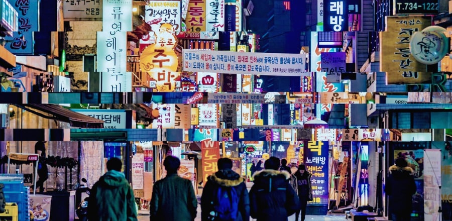 При наведении на изображение воспроизводится глитч эффект. Сделано на CSS за счет использования одного и того же изображения несколько раз.
HTML
<main>
  <div class="c-glitch" style="background-image: url('https://s3-us-west-2.amazonaws.com/s.cdpn.io/204808/night-street-seoul-south-korea-shutterstock_578475466-1.jpg');">
    <div class="c-glitch__img" style="background-image: url('https://s3-us-west-2.amazonaws.com/s.cdpn.io/204808/night-street-seoul-south-korea-shutterstock_578475466-1.jpg');"></div>
    <div class="c-glitch__img" style="background-image: url('https://s3-us-west-2.amazonaws.com/s.cdpn.io/204808/night-street-seoul-south-korea-shutterstock_578475466-1.jpg');"></div>
    <div class="c-glitch__img" style="background-image: url('https://s3-us-west-2.amazonaws.com/s.cdpn.io/204808/night-street-seoul-south-korea-shutterstock_578475466-1.jpg');"></div>
    <div class="c-glitch__img" style="background-image: url('https://s3-us-west-2.amazonaws.com/s.cdpn.io/204808/night-street-seoul-south-korea-shutterstock_578475466-1.jpg');"></div>
    <div class="c-glitch__img" style="background-image: url('https://s3-us-west-2.amazonaws.com/s.cdpn.io/204808/night-street-seoul-south-korea-shutterstock_578475466-1.jpg');"></div>
  </div>
</main>
SCSS
/* =Variables
------------------------------------- */
// Colors
$pure-white: hsla(0, 0%, 100%, 1); // #fff
$pure-black: hsla(0, 0%, 0%, 1); // #000
$dark-jungle-green: hsla(210, 3%, 11%, 1); //1c1d1e
$grey-dark: hsla(0, 0%, 25%, 1); // #404040
$white-dark: hsla(0, 0%, 95%, 1); /// #f1f1f1
$fuel-yellow: hsla(36, 100%, 49%, 1); // #f89500

// Fonts
$droid-serif: 'Droid Serif', serif;
$kalam: 'Kalam', cursive;
$open-sans: 'Open Sans', sans-serif;

// transition
$transition: .5s cubic-bezier(.77, 0, .175, 1);
$transition-fast: .2s cubic-bezier(.77, 0, .175, 1);

/* =Functions
------------------------------------- */
// Convert a pixel value to REM units
@function rem($pixel) {
  @return $pixel / 16 + rem;
}

/* =Styles
------------------------------------- */
html {
  background: $dark-jungle-green;
  box-sizing: border-box;
  margin: 0;
  min-height: 100vh;
  padding: 0;
}

.c-intro {
  animation: fe30-anime 1s ease-in-out 4s forwards;
  opacity: 0;
}

.c-fe30 {
  color: $pure-white;
  margin-top: rem(40);
  text-align: center;

  a {
    color: $pure-white;

    &:hover {
      text-decoration: none;
    }
  }
}

.c-ryanyu {
  background-color: transparent;
  display: block;
  font-family: $kalam;
  height: rem(70);
  margin: rem(20) auto 0;
  position: relative;
  text-align: center;
  width: rem(70);

  img {
    background-color: $pure-white;
    border: rem(3) solid $fuel-yellow;
    border-radius: 50%;
    height: rem(70);
    object-fit: contain;
    width: rem(70);
  }
}

.c-ryanyu__front {
  backface-visibility: hidden;
  height: inherit;
  position: absolute;
  top: 0;
  transform: rotateX(0) rotateY(0);
  transform-style: preserve-3d;
  transition: all $transition;
  z-index: 2000;

  .c-ryanyu:hover & {
    transform: rotateY(180deg);
  }
}

.c-ryanyu__back {
  background-color: $pure-white;
  backface-visibility: hidden;
  border-radius: 50%;
  color: $fuel-yellow;
  height: inherit;
  position: absolute;
  text-align: center;
  top: 0;
  transform: rotateY(180deg);
  transform-style: preserve-3d;
  transition: all $transition;
  width: inherit;
  z-index: 1000;

  &::before {
    content: 'Ryan Yu';
    display: block;
    transform: rotate(-45deg) translate(-4px, 25px);
    width: rem(50);
  }

  .c-ryanyu:hover & {
    transform: rotateY(0);
  }
}

@keyframes fe30-anime {
  0% {
    opacity: 0;
  }

  100% {
    opacity: 1;
  }
}

/* =Custom Styles
------------------------------------- */
.c-glitch,
.c-glitch__img {
  background-repeat: no-repeat;
    background-position: 50% 50%;
    background-size: cover;
}

.c-glitch {
  height: calc(100vh - 200px);
  margin: 0 auto;
  overflow: hidden;
    position: relative;
  width: 60vw;
}

.c-glitch__img {
  background-blend-mode: none;
  background-color: transparent;
  height: calc(100% + 5px * 2);
  left: 0;
  pointer-events: none;
  position: absolute;
  top: 0;
  transform: translate3d(0, 0, 0);
  width: calc(100% + 10px * 2);

  .c-glitch:hover &:nth-child(n+2) {
    animation-duration: 2s;
    animation-delay: 0;
    animation-timing-function: linear;
    animation-iteration-count: infinite;
    animation-fill-mode: forwards;
  }

  .c-glitch:hover &:nth-child(2) {
    animation-name: glitch-anim-1;
  }

  .c-glitch:hover &:nth-child(3) {
    animation-name: glitch-anim-2;
  }

  .c-glitch:hover &:nth-child(4) {
    animation-name: glitch-anim-3;
  }

  .c-glitch:hover &:nth-child(5) {
    animation-name: glitch-anim-4;
    background-blend-mode: overlay;
    background-color: #af4949;
  }
}

.c-glitch__img:nth-child(n+2) {
    opacity: 0;
}

@keyframes glitch-anim-1 {
    0%, 100% {
        opacity: 1;
        transform: translate3d(40px, 0, 0) scale3d(-1, -1, 1);
        clip-path: polygon(0 2%, 100% 2%, 100% 5%, 0 5%);
    }

    20% {
        clip-path: polygon(0 15%, 100% 15%, 100% 15%, 0 15%);
    }

    30% {
        clip-path: polygon(0 10%, 100% 10%, 100% 20%, 0 20%);
    }

    40% {
        clip-path: polygon(0 1%, 100% 1%, 100% 2%, 0 2%);
    }

    50% {
        clip-path: polygon(0 33%, 100% 33%, 100% 33%, 0 33%);
    }

    55% {
        clip-path: polygon(0 44%, 100% 44%, 100% 44%, 0 44%);
    }

    60% {
        clip-path: polygon(0 50%, 100% 50%, 100% 20%, 0 20%);
    }

  65% {

        clip-path: polygon(0 70%, 100% 70%, 100% 70%, 0 70%);
    }

    70% {

        clip-path: polygon(0 80%, 100% 80%, 100% 80%, 0 80%);
    }

    80% {
        clip-path: polygon(0 50%, 100% 50%, 100% 55%, 0 55%);
    }

    85% {
        clip-path: polygon(0 60%, 100% 60%, 100% 65%, 0 65%);
    }

    95% {
        clip-path: polygon(0 72%, 100% 72%, 100% 78%, 0 78%);
    }
}

@keyframes glitch-anim-2 {
    0%, 100% {
        opacity: 1;
        transform: translate3d(-10px, 0, 0);
        clip-path: polygon(0 25%, 100% 25%, 100% 30%, 0 30%);
    }

    10% {
        clip-path: polygon(0 3%, 100% 3%, 100% 3%, 0 3%);
    }

    15% {
        clip-path: polygon(0 5%, 100% 5%, 100% 20%, 0 20%);
    }

    17% {
        clip-path: polygon(0 20%, 100% 20%, 100% 20%, 0 20%);
    }

    19% {
        clip-path: polygon(0 40%, 100% 40%, 100% 40%, 0 40%);
    }

    33% {
        clip-path: polygon(0 52%, 100% 52%, 100% 59%, 0 59%);
    }

    35% {
        clip-path: polygon(0 60%, 100% 60%, 100% 60%, 0 60%);
    }

    40% {
        clip-path: polygon(0 75%, 100% 75%, 100% 75%, 0 75%);
    }

    45% {
        clip-path: polygon(0 65%, 100% 65%, 100% 40%, 0 40%);
    }

    49% {
        clip-path: polygon(0 45%, 100% 45%, 100% 50%, 0 50%);
    }

    50% {
        clip-path: polygon(0 14%, 100% 14%, 100% 33%, 0 33%);
    }

    55% {
        clip-path: polygon(0 15%, 100% 15%, 100% 35%, 0 35%);
    }

    60% {
        clip-path: polygon(0 15%, 100% 15%, 100% 15%, 0 15%);
    }

    70% {
        clip-path: polygon(0 65%, 100% 65%, 100% 60%, 0 60%);
    }

    80% {
        clip-path: polygon(0 80%, 100% 80%, 100% 85%, 0 85%);
    }

    90% {
        clip-path: polygon(0 55%, 100% 55%, 100% 65%, 0 65%);
    }
}

@keyframes glitch-anim-3 {
    0%, 100% {
        opacity: 1;
        transform: translate3d(0, -5px, 0) scale3d(-1, -1, 1);
        clip-path: polygon(0 1%, 100% 1%, 100% 3%, 0 3%);
    }

    5% {
        clip-path: polygon(0 10%, 100% 10%, 100% 9%, 0 9%);
    }

    11% {
        clip-path: polygon(0 5%, 100% 5%, 100% 6%, 0 6%);
    }

    20% {
        clip-path: polygon(0 20%, 100% 20%, 100% 20%, 0 20%);
    }

    25% {
        clip-path: polygon(0 10%, 100% 10%, 100% 10%, 0 10%);
    }

    35% {
        clip-path: polygon(0 30%, 100% 30%, 100% 25%, 0 25%);
    }

    42% {
        clip-path: polygon(0 15%, 100% 15%, 100% 16%, 0 16%);
    }

    48% {
        clip-path: polygon(0 40%, 100% 40%, 100% 39%, 0 39%);
    }

    50% {
        clip-path: polygon(0 20%, 100% 20%, 100% 21%, 0 21%);
    }

    56% {
        clip-path: polygon(0 60%, 100% 60%, 100% 55%, 0 55%);
    }

    61% {
        clip-path: polygon(0 30%, 100% 30%, 100% 31%, 0 31%);
    }

    68% {
        clip-path: polygon(0 70%, 100% 70%, 100% 69%, 0 69%);
    }

    72% {
        clip-path: polygon(0 40%, 100% 40%, 100% 41%, 0 41%);
    }

    77% {
        clip-path: polygon(0 80%, 100% 80%, 100% 75%, 0 75%);
    }

    81% {
        clip-path: polygon(0 50%, 100% 50%, 100% 51%, 0 51%);
    }

    86% {
        clip-path: polygon(0 90%, 100% 90%, 100% 90%, 0 90%);
    }

    90% {
        clip-path: polygon(0 60%, 100% 60%, 100% 60%, 0 60%);
    }

    92% {
        clip-path: polygon(0 100%, 100% 100%, 100% 99%, 0 99%);
    }

    94% {
        clip-path: polygon(0 70%, 100% 70%, 100% 71%, 0 71%);
    }
}

@keyframes glitch-anim-4 {
    0%, 5% {
        opacity: 0.2;
        transform: translate3d(10px, 5px, 0);
    }

    5.5%, 100% {
        opacity: 0;
        transform: translate3d(0, 0, 0);
    }
}
Ссылки