CSS анимация облаков и ночного неба
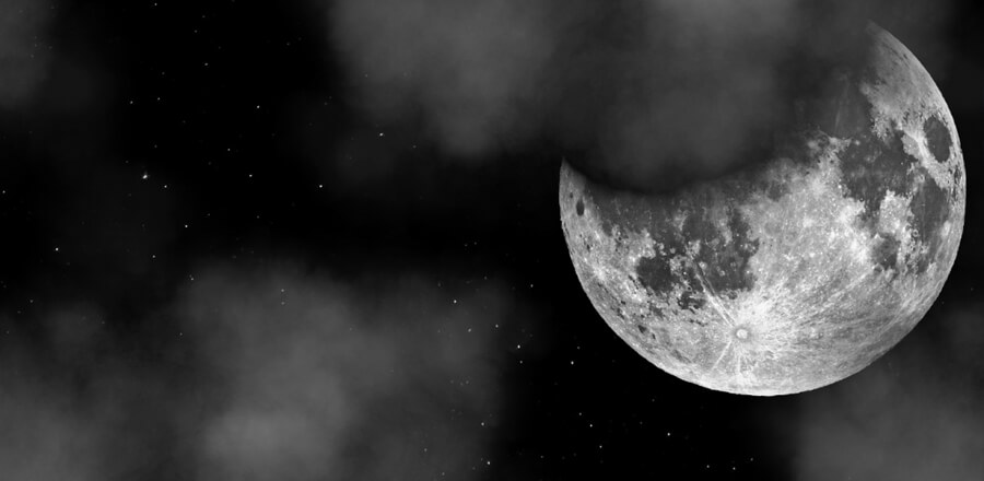 Ночное небо с мерцающими звездами и пролетающими луну облаками. Анимация всего сделана на CSS
 HTML
<div class="background-container">
<img src="https://s3-us-west-2.amazonaws.com/s.cdpn.io/1231630/moon2.png" alt="">
<div class="stars"></div>
<div class="twinkling"></div>
<div class="clouds"></div>
CSS
@keyframes move-background {
  from {
    -webkit-transform: translate3d(0px, 0px, 0px);
  }
  to {
    -webkit-transform: translate3d(1000px, 0px, 0px);
  }
}
@-webkit-keyframes move-background {
  from {
    -webkit-transform: translate3d(0px, 0px, 0px);
  }
  to {
    -webkit-transform: translate3d(1000px, 0px, 0px);
  }
}
@-moz-keyframes move-background {
  from {
    -webkit-transform: translate3d(0px, 0px, 0px);
  }
  to {
    -webkit-transform: translate3d(1000px, 0px, 0px);
  }
}
@-webkit-keyframes move-background {
  from {
    -webkit-transform: translate3d(0px, 0px, 0px);
  }
  to {
    -webkit-transform: translate3d(1000px, 0px, 0px);
  }
}
.background-container {
  position: fixed;
  top: 0;
  left: 0;
  bottom: 0;
  right: 0;
}

.stars {
  background: black url(https://s3-us-west-2.amazonaws.com/s.cdpn.io/1231630/stars.png) repeat;
  position: absolute;
  top: 0;
  bottom: 0;
  left: 0;
  right: 0;
  display: block;
  z-index: 0;
}

.twinkling {
  width: 10000px;
  height: 100%;
  background: transparent url("https://s3-us-west-2.amazonaws.com/s.cdpn.io/1231630/twinkling.png") repeat;
  background-size: 1000px 1000px;
  position: absolute;
  right: 0;
  top: 0;
  bottom: 0;
  z-index: 2;
  -moz-animation: move-background 70s linear infinite;
  -ms-animation: move-background 70s linear infinite;
  -o-animation: move-background 70s linear infinite;
  -webkit-animation: move-background 70s linear infinite;
  animation: move-background 70s linear infinite;
}

.clouds {
  width: 10000px;
  height: 100%;
  background: transparent url("https://s3-us-west-2.amazonaws.com/s.cdpn.io/1231630/clouds_repeat.png") repeat;
  background-size: 1000px 1000px;
  position: absolute;
  right: 0;
  top: 0;
  bottom: 0;
  z-index: 3;
  -moz-animation: move-background 150s linear infinite;
  -ms-animation: move-background 150s linear infinite;
  -o-animation: move-background 150s linear infinite;
  -webkit-animation: move-background 150s linear infinite;
  animation: move-background 150s linear infinite;
}

img {
  height: 70vh;
  width: 70vh;
  position: absolute;
  z-index: 3;
  right: 20px;
}