Анимация подчеркивания текста при наведении
 CSS анимация эффекта подчеркивания текста. Эффекты достигаются с помощью css градиентов и background-position
HTML
<div class="wrap">
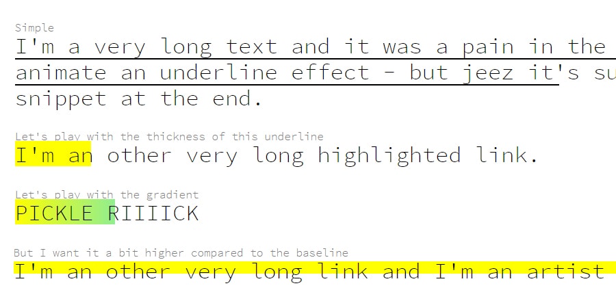
<h2>Simple</h2>
<p><a href="#" class="underlined underlined--thin">I'm a very long text and it was a pain in the ass to animate an underline effect - but jeez it's such a simple snippet at the end.</a></p>
<h2>Let's play with the thickness of this underline</h2>
<p><a href="#" class="underlined underlined--thick">I'm an other very long highlighted link.</a></p>
<h2>But I want it a bit higher compared to the baseline</h2>
<p><a href="#" class="underlined underlined--offset">I'm an other very long link and I'm an artist you know.</a></p>
<h2>Let's play with the gradient</h2>
<a href="#" class="underlined underlined--gradient">PICKLE RIIIICK</a>
<h2>Oooh fancy</h2>
<p><a href="#" class="underlined underlined--reverse">I'm an other long link and I don't like lorem.</a></p>
</div> CSS
body {
  font-family: 'Source Code Pro', sans-serif;
}

.wrap {
  padding: 10% 20%;
}

h2 {
  margin-top: 3em;
  color: grey;
}
h2:first-child {
  margin-top: 0;
}

.underlined {
  color: black;
  flex: 1;
  font-size: 2em;
  line-height: 1.2;
  text-decoration: none;
  background-image: linear-gradient(to right, yellow 0, yellow 100%);
  background-position: 0 1.2em;
  background-size: 0 100%;
  background-repeat: no-repeat;
  transition: background .5s;
}
.underlined:hover {
  background-size: 100% 100%;
}
.underlined--thin {
  background-image: linear-gradient(to right, black 0, black 100%);
}
.underlined--thick {
  background-position: 0 -0.1em;
}
.underlined--offset {
  background-position: 0 0.2em;
  box-shadow: inset 0 -.5em 0 0 white;
}
.underlined--gradient {
  background-position: 0 -0.1em;
  background-image: linear-gradient(to right, yellow 0, lightgreen 100%);
}
.underlined--reverse {
  background-position: 100% -0.1em;
  transition: background 1s;
  background-image: linear-gradient(to right, yellow 0, yellow 100%);
}