Сыр на чистом CSS
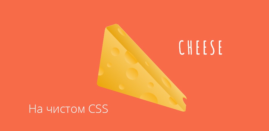 Анимация вращения куска сыра сделанная на чистом CSS
 HTML
<div class="title">
  <h1>Cheese</h1>
</div>
<div class="cheese-wrapper">
  <div class="cheese">
    <div class="cheese-front side">
      <div class="hole hole-0"></div>
      <div class="hole hole-1"></div>
      <div class="hole hole-2"></div>
      <div class="hole hole-3"></div>
      <div class="hole hole-4"></div>
      <div class="hole hole-5"></div>
      <div class="hole hole-6"></div>
      <div class="hole hole-7"></div>
      <div class="hole hole-8"></div>
    </div>
    <div class="cheese-back side">
      <div class="hole hole-0"></div>
      <div class="hole hole-1"></div>
      <div class="hole hole-2"></div>
      <div class="hole hole-3"></div>
      <div class="hole hole-4"></div>
      <div class="hole hole-5"></div>
      <div class="hole hole-6"></div>
    </div>
    <div class="cheese-left side">
      <div class="hole hole-0"></div>
      <div class="hole hole-1"></div>
      <div class="hole hole-2"></div>
      <div class="hole hole-3"></div>
      <div class="hole hole-4"></div>
      <div class="hole hole-5"></div>
    </div>
    <div class="cheese-top side">
      <div class="hole hole-0"></div>
      <div class="hole hole-1"></div>
      <div class="hole hole-2"></div>
      <div class="hole hole-3"></div>
      <div class="hole hole-4"></div>
      <div class="hole hole-5"></div>
      <div class="hole hole-6"></div>
    </div>
    <div class="cheese-bottom side">
      <div class="hole hole-0"></div>
      <div class="hole hole-1"></div>
      <div class="hole hole-2"></div>
      <div class="hole hole-3"></div>
      <div class="hole hole-4"></div>
      <div class="hole hole-5"></div>
    </div>
  </div>
</div>
CSS
body {
  background: #f86b49;
  margin: 0;
  height: 100vh;
  width: 100%;
  display: -webkit-box;
  display: -ms-flexbox;
  display: flex;
  -webkit-box-orient: vertical;
  -webkit-box-direction: normal;
      -ms-flex-direction: column;
          flex-direction: column;
  -webkit-box-align: center;
      -ms-flex-align: center;
          align-items: center;
  font-family: 'Amatic SC', cursive;
  color: #fff;
  letter-spacing: .3em;
  font-size: 30px;
  text-transform: uppercase;
  -ms-flex-wrap: wrap;
      flex-wrap: wrap;
}

.cheese-wrapper {
  -webkit-perspective: 700px;
          perspective: 700px;
  position: absolute;
  height: 150px;
  width: 300px;
  top: 35%;
}

.cheese {
  width: 100%;
  height: 100%;
  position: absolute;
  -webkit-transform-style: preserve-3d;
          transform-style: preserve-3d;
  -webkit-transform-origin: 30% 70%;
          transform-origin: 30% 70%;
  -webkit-transform: rotateX(0deg) rotateY(50deg) rotateZ(50deg);
          transform: rotateX(0deg) rotateY(50deg) rotateZ(50deg);
  -webkit-animation: spin 10s infinite 1s linear alternate;
          animation: spin 10s infinite 1s linear alternate;
}

.side {
  margin: 0;
  display: block;
  position: absolute;
  -webkit-box-sizing: border-box;
          box-sizing: border-box;
  border-radius: 10px;
  overflow: hidden;
}

.cheese-front,
.cheese-back {
  width: 300px;
  height: 200px;
}

.cheese-right,
.cheese-left {
  width: 100px;
  height: 200px;
  left: 100px;
}

.cheese-bottom {
  width: 300px;
  height: 100px;
  top: 50px;
}

.cheese-front {
  -webkit-transform: rotateY(0deg) translateZ(50px);
          transform: rotateY(0deg) translateZ(50px);
  background-image: -webkit-gradient(linear, left bottom, right top, from(#f8c249), color-stop(50%, #f8c249), color-stop(50%, transparent));
  background-image: linear-gradient(to top right, #f8c249, #f8c249 50%, transparent 50%);
  background-image: -webkit-gradient(linear, left bottom, right top, from(#eba609), color-stop(50%, #f9ca62), color-stop(50%, transparent));
  background-image: linear-gradient(to top right, #eba609 0%, #f9ca62 50%, transparent 50%);
}
.cheese-front .hole-0 {
  position: absolute;
  height: 40px;
  width: 40px;
  border-radius: 50%;
  background-image: linear-gradient(-150deg, #f6ae0e, #fad27a);
  left: 30%;
  top: 52%;
}
.cheese-front .hole-1 {
  position: absolute;
  height: 60px;
  width: 60px;
  border-radius: 50%;
  background-image: linear-gradient(-150deg, #f6ae0e, #fad27a);
  left: 50%;
  top: 85%;
}
.cheese-front .hole-2 {
  position: absolute;
  height: 20px;
  width: 20px;
  border-radius: 50%;
  background-image: linear-gradient(-150deg, #f6ae0e, #fad27a);
  left: 25%;
  top: 84%;
}
.cheese-front .hole-3 {
  position: absolute;
  height: 32px;
  width: 32px;
  border-radius: 50%;
  background-image: linear-gradient(-150deg, #f6ae0e, #fad27a);
  left: -5%;
  top: 65%;
}
.cheese-front .hole-4 {
  position: absolute;
  height: 28px;
  width: 28px;
  border-radius: 50%;
  background-image: linear-gradient(-150deg, #f6ae0e, #fad27a);
  left: 10%;
  top: 27%;
}
.cheese-front .hole-5 {
  position: absolute;
  height: 48px;
  width: 48px;
  border-radius: 50%;
  background-image: linear-gradient(-150deg, #f6ae0e, #fad27a);
  left: 25%;
  top: 23%;
  background-image: linear-gradient(34deg, #fad27a 10%, #f6ae0e 55%, transparent 55%);
}
.cheese-front .hole-6 {
  position: absolute;
  height: 16px;
  width: 16px;
  border-radius: 50%;
  background-image: linear-gradient(-150deg, #f6ae0e, #fad27a);
  left: 8%;
  top: 54%;
}
.cheese-front .hole-7 {
  position: absolute;
  height: 20px;
  width: 20px;
  border-radius: 50%;
  background-image: linear-gradient(-150deg, #f6ae0e, #fad27a);
  left: 55%;
  top: 67%;
}
.cheese-front .hole-8 {
  position: absolute;
  height: 32px;
  width: 32px;
  border-radius: 50%;
  background-image: linear-gradient(-150deg, #f6ae0e, #fad27a);
  left: 80%;
  top: 78%;
  background-image: linear-gradient(34deg, #fad27a 10%, #f6ae0e 53%, transparent 53%);
}

.cheese-back {
  -webkit-transform: rotateX(180deg) translateZ(50px);
          transform: rotateX(180deg) translateZ(50px);
  background-image: -webkit-gradient(linear, left top, right bottom, from(#f8c249), color-stop(50%, #f8c249), color-stop(50%, transparent));
  background-image: linear-gradient(to bottom right, #f8c249, #f8c249 50%, transparent 50%);
  background-image: -webkit-gradient(linear, left top, right bottom, from(#eba609), color-stop(50%, #fbdb93), color-stop(50%, transparent));
  background-image: linear-gradient(to bottom right, #eba609, #fbdb93 50%, transparent 50%);
}
.cheese-back .hole-0 {
  position: absolute;
  height: 28px;
  width: 28px;
  border-radius: 50%;
  background-image: linear-gradient(-150deg, #f6ae0e, #fad27a);
  left: 40%;
  top: -10%;
}
.cheese-back .hole-1 {
  position: absolute;
  height: 44.8px;
  width: 44.8px;
  border-radius: 50%;
  background-image: linear-gradient(-150deg, #f6ae0e, #fad27a);
  left: -13%;
  top: 64%;
}
.cheese-back .hole-2 {
  position: absolute;
  height: 36px;
  width: 36px;
  border-radius: 50%;
  background-image: linear-gradient(-150deg, #f6ae0e, #fad27a);
  left: 6%;
  top: 30%;
}
.cheese-back .hole-3 {
  position: absolute;
  height: 20px;
  width: 20px;
  border-radius: 50%;
  background-image: linear-gradient(-150deg, #f6ae0e, #fad27a);
  left: 20%;
  top: 50%;
}
.cheese-back .hole-4 {
  position: absolute;
  height: 12px;
  width: 12px;
  border-radius: 50%;
  background-image: linear-gradient(-150deg, #f6ae0e, #fad27a);
  left: 80%;
  top: 5%;
}
.cheese-back .hole-5 {
  position: absolute;
  height: 24px;
  width: 24px;
  border-radius: 50%;
  background-image: linear-gradient(-150deg, #f6ae0e, #fad27a);
  left: 30%;
  top: 14%;
}
.cheese-back .hole-6 {
  position: absolute;
  height: 40px;
  width: 40px;
  border-radius: 50%;
  background-image: linear-gradient(-150deg, #f6ae0e, #fad27a);
  left: 55%;
  top: 10%;
}

.cheese-left {
  -webkit-transform: rotateY(-90deg) translateZ(150px);
          transform: rotateY(-90deg) translateZ(150px);
  background: #f8c249;
  background-image: -webkit-gradient(linear, left bottom, right top, from(#eba609), to(#fbdb93));
  background-image: linear-gradient(to top right, #eba609, #fbdb93);
}
.cheese-left .hole-0 {
  position: absolute;
  height: 32px;
  width: 32px;
  border-radius: 50%;
  background-image: linear-gradient(-150deg, #f6ae0e, #fad27a);
  left: 85%;
  top: 65%;
}
.cheese-left .hole-1 {
  position: absolute;
  height: 24px;
  width: 24px;
  border-radius: 50%;
  background-image: linear-gradient(-150deg, #f6ae0e, #fad27a);
  left: 65%;
  top: 45%;
}
.cheese-left .hole-2 {
  position: absolute;
  height: 16px;
  width: 16px;
  border-radius: 50%;
  background-image: linear-gradient(-150deg, #f6ae0e, #fad27a);
  left: 20%;
  top: 85%;
}
.cheese-left .hole-3 {
  position: absolute;
  height: 40px;
  width: 40px;
  border-radius: 50%;
  background-image: linear-gradient(-150deg, #f6ae0e, #fad27a);
  left: -7%;
  top: 15%;
}
.cheese-left .hole-4 {
  position: absolute;
  height: 20px;
  width: 20px;
  border-radius: 50%;
  background-image: linear-gradient(-150deg, #f6ae0e, #fad27a);
  left: 10%;
  top: 10%;
}
.cheese-left .hole-5 {
  position: absolute;
  height: 12px;
  width: 12px;
  border-radius: 50%;
  background-image: linear-gradient(-150deg, #f6ae0e, #fad27a);
  left: 60%;
  top: 6%;
}

.cheese-top {
  width: 360px;
  height: 100px;
  top: 50px;
  right: -30px;
  -webkit-transform: rotateX(90deg) rotateY(33.5deg) translateZ(0);
          transform: rotateX(90deg) rotateY(33.5deg) translateZ(0);
  background: #f8c249;
  background-image: -webkit-gradient(linear, left bottom, right top, from(#e7a209), to(#fad27a));
  background-image: linear-gradient(to top right, #e7a209, #fad27a);
}
.cheese-top .hole-0 {
  position: absolute;
  height: 48px;
  width: 48px;
  border-radius: 50%;
  background-image: linear-gradient(-150deg, #f6ae0e, #fad27a);
  left: 94%;
  top: 11%;
}
.cheese-top .hole-1 {
  position: absolute;
  height: 40px;
  width: 40px;
  border-radius: 50%;
  background-image: linear-gradient(-150deg, #f6ae0e, #fad27a);
  left: 95%;
  top: 15%;
  background: #f86b49;
}
.cheese-top .hole-2 {
  position: absolute;
  height: 32px;
  width: 32px;
  border-radius: 50%;
  background-image: linear-gradient(-150deg, #f6ae0e, #fad27a);
  left: 81%;
  top: 90%;
}
.cheese-top .hole-3 {
  position: absolute;
  height: 68px;
  width: 68px;
  border-radius: 50%;
  background-image: linear-gradient(-150deg, #f6ae0e, #fad27a);
  left: 24%;
  top: 90%;
}
.cheese-top .hole-4 {
  position: absolute;
  height: 48px;
  width: 48px;
  border-radius: 50%;
  background-image: linear-gradient(-150deg, #f6ae0e, #fad27a);
  left: 66%;
  top: 20%;
}
.cheese-top .hole-5 {
  position: absolute;
  height: 20px;
  width: 20px;
  border-radius: 50%;
  background-image: linear-gradient(-150deg, #f6ae0e, #fad27a);
  left: 45%;
  top: 43%;
}
.cheese-top .hole-6 {
  position: absolute;
  height: 36px;
  width: 36px;
  border-radius: 50%;
  background-image: linear-gradient(-150deg, #f6ae0e, #fad27a);
  left: 5%;
  top: 6%;
}

.cheese-bottom {
  -webkit-transform: rotateX(-90deg) translateZ(100px);
          transform: rotateX(-90deg) translateZ(100px);
  background: #f8c249;
  background-image: -webkit-gradient(linear, left top, right bottom, from(#e7a209), to(#fbdb93));
  background-image: linear-gradient(to bottom right, #e7a209, #fbdb93);
}
.cheese-bottom .hole-0 {
  position: absolute;
  height: 60px;
  width: 60px;
  border-radius: 50%;
  background-image: linear-gradient(-150deg, #f6ae0e, #fad27a);
  left: 50%;
  top: -30%;
}
.cheese-bottom .hole-1 {
  position: absolute;
  height: 48px;
  width: 48px;
  border-radius: 50%;
  background-image: linear-gradient(-150deg, #f6ae0e, #fad27a);
  left: 92%;
  top: 40%;
}
.cheese-bottom .hole-2 {
  position: absolute;
  height: 44px;
  width: 44px;
  border-radius: 50%;
  background-image: linear-gradient(-150deg, #f6ae0e, #fad27a);
  left: 95%;
  top: 42%;
  background: #f86b49;
}
.cheese-bottom .hole-3 {
  position: absolute;
  height: 40px;
  width: 40px;
  border-radius: 50%;
  background-image: linear-gradient(-150deg, #f6ae0e, #fad27a);
  left: 10%;
  top: 30%;
}
.cheese-bottom .hole-4 {
  position: absolute;
  height: 28px;
  width: 28px;
  border-radius: 50%;
  background-image: linear-gradient(-150deg, #f6ae0e, #fad27a);
  left: 40%;
  top: 80%;
}
.cheese-bottom .hole-5 {
  position: absolute;
  height: 20px;
  width: 20px;
  border-radius: 50%;
  background-image: linear-gradient(-150deg, #f6ae0e, #fad27a);
  left: 75%;
  top: 30%;
}

@-webkit-keyframes spin {
  from {
    -webkit-transform: rotateX(0deg) rotateY(50deg) rotateZ(50deg);
            transform: rotateX(0deg) rotateY(50deg) rotateZ(50deg);
  }
  to {
    -webkit-transform: rotateX(-360deg) rotateY(-360deg) rotateZ(-360deg);
            transform: rotateX(-360deg) rotateY(-360deg) rotateZ(-360deg);
  }
  to {
    -webkit-transform: rotateX(360deg) rotateY(360deg) rotateZ(360deg);
            transform: rotateX(360deg) rotateY(360deg) rotateZ(360deg);
  }
}

@keyframes spin {
  from {
    -webkit-transform: rotateX(0deg) rotateY(50deg) rotateZ(50deg);
            transform: rotateX(0deg) rotateY(50deg) rotateZ(50deg);
  }
  to {
    -webkit-transform: rotateX(-360deg) rotateY(-360deg) rotateZ(-360deg);
            transform: rotateX(-360deg) rotateY(-360deg) rotateZ(-360deg);
  }
  to {
    -webkit-transform: rotateX(360deg) rotateY(360deg) rotateZ(360deg);
            transform: rotateX(360deg) rotateY(360deg) rotateZ(360deg);
  }
}