Выпадающее CSS3 меню
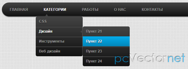
Реализованное только на CSS простое, но стильное выпадающее меню.
HTML
<ul id="menu">
    <li><a href="#">Главная</a></li>
    <li>
        <a href="#">Категории</a>
        <ul>
            <li>
                <a href="#">CSS</a>
                <ul>
                    <li><a href="#">Пункт 11</a></li>
                </ul>
            </li>
            <li>
                <a href="#">Дизайн</a>
                <ul>
                    <li><a href="#">Пункт 21</a></li>
                </ul>
            </li>
            <li>
                <a href="#">Инструменты</a>
                <ul>
                    <li><a href="#">Пункт 31</a></li>
                </ul>
            </li>
            <li>
                <a href="#">Веб дизайн</a>
                <ul>
                    <li><a href="#">Пункт 41</a></li>
                </ul>
            </li>
        </ul>
    </li>
    <li>
        <a href="#">Работы</a>
    </li>
    <li>
        <a href="#">О нас</a>
    </li>
    <li>
        <a href="#">Контакты</a>
    </li>
</ul>
CSS
body
{
    width: 960px;
    margin: 40px auto;
    background: #ffffff url(https://pcvector.net/templates/pcv/images/bg_grid.png);
}

/* Главное меню */

#menu
{
    width: 100%;
    margin: 0;
    padding: 10px 0 0 0;
    list-style: none;
    background: #111;
    background: -moz-linear-gradient(#444, #111);
    background: -webkit-gradient(linear,left bottom,left top,color-stop(0, #111),color-stop(1, #444));
    background: -webkit-linear-gradient(#444, #111);
    background: -o-linear-gradient(#444, #111);
    background: -ms-linear-gradient(#444, #111);
    background: linear-gradient(#444, #111);
    -moz-border-radius: 50px;
    border-radius: 50px;
    -moz-box-shadow: 0 2px 1px #9c9c9c;
    -webkit-box-shadow: 0 2px 1px #9c9c9c;
    box-shadow: 0 2px 1px #9c9c9c;
}

#menu li
{
    float: left;
    padding: 0 0 10px 0;
    position: relative;
    line-height: 0;
}

#menu a
{
    float: left;
    height: 25px;
    padding: 0 25px;
    color: #999;
    text-transform: uppercase;
    font: bold 12px/25px Arial, Helvetica;
    text-decoration: none;
    text-shadow: 0 1px 0 #000;
}

#menu li:hover > a
{
    color: #fafafa;
}

*html #menu li a:hover /* IE6 */
{
    color: #fafafa;
}

#menu li:hover > ul
{
    display: block;
}

/* Подменю */

#menu ul
{
    list-style: none;
    margin: 0;
    padding: 0;
    display: none;
    position: absolute;
    top: 35px;
    left: 0;
    z-index: 99999;
    background: #444;
    background: -moz-linear-gradient(#444, #111);
    background: -webkit-gradient(linear,left bottom,left top,color-stop(0, #111),color-stop(1, #444));
    background: -webkit-linear-gradient(#444, #111);
    background: -o-linear-gradient(#444, #111);
    background: -ms-linear-gradient(#444, #111);
    background: linear-gradient(#444, #111);
    -moz-box-shadow: 0 0 2px rgba(255,255,255,.5);
    -webkit-box-shadow: 0 0 2px rgba(255,255,255,.5);
    box-shadow: 0 0 2px rgba(255,255,255,.5);
    -moz-border-radius: 5px;
    border-radius: 5px;
}

#menu ul ul
{
  top: 0;
  left: 150px;
}

#menu ul li
{
    float: none;
    margin: 0;
    padding: 0;
    display: block;
    -moz-box-shadow: 0 1px 0 #111111, 0 2px 0 #777777;
    -webkit-box-shadow: 0 1px 0 #111111, 0 2px 0 #777777;
    box-shadow: 0 1px 0 #111111, 0 2px 0 #777777;
}

#menu ul li:last-child
{
    -moz-box-shadow: none;
    -webkit-box-shadow: none;
    box-shadow: none;
}

#menu ul a
{
    padding: 10px;
    height: 10px;
    width: 130px;
    height: auto;
    line-height: 1;
    display: block;
    white-space: nowrap;
    float: none;
    text-transform: none;
}

*html #menu ul a /* IE6 */
{
    height: 10px;
}

*:first-child+html #menu ul a /* IE7 */
{
    height: 10px;
}

#menu ul a:hover
{
    background: #0186ba;
    background: -moz-linear-gradient(#04acec,  #0186ba);
    background: -webkit-gradient(linear, left top, left bottom, from(#04acec), to(#0186ba));
    background: -webkit-linear-gradient(#04acec,  #0186ba);
    background: -o-linear-gradient(#04acec,  #0186ba);
    background: -ms-linear-gradient(#04acec,  #0186ba);
    background: linear-gradient(#04acec,  #0186ba);
}

#menu ul li:first-child > a
{
    -moz-border-radius: 5px 5px 0 0;
    border-radius: 5px 5px 0 0;
}

#menu ul li:first-child > a:after
{
    content: '';
    position: absolute;
    left: 30px;
    top: -8px;
    width: 0;
    height: 0;
    border-left: 5px solid transparent;
    border-right: 5px solid transparent;
    border-bottom: 8px solid #444;
}

#menu ul ul li:first-child a:after
{
    left: -8px;
    top: 12px;
    width: 0;
    height: 0;
    border-left: 0;
    border-bottom: 5px solid transparent;
    border-top: 5px solid transparent;
    border-right: 8px solid #444;
}

#menu ul li:first-child a:hover:after
{
    border-bottom-color: #04acec;
}

#menu ul ul li:first-child a:hover:after
{
    border-right-color: #04acec;
    border-bottom-color: transparent;
}


#menu ul li:last-child > a
{
    -moz-border-radius: 0 0 5px 5px;
    border-radius: 0 0 5px 5px;
}

/* Clear floated elements */
#menu:after
{
    visibility: hidden;
    display: block;
    font-size: 0;
    content: " ";
    clear: both;
    height: 0;
}

* html #menu             { zoom: 1; } /* IE6 */
*:first-child+html #menu { zoom: 1; } /* IE7 */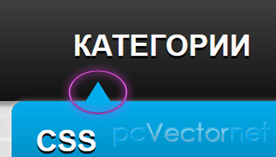
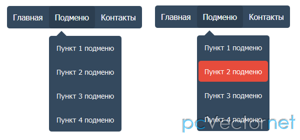
Заметили синий (серый) треугольничек у пунктов меню? Обычно такие вещи реализуют дополнительной картинкой, в нашем же случае все реализовано на CSS с помощью псевдо-элемента :after
#menu ul li:first-child a:after
{
    content: '';
    position: absolute;
    left: 30px;
    top: -8px;
    width: 0;
    height: 0;
    border-left: 5px solid transparent;
    border-right: 5px solid transparent;
    border-bottom: 8px solid #444;
}

#menu ul li:first-child a:hover:after
{
    border-bottom-color: #04acec;
}
Для наших ископаемых IE6 и IE7 нужно будет добавить в CSS:
* html #menu   { zoom: 1; } /* IE6 */
*:first-child+html #menu { zoom: 1; } /* IE7 */
Ну, а для нашего ишакозавра IE6 придется для построения меню использовать ещё и jQuery, так как он не поддерживает событие наведения курсора - если элемент не ссылка.
<script type="text/javascript" src="http://code.jquery.com/jquery-latest.min.js"></script>
<script type="text/javascript">
        $(function() {
          if ($.browser.msie && $.browser.version.substr(0,1)<7)
          {
                $('li').has('ul').mouseover(function(){
                        $(this).children('ul').show();
                        }).mouseout(function(){
                        $(this).children('ul').hide();
                        })
          }
        });
</script>Ссылки