Размытость элементов
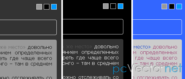
В этом уроке посмотрим, как сделать простой эффект размытости для тексто содержащих элементов. Идея заключается в том, что у нас есть ряд текстовых контейнеров, которые будут размыты и уменьшены, как только курсор мыши окажется над областью в которой они размещены, а элемент на который наведен курсор увеличится, т.е. внимание сфокусируется именно на нём.
Будем использовать эффекты transition CSS3 и немножко jQuery. Самые плавные эффекты получим в браузере Chrome, а в старых браузерах, неподдерживающих CSS3, понятное дело ничего не увидим.
HTML
Структура состоит из <section> внутри которой несколько <article>. Каждая статья (article) содержит Заголовок и параграф:
<section class="ib-container" id="ib-container">
    <article>
        <header>
            <h3><a href="#">Заголовок</a></h3>
            <span>Какой то текст</span>
        </header>
        <p>Краткое описание...</p>
    </article>
    <article>
        <!-- ... -->
    </article>
    <!-- ... -->
</section>
CSS
.ib-container{
    position: relative;
    width: 800px;
    margin: 30px auto;
    display: block;
}
.ib-container:before,
.ib-container:after {
    content:"";
    display:table;
}
.ib-container:after {
    clear:both;
}
.ib-container article{
    display: block;
    width: 140px;
    height: 220px;
    background: #fff;
    cursor: pointer;
    float: left;
    border: 10px solid #fff;
    text-align: left;
    text-transform: none;
    margin: 15px;
    z-index: 1;
    -webkit-backface-visibility: hidden;
    box-shadow:
        0px 0px 0px 10px rgba(255,255,255,1),
        1px 1px 3px 10px rgba(0,0,0,0.2);
    -webkit-transition:
        opacity 0.4s linear,
        -webkit-transform 0.4s ease-in-out,
        box-shadow 0.4s ease-in-out;
    -moz-transition:
        opacity 0.4s linear,
        -moz-transform 0.4s ease-in-out,
        box-shadow 0.4s ease-in-out;
    -o-transition:
        opacity 0.4s linear,
        -o-transform 0.4s ease-in-out,
        box-shadow 0.4s ease-in-out;
    -ms-transition:
        opacity 0.4s linear,
        -ms-transform 0.4s ease-in-out,
        box-shadow 0.4s ease-in-out;
    transition:
        opacity 0.4s linear,
        transform 0.4s ease-in-out,
        box-shadow 0.4s ease-in-out;
}
.ib-container h3 a{
    font-size: 16px;
    font-weight: 400;
    color: #000;
    color: rgba(0, 0, 0, 1);
    text-shadow: 0px 0px 0px rgba(0, 0, 0, 1);
    opacity: 0.8;
}
.ib-container article header span{
    font-size: 10px;
    font-family: "Big Caslon", "Book Antiqua", "Palatino Linotype", Georgia, serif;
    padding: 10px 0;
    display: block;
    color: #FFD252;
    color: rgba(255, 210, 82, 1);
    text-shadow: 0px 0px 0px rgba(255, 210, 82, 1);
    text-transform: uppercase;
    opacity: 0.8;
}
.ib-container article p{
    font-family: Verdana, sans-serif;
    font-size: 10px;
    line-height: 13px;
    color: #333;
    color: rgba(51, 51, 51, 1);
    text-shadow: 0px 0px 0px rgba(51, 51, 51, 1);
    opacity: 0.8;
}
.ib-container h3 a,
.ib-container article header span,
.ib-container article p{
    -webkit-transition:
        opacity 0.2s linear,
        text-shadow 0.5s ease-in-out,
        color 0.5s ease-in-out;
    -moz-transition:
        opacity 0.2s linear,
        text-shadow 0.5s ease-in-out,
        color 0.5s ease-in-out;
    -o-transition:
        opacity 0.2s linear,
        text-shadow 0.5s ease-in-out,
        color 0.5s ease-in-out;
    -ms-transition:
        opacity 0.2s linear,
        text-shadow 0.5s ease-in-out,
        color 0.5s ease-in-out;
    transition:
        opacity 0.2s linear,
        text-shadow 0.5s ease-in-out,
        color 0.5s ease-in-out;
}
/* Hover Style for all the items: blur, scale down*/
.ib-container article.blur{
    box-shadow: 0px 0px 20px 10px rgba(255,255,255,1);
    -webkit-transform: scale(0.9);
    -moz-transform: scale(0.9);
    -o-transform: scale(0.9);
    -ms-transform: scale(0.9);
    transform: scale(0.9);
    opacity: 0.7;
}
.ib-container article.blur h3 a{
    text-shadow: 0px 0px 10px rgba(0, 0, 0, 0.9);
    color: rgba(0, 0, 0, 0);
    opacity: 0.5;
}
.ib-container article.blur header span{
    text-shadow: 0px 0px 10px rgba(255, 210, 82, 0.9);
    color: rgba(255, 210, 82, 0);
    opacity: 0.5;
}
.ib-container article.blur  p{
    text-shadow: 0px 0px 10px rgba(51, 51, 51, 0.9);
    color: rgba(51, 51, 51, 0);
    opacity: 0.5;
}
/* Hover Style for single item: scale up */
.ib-container article.active{
    -webkit-transform: scale(1.05);
    -moz-transform: scale(1.05);
    -o-transform: scale(1.05);
    -ms-transform: scale(1.05);
    transform: scale(1.05);
    box-shadow:
        0px 0px 0px 10px rgba(255,255,255,1),
        1px 11px 15px 10px rgba(0,0,0,0.4);
    z-index: 100;
    opacity: 1;
}
.ib-container article.active h3 a,
.ib-container article.active header span,
.ib-container article.active p{
    opacity; 1;
}
JS
Подключаем в теле документа библиотеку jQuery.
Когда мы наведем курсор на текстовый блок, то все другие блоки станут размытыми, а текущий получит "активный" класс:
$(function() {

    var $container    = $('#ib-container'),
        $articles    = $container.children('article'),
        timeout;

    $articles.on( 'mouseenter', function( event ) {

        var $article    = $(this);
        clearTimeout( timeout );
        timeout = setTimeout( function() {

            if( $article.hasClass('active') ) return false;

            $articles.not( $article.removeClass('blur').addClass('active') )
                     .removeClass('active')
                     .addClass('blur');

        }, 65 );

    });

    $container.on( 'mouseleave', function( event ) {

        clearTimeout( timeout );
        $articles.removeClass('active blur');

    });
});