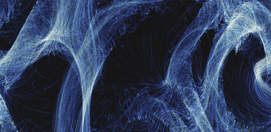
Кристаллический параллакс
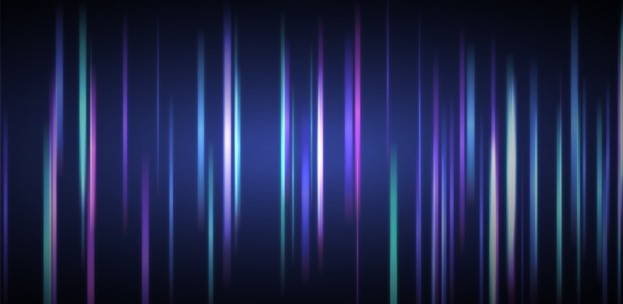 Реализованный на канвасе параллакс эффект из градиентных полос. При клике случайным образом градиент меняется.
HTML
<div id="bg_glow"></div>
<div id="overlay"></div>
<canvas id="canvas"></canvas>
CSS
html, body{
  overflow: hidden;
  background: #000;
  padding: 0px;
  margin: 0px;
}

#canvas{
  cursor: crosshair;
  z-index: 2;
  position: absolute;
  top: 0; left: 0;
}

#overlay{
  background: radial-gradient(ellipse at center, rgba(0,0,0,.0) 10%, rgba(0,0,0,.8) 80%, rgba(0,0,0,1) 90%, rgba(0,0,0,1) 100%);
  z-index: 3;
  position: absolute;
  top:0;left:0;
  height: 100%;
  width: 100%;
}

#bg_glow{
  z-index: 1;
  position: absolute;
  top:0;left:0;
  height: 100%;
  width: 100%;
}

#info{
  z-index: 4;
  position: absolute;
  color: #fff;
  top: 0px;
  left: 0px;
  background: rgba(60,60,60,.6);
  padding: 5px;
}
#overlay:hover{
  cursor: pointer;
}

#fps{
  position: absolute;
  top: 0px;
  right: 0px;
  z-index: 5;
}
JS
var canvas = document.getElementById("canvas");
var ctx = canvas.getContext("2d");
var bgg = document.getElementById("bg_glow");
w = ctx.canvas.width = window.innerWidth;
h = ctx.canvas.height = window.innerHeight;

window.onresize = function() {
  w = ctx.canvas.width = window.innerWidth;
  h = ctx.canvas.height = window.innerHeight;
  maxHeight = h*.9
  minHeight = h*.5;
  dots = [];
  pushDots();
  ctx.globalCompositeOperation = "lighter";
};

document.getElementById("overlay").onclick = function(){
  hue = Math.random()*360;
  bgg.style.background = "radial-gradient(ellipse at center, hsla("+hue+",50%,50%,.8) 0%,rgba(0,0,0,0) 100%)";
  dots = [];
  pushDots();
}

dots=[{}];
mx = 0; my = 0;
md = 100;
maxWidth = 15;
minWidth = 2;
maxHeight = h*.9
minHeight = h*.5;
maxSpeed = 35;
minSpeed = 6;
hue = 230;
hueDif = 50; // Hue +/-
glow = 10; // Turn this off for better performance
ctx.globalCompositeOperation = "lighter";

function pushDots(num){
  for(i=1; i<md; i++){
    dots.push({
      x:Math.random()*w,
      y:Math.random()*h/2,
      h:Math.random()*(maxHeight-minHeight)+minHeight,
      w:Math.random()*(maxWidth-minWidth)+minWidth,
      c:Math.random()*((hue+hueDif)-(hue-hueDif))+(hue-hueDif),
      m:Math.random()*(maxSpeed-minSpeed)+minSpeed
    });
  }
}pushDots();

function render(){
  ctx.clearRect(0,0,w,h);
  for(i=1; i<dots.length; i++){
    ctx.beginPath();
    grd = ctx.createLinearGradient(dots[i].x, dots[i].y, dots[i].x+dots[i].w, dots[i].y+dots[i].h);
    grd.addColorStop(.0, "hsla("+dots[i].c+",50%,50%,.0)");
    grd.addColorStop(.2, "hsla("+dots[i].c+20+",50%,50%,.5)");
    grd.addColorStop(.5, "hsla("+dots[i].c+50+",70%,60%,.8)");
    grd.addColorStop(.8, "hsla("+dots[i].c+80+",50%,50%,.5)");
    grd.addColorStop(1., "hsla("+(dots[i].c+100)+",50%,50%,.0)");
    ctx.shadowBlur = glow;
    ctx.shadowColor = "hsla("+(dots[i].c)+",50%,50%,1)";
    ctx.fillStyle=grd;
    ctx.rect(dots[i].x,dots[i].y,dots[i].w,dots[i].h);
    ctx.fill();
    ctx.closePath();
    dots[i].x += dots[i].m/100;
    if(dots[i].x > w+maxWidth){
      dots.splice(i,1);
      dots.push({
        x:0,
        y:Math.random()*h,
        h:Math.random()*(maxHeight-minHeight)+minHeight,
        w:Math.random()*(maxWidth-minWidth)+minWidth,
        c:Math.random()*((hue+hueDif)-(hue-hueDif))+(hue-hueDif),
        m:Math.random()*(maxSpeed-minSpeed)+minSpeed
      });
    }
  }window.requestAnimationFrame(render);
}

bgg.style.background = "radial-gradient(ellipse at center, hsla("+hue+",50%,50%,.8) 0%,rgba(0,0,0,0) 100%)";
render();