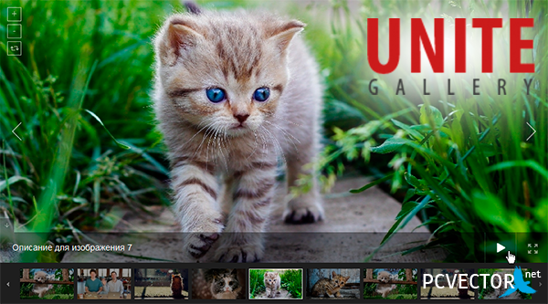
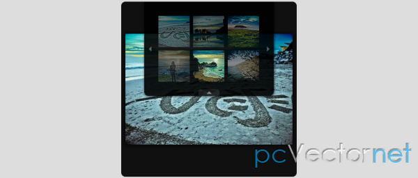
Галерея с "круглой" навигацией
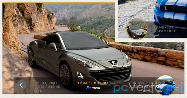
Галерея с красивым эффектом наведения на кнопки навигации с помощью CSS3. Идея состоит в том, чтобы при наведении на стрелку, происходило её расширение по диаметру с появлением внутри превьюшки того изображения, к которому будет совершен переход.
HTML
Для нашего небольшого эффекта используем такую структуру навигации:
<div class="cn-nav">
    <a href="#" class="cn-nav-prev">
        <span>Предыдущий</span>
        <div style="background-image:url(../images/thumbs/1.jpg);"></div>
    </a>
    <a href="#" class="cn-nav-next">
        <span>Следующий</span>
        <div style="background-image:url(../images/thumbs/3.jpg);"></div>
    </a>
</div>
CSS
Три файла стилей:
reset.css, demo.css и непосредственно для навигации style.css:
.cn-slideshow{
    width: 820px;
    height: 410px;
    position: relative;
    margin: 0 auto;
    background: #fff;
    border-top: 5px solid #d0ab47;
    -webkit-box-shadow: 1px 1px 3px rgba(0,0,0,0.2);
    -moz-box-shadow: 1px 1px 3px rgba(0,0,0,0.2);
    box-shadow: 1px 1px 3px rgba(0,0,0,0.2);
}
.cn-loading{
    position: absolute;
    z-index:999;
    text-indent: -9000px;
    opacity:0.6;
    top:50%;
    left:50%;
    margin:-25px 0 0 -25px;
    width:50px;
    height:50px;
    background:#000 url(../images/ajax-loader.gif) no-repeat center center;
    -moz-border-radius: 25px;
    -webkit-border-radius: 25px;
    border-radius: 25px;
}
.cn-images{
    width: 100%;
    height: 100%;
    overflow: hidden;
    position: relative;
}
.cn-images img{
    position: absolute;
    top: 0px;
    left: 0px;
    display: none;
}
.cn-bar{
    background: transparent url(../images/bar.png) repeat top left;
    height: 74px;
    position: absolute;
    bottom: 0px;
    right: 50px;
    left: 50px;
    color: #f8f8f8;
    z-index: 999;
}
.cn-nav-content{
    position: absolute;
    top: 0px;
    height: 100%;
    right: 70px;
    left: 70px;
    overflow: hidden;
    text-shadow:1px 1px 1px rgba(0,0,0,0.2);
}
.cn-nav-content div{
    float: left;
    width: 130px;
    color:#aaa;
}
.cn-nav-content span{
    color:#777;
}
.cn-nav-content div.cn-nav-content-current{
    text-align: center;
    width: 280px;
    position:absolute;
    top:0px;
    left:50%;
    margin-left:-140px;
}
.cn-nav-content h2,
.cn-nav-content h3{
    padding: 0;
    margin: 0;
    font-size: 12px;
    line-height:24px;
    font-family:Georgia, serif;
    font-style:italic;
}
.cn-nav-content h2{
    font-size:18px;
    color:#fff;
}
.cn-nav-content-current span{
    color:#d0ab47;
}
.cn-nav-content div.cn-nav-content-prev{
    margin-left: 20px;
}
.cn-nav-content div.cn-nav-content-next{
    text-align: right;
    margin-right: 20px;
    float:right;
}
.cn-nav-content div span{
    display: block;
    padding-top: 18px;
    text-transform: uppercase;
    font-weight: bold;
    letter-spacing: 2px;
}
.cn-nav > a{
    position: absolute;
    top: 0px;
    height: 70px;
    width: 70px;
}
a.cn-nav-prev{
    left: 0px;
}
a.cn-nav-next{
    right: 0px;
}
.cn-nav a span{
    width: 46px;
    height: 46px;
    display: block;
    text-indent: -9000px;
    -moz-border-radius: 23px;
    -webkit-border-radius: 23px;
    border-radius: 23px;
    cursor: pointer;
    opacity: 0.9;
    position: absolute;
    top: 50%;
    left: 50%;
    background-size: 17px 25px;
    margin: -23px 0 0 -23px;
    -webkit-transition: all 0.4s ease;
    -moz-transition: all 0.4s ease;
    -o-transition: all 0.4s ease;
    -ms-transition: all 0.4s ease;
    transition: all 0.4s ease;
}
.cn-nav a.cn-nav-prev span{
    background: #666 url(../images/prev.png) no-repeat center center;
}
.cn-nav a.cn-nav-next span{
    background: #666 url(../images/next.png) no-repeat center center;
}
.cn-nav a div{
    width: 0px;
    height: 0px;
    position: absolute;
    top: 50%;
    left: 50%;
    overflow: hidden;
    background-size: 100% 100%;
    background-position: center center;
    background-repeat: no-repeat;
    margin: 0px;
    -moz-border-radius: 0px;
    -webkit-border-radius: 0px;
    border-radius: 0px;
    -webkit-transition: all 0.2s ease-out;
    -moz-transition: all 0.2s ease-out;
    -o-transition: all 0.2s ease-out;
    -ms-transition: all 0.2s ease-out;
    transition: all 0.2s ease-out;
}
.cn-nav a:hover span{
    width: 100px;
    height: 100px;
    -moz-border-radius: 50px;
    -webkit-border-radius: 50px;
    border-radius: 50px;
    opacity: 0.6;
    margin: -50px 0 0 -50px;
    background-size: 22px 32px;
    background-color:#a8872d;
}
.cn-nav a:hover div{
    width: 90px;
    height: 90px;
    background-size: 120% 120%;
    margin: -45px 0 0 -45px;
    -moz-border-radius: 45px;
    -webkit-border-radius: 45px;
    border-radius: 45px;
}
JS
<script type="text/jаvascript" src="http://ajax.googleapis.com/ajax/libs/jquery/1.6.4/jquery.min.js"></script>
<script type="text/jаvascript" src="js/jquery.tmpl.min.js"></script>
<script type="text/jаvascript" src="js/jquery.slideshow.js"></script>
<script type="text/jаvascript">
    $(function() {
        $('#cn-slideshow').slideshow();
    });
</script>Ссылки