Эффект fill для текста при наведении
 Эффект заполнения текста при наведении. Реализовано с помощью CSS.
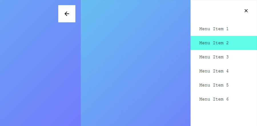
HTML
<div>Filling the text on hover</div>
<p data-item='Rohit'>Rohit</p>

<section>
  <div>Real time example, Navbar:</div>
  <nav>
    <ul class="menuItems">
      <li><a href='#' data-item='Home'>Home</a></li>
      <li><a href='#' data-item='About'>About</a></li>
      <li><a href='#' data-item='Projects'>Projects</a></li>
      <li><a href='#' data-item='Blog'>Blog</a></li>
      <li><a href='#' data-item='Contact'>Contact</a></li>
    </ul>
  </nav>

</section>
CSS
p {
  margin: 16px;
  font-size: 96px;
  color: #ccc;
  text-transform: uppercase;
  font-weight: 600;
  transition: all 1s ease-in-out;
  position: relative;

  &::before {
    content: attr(data-item);
    transition: all 1s ease-in-out;
    color: #8254ff;
    position: absolute;
    top: 0;
    bottom: 0;
    left: 0;
    right: 0;
    width: 0;
    overflow: hidden;
  }

  &:hover {
    &::before {
      width: 100%;
    }
  }
}

nav {
  margin: 25px;
  background: #f9f9f9;
  padding: 16px;
  .menuItems {
    list-style: none;
    display: flex;

    li {
      margin: 50px;

      a {
        text-decoration: none;
        color: #8f8f8f;
        font-size: 24px;
        font-weight: 400;
        transition: all 0.5s ease-in-out;
        position: relative;
        text-transform: uppercase;

        &::before {
          content: attr(data-item);
          transition: 0.5s;
          color: #8254ff;
          position: absolute;
          top: 0;
          bottom: 0;
          left: 0;
          right: 0;
          width: 0;
          overflow: hidden;
        }

        &:hover {
          &::before {
            width: 100%;
            transition: all 0.5s ease-in-out;
          }
        }
      }
    }
  }
}