Загрузчик в виде кубиков лего
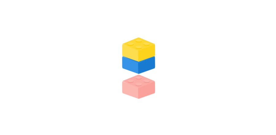 Анимация загрузчика страницы в виде кубиков лего. Сделано на CSS.
HTML
<div class="lego red">
  <div class="left"></div>
  <div class="right"></div>
  <div class="container-top">
    <div class="top">
      <div class="dot d-n1"></div>
      <div class="dot d-n2"></div>
      <div class="dot d-n3"></div>
      <div class="dot d-n4"></div>
    </div>
  </div>
</div>

<div class="lego blue">
  <div class="left"></div>
  <div class="right"></div>
  <div class="container-top">
    <div class="top">
      <div class="dot d-n1"></div>
      <div class="dot d-n2"></div>
      <div class="dot d-n3"></div>
      <div class="dot d-n4"></div>
    </div>
  </div>
</div>

<div class="lego yellow">
  <div class="left"></div>
  <div class="right"></div>
  <div class="container-top">
    <div class="top">
      <div class="dot d-n1"></div>
      <div class="dot d-n2"></div>
      <div class="dot d-n3"></div>
      <div class="dot d-n4"></div>
    </div>
  </div>
</div>
SCSS
$red: #F44336;
$blue: #1E88E5;
$yellow: #FDD835;

$shadow-prop: 5px 5px 0px;

body {
  margin: 0;
  perspective: 1000px;
}

.red.lego {
  animation-delay: 0s;
  & > .left {
    background: lighten($red, 5%);
  }
  & > .right {
    background: darken($red, 5%);
  }
  & > .container-top > .top {
    background: $red;
    & > .dot {
      background: lighten($red, 5%);
      filter: drop-shadow($shadow-prop darken($red, 10%));
    }
  }
}

.blue.lego {
  animation-delay: 1.4s;
  & > .left {
    background: lighten($blue, 5%);
  }
  & > .right {
    background: darken($blue, 5%);
  }
  & > .container-top > .top {
    background: $blue;
    & > .dot {
      background: lighten($blue, 5%);
      filter: drop-shadow($shadow-prop darken($blue, 10%));
    }
  }
}

.yellow.lego {
  animation-delay: 2.8s;
  & > .left {
    background: lighten($yellow, 5%);
  }
  & > .right {
    background: darken($yellow, 5%);
  }
  & > .container-top > .top {
    background: $yellow;
    & > .dot {
      background: lighten($yellow, 5%);
      filter: drop-shadow($shadow-prop darken($yellow, 10%));
    }
  }
}

.lego {
  width: 150px;
  height: 150px;
  position: fixed;
  left: calc(50vw - 75px);
  top: calc(50vh - 100px);
  animation: loading 4.2s infinite ease;
  opacity: 0;
  & > .left {
    width: 102px;
    height: 35px;
    position: absolute;
    transform: rotateY(60deg) rotate(10deg) rotateX(6deg);
    bottom: 15px;
    border-radius: 5px 0 5px 5px;
  }
  & > .right {
    width: 102px;
    height: 35px;
    position: absolute;
    transform: rotateY(-60deg) rotate(-10deg) rotateX(5deg);
    bottom: 15px;
    right: 0;
    border-radius: 0 5px 5px 5px;
  }
  & .container-top {
    position: absolute;
    left: 0;
    right: 0;
    margin-left: auto;
    margin-right: auto;
    width: 75px;
    height: 75px;
    transform: rotateZ(45deg);
    bottom: 16.5px;
    & .top {
      width: 68px;
      height: 69px;
      position: absolute;
      transform: rotateY(42deg) rotateZ(-17deg) rotateX(-43deg);
      border-radius: 5px 0 0 0;
      & > .dot {
        position: absolute;
        width: 18px;
        height: 18px;
        border-radius: 100%;
        &.d-n1 {left: 7px; top: 7px;}
        &.d-n2 {right: 10px; top: 7px;}
        &.d-n3 {right: 10px; bottom: 10px;}
        &.d-n4 {left: 7px; bottom: 10px;}
      }
    }
  }
}

@-webkit-keyframes loading {
  0% {transform: translate(0,-50px); opacity: 0; z-index: 10;}
  10% {opacity: 1;}
  40% {transform: translate(0,0); z-index: 1;}
  75% {opacity: 1;}
  100% {transform: translate(0,100px); opacity: 0;}
}

@-moz-keyframes loading {
  0% {transform: translate(0,-50px); opacity: 0; z-index: 10;}
  40% {transform: translate(0,0); opacity: 1; z-index: 1;}
  75% {opacity: 1;}
  100% {transform: translate(0,100px); opacity: 0;}
}