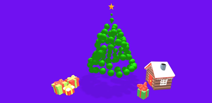
Новогодняя ёлка на CSS
 Новогодняя ёлочка сделанная на чистом CSS. Задний фон и мерцающие буквы с Новым годом, также реализованы на CSS.
HTML
 <div id="siteWrapper">
  <div id="treeContainer">
   <div class="star"></div>
   <div id="tree">
    <div class="layerContainer">
     <div class="layer">
      <div class="edge right"></div>
      <div class="edge left">
       <div class="ball a"></div>
      </div>
     </div>
    </div>
    <div class="layerContainer">
     <div class="layer">
      <div class="edge right">
       <div class="ball b"></div>
      </div>
      <div class="edge left"></div>
     </div>
    </div>
    <div class="layerContainer">
     <div class="layer">
      <div class="ball c" style="bottom: 0"></div>
      <div class="edge right"></div>
      <div class="edge left"></div>
     </div>
    </div>
    <div class="layerContainer">
     <div class="layer">
      <div class="edge right">
       <div class="ball d"></div>
      </div>
      <div class="edge left">
       <div class="ball e"></div>
      </div>
     </div>
    </div>
    <div class="layerContainer">
     <div class="layer">
      <div class="edge right">
       <div class="ball f"></div>
      </div>
      <div class="edge left">
       <div class="ball g"></div>
      </div>
      <div class="ball h"></div>
     </div>
     <div class="stem"></div>
    </div>
   </div>
  </div>
  <p id="greeting">
    <span class='text'>С</span>
    <span class='space'></span>
    <span class='text'>Н</span>
    <span class='text'>о</span>
    <span class='text'>в</span>
    <span class='text'>ы</span>
    <span class='text'>м</span>
    <span class='space'> </span>
    <span class='text'>г</span>
    <span class='text'>о</span>
    <span class='text'>д</span>
    <span class='text'>о</span>
    <span class='text'>м</span>
    <span class='text'>!</span>
  </p>
 </div>
CSS
@import url("https://fonts.googleapis.com/css?family=Bad+Script");
* {
 margin: 0;
 padding: 0;
}
body {
    font-family: "Bad Script",
    -apple-system, BlinkMacSystemFont,"Segoe UI",Roboto,"Helvetica Neue",Oxygen-Sans,Ubuntu,Cantarell,sans-serif;
}
body, #siteWrapper {
    height: 100%;
 overflow-x: hidden;
}
#siteWrapper {
 width: 100vw;
 min-height: 100vh;
 background-color: #fa3e38;
 background-image: repeating-linear-gradient(transparent, transparent 50px, rgba(0,0,0,.4) 50px, rgba(0,0,0,.4) 53px, transparent 53px, transparent 63px, rgba(0,0,0,.4) 63px, rgba(0,0,0,.4) 66px, transparent 66px, transparent 116px, rgba(0,0,0,.5) 116px, rgba(0,0,0,.5) 166px, rgba(255,255,255,.2) 166px, rgba(255,255,255,.2) 169px, rgba(0,0,0,.5) 169px, rgba(0,0,0,.5) 179px, rgba(255,255,255,.2) 179px, rgba(255,255,255,.2) 182px, rgba(0,0,0,.5) 182px, rgba(0,0,0,.5) 232px, transparent 232px),
 repeating-linear-gradient(270deg, transparent, transparent 50px, rgba(0,0,0,.4) 50px, rgba(0,0,0,.4) 53px, transparent 53px, transparent 63px, rgba(0,0,0,.4) 63px, rgba(0,0,0,.4) 66px, transparent 66px, transparent 116px, rgba(0,0,0,.5) 116px, rgba(0,0,0,.5) 166px, rgba(255,255,255,.2) 166px, rgba(255,255,255,.2) 169px, rgba(0,0,0,.5) 169px, rgba(0,0,0,.5) 179px, rgba(255,255,255,.2) 179px, rgba(255,255,255,.2) 182px, rgba(0,0,0,.5) 182px, rgba(0,0,0,.5) 232px, transparent 232px),
    repeating-linear-gradient(125deg, transparent, transparent 2px, rgba(0,0,0,.2) 2px, rgba(0,0,0,.2) 3px, transparent 3px, transparent 5px, rgba(0,0,0,.2) 5px);
 box-shadow: inset 0px 0px 150px 120px rgba(0, 0, 0, 0.85);
 display: flex;
 flex-direction: column;
 align-items: center;
 justify-content: flex-start;
}
#treeContainer {
 margin-top: 80px;
 width: 320px;
 height: 400px;
 position: relative;
 display: flex;
 flex-direction: row;
 justify-content: center;
}
#tree {
    position: relative;
    border-radius: 20px;
    width: inherit;
}
.star {
        background: #ffd700;
        clip-path: polygon(50% 0%, 61% 35%, 98% 35%, 68% 57%, 79% 91%, 50% 70%, 21% 91%, 32% 57%, 2% 35%, 39% 35%);
        height: 38px;
        width: 40px;
        transform: translateY(-20%);
        position: absolute;
        z-index: 8;
}
.ball{
    border-radius: 50%;
    position: absolute;
    width: 20px;
    height: 20px;
    background:
radial-gradient(rgb(14, 12, 12) 15%, transparent 16%) 0 0,
radial-gradient(rgb(231, 22, 22) 15%, transparent 16%) 4px 3.5px,
radial-gradient(rgba(105, 66, 66, 0.1) 15%, transparent 20%) 0 0.5px,
radial-gradient(rgba(194, 57, 57, 0.1) 15%, transparent 20%) 4px 3.5px;
background-color:#dfc63b;
background-size: 8px 8px;
box-shadow: 3px 3px 10px 1px rgb(32, 31, 31);
    z-index: 1;
}
.layerContainer {
 height: 60px;
 width: 60px;
 position: absolute;
 left: 50%;
 transform: translateX(-50%);
 border-radius: 0 0 10px 10px;
}
.layer {
 flex-direction: row;
 justify-content: center;
 position: relative;
 background-color: green;
 width: 60px;
 height: 60px;
 border-radius: 0 10px 35px 10px ;
 transform-origin: center;
 transform: rotateZ(45deg) translateX(20%) translateY(20%);
 box-shadow: 2px 10px 2px  rgba(43, 43, 43, 0.158);
}
.edge {
 position: absolute;
}
.edge.left {
 left: 0;
 bottom: 0;
 width: 25px;
 height: 30px;
 border-radius: 0 10px 35px 10px ;
 transform: translateY(50%) translateX(0);
}
.edge.right {
 top: 0;
 right: 0;
 width: 30px;
 height: 25px;
border-radius: 0 10px 35px 10px ;
transform: translateY(0) translateX(50%);
}
#tree .layerContainer:nth-child(1){
 transform-origin: left;
 transform: scale(0.8) translateY(0%) translateX(-50%);
 z-index: 5;
 }
 #tree .layerContainer:nth-child(2){
    z-index: 4;
    transform-origin: left;
    transform: scale(1.5) translateY(40%) translateX(-50%);
    }
 #tree .layerContainer:nth-child(3){
    z-index: 3;
    transform-origin: left;
    transform: scale(2) translateY(60%) translateX(-50%);
    }
    #tree .layerContainer:nth-child(4){
     z-index: 2;
     transform-origin: left;
     transform: scale(2.5) translateY(80%) translateX(-50%);
     }
     #tree .layerContainer:nth-child(5){
        z-index: 1;
        transform-origin: left;
        transform: scale(2.8) translateY(100%) translateX(-50%);
        }
        #tree .layerContainer:nth-child(5) .layer{
         border-radius: 0 10px 40px 10px ;
         }
     #tree .layerContainer:nth-child(5) .layer .edge{
            border-radius: 0 10px 35px 10px ;
     }
         .stem {
             border-radius: 0 0 3px 3px;
            height: 25px;
            width: 25px;
            position: absolute;
            transform-origin: left;
            left: 50%;
            transform: translateX(-50%);
            z-index: -1;
            background-color: #a04d04;
            box-shadow: 0 0 10px 5px rgb(19, 18, 18);
    /* background: linear-gradient(0deg, #6d411b 0%, #140e0e 64%); */
     }
 #tree .layerContainer:nth-child(odd) .layer,    #tree .layerContainer:nth-child(odd) .edge{
                background-color: rgb(14, 110, 14);
        }
        #tree .layerContainer:nth-child(even) .layer, #tree .layerContainer:nth-child(even) .edge{
                    background-color: #0f880f;
        }
 #tree .ball.a  {
    transform: scale(1.3);
    margin-left: 18px
    }
    #tree .ball.b  {
        transform: scale(0.8);
        margin-top: 10px
        }
        #tree .ball.c  {
            transform: scale(0.7);
            margin-left: 38px
            }
            #tree .ball.d {
                transform: scale(0.55);
                }
                #tree .ball.e {
                    transform: scale(0.55);
                    margin-top: -10px
                    }
                    #tree .ball.f {
                        transform: scale(0.55);
                        margin-left: 0px
                        }
                        #tree .ball.g {
                            transform: scale(0.55);
                            margin-left: 0px;
                            margin-top: -2px;
    }
#greeting span.space {
width: 0.4em;
}
#greeting span.text:nth-child(1) {
    animation-delay: 0s
    }
    #greeting span.text:nth-child(2) {
    animation-delay: 0.1s
    }
    #greeting span.text:nth-child(3) {
    animation-delay: 0.2s
    }
    #greeting span.text:nth-child(4) {
    animation-delay: 0.3s
    }
    #greeting span.text:nth-child(5) {
    animation-delay: 0.4s
    }
    #greeting span.text:nth-child(6) {
    animation-delay: 0.5s
    }
    #greeting span.text:nth-child(7) {
    animation-delay: 0.6s
    }
    #greeting span.text:nth-child(8) {
    animation-delay: 0.7s
    }
    #greeting span.text:nth-child(9) {
    animation-delay: 0.8s
    }
    #greeting span.text:nth-child(10) {
    animation-delay: 0.9s
    }
    #greeting span.text:nth-child(11) {
    animation-delay: 1s
    }
    #greeting span.text:nth-child(12) {
    animation-delay: 1.1s
    }
    #greeting span.text:nth-child(13) {
    animation-delay: 1.2s
    }
    #greeting span.text:nth-child(14) {
    animation-delay: 1.3s
    }
    #greeting span.text:nth-child(15) {
        animation-delay: 1.4s
        }
    #greeting {
        font-size: 80px;
        font-weight: bolder;
    color: #7b7e4eb4;
        word-wrap: normal;
    }
    #greeting span {
        display: table-cell;
        animation: blink 1.5s ease-in infinite;
    }
    #from {
    font-size: 30px;
    }
#from, a {
    color: white;
}
    @media only screen and (max-width: 700px) {
        #greeting {
            font-size: 55px
        }
    }
    @media only screen and (max-width: 700px) {
        #greeting {
            font-size: 45px
        }
        #treeContainer {
            transform-origin: center;
            transform: scale(0.8);
        }
    }
    @media only screen and (max-width: 315px) {
        #greeting {
            font-size: 35px
        }
        #from {
            font-size: 20px
        }
    }
    @media only screen and (max-height: 650px){
        #treeContainer {
            margin-top: 20px;
        }
    }

@keyframes blink {
    0%, 100%{
            color: #ffd700;
            filter: blur(2px);
            text-shadow: 0 0 10px #f9fc3e,
            0 0 20px #d0ff00,
            0 0 40px #f9fc3e,
            0 0 80px #f9fc3e,
            0 0 1200px #f9fc3e,
            0 0 200px #f9fc3e,
            0 0 300px #f9fc3e,
            0 0 400px #f9fc3e        ;
    }
    5%, 95% {
            color: rgb(247, 214, 30);
            filter: blur(1px);
            text-shadow: none;
    }
}