Дом с привидениями
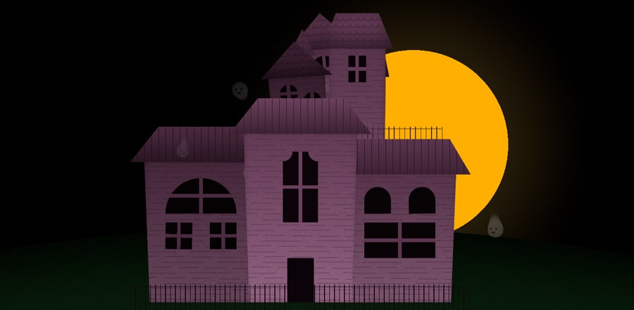 Случайным образом генерируемый дом с привидениями
HTML
<div class='trigger'></div>
<div class='hide' id='wrap'>
  <div class='cell'>
    <div class='inner'></div>
    <div class='roof'></div>
    <div class='window'></div>
    <div class='ghost'>
      <div class='trail'></div>
      <div class='trail'></div>
      <div class='trail'></div>
      <div class='trail'></div>
      <div class='trail'></div>
      <div class='trail'></div>
    </div>
  </div>
</div>
SCSS
$t: rgba(255,255,255,0.000001);
$p: #a57b9d;
$g: #304629;
$y: #eeae17;
$noise: url('dаta:image/png;base64,iVBORw0KGgoAAAANSUhEUgAAAEEAAABBCAMAAAC5KTl3AAAAgVBMVEUAAAAAAAAAAAAAAAAAAAAAAAAAAAAAAAAAAAAAAAAAAAAAAAAAAAAAAAAAAAAAAAAAAAAAAAAAAAAAAAAAAAAAAAAAAAAAAAAAAAAAAAAAAAAAAAAAAAAAAAAAAAAAAAAAAAAAAAAAAAAAAAAAAAAAAAAAAAAAAAAAAAAAAAAAAABtFS1lAAAAK3RSTlMWi3QSa1uQOKBWCTwcb6V4gWInTWYOqQSGfa6XLyszmyABlFFJXySxQ0BGn2PQBgAAC4NJREFUWMMV1kWO5UAQRdFk5kwzs/33v8Cunr7ZUehKAdaRUAse99ozDjF5BqswrPKm7btzJ2tRziN3rMYXC236humIV5Our7nHWnVdFOBojW2XVnkeu1IZHNJH5OPHj9TjgVxBGBwAAmp60WoA1gBBvg3XMFhxUQ4KuLqx0CritYZPPXinsOqB7I76+OHaZlPzLEcftrqOlOwjeXvuEuH6t6emkaofgVUDIb4fEZB6CmRAeFCTq11lxbAgUyx4rXkqlH9I4bTUDRRVD1xjbqb9HyUBn7rhtr1x+x9Y0e3BdX31/loYvZaLxqnjbRuokz+pPG7WebnSNKE3yE6Tka4aDEDMVYr6Neq126c+ZR2nzzm3yyiC7PGWG/1uueqZudrVGYNdsgOMDvt1cI8CXu63QIcPvYNY8z870WwYazTS7DqpDEknZqS0AFXObWUxTaw0q5pnHlq4oQImakpLfJkmErdvAfhsc7lod0DVT4tuob25C0tQjzdiFObCz7U7eaKGP3s6yQVgQ/y+q+nY6K5dfV75iXzcNlGIP38aj22sVwtWWKMRb7B5HoHPaBvI1Ve5TSXATi66vV6utxsV+aZNFu+93VvlrG/oj8Wp67YT8l+Oq6PjwdGatFm7SEAP13kE0y9CEcf9qhtEWCMIq5AGq71moEAI9vrmFcmO8+7ZyDnmRN/VUaFkM2ce8KuBGFzDMmY6myLfQGra2ofgHhbJRXuRDZ4H+HmliWBHXQ0ysLGfv6FetbxtxzRgIZWjIsGVFl5imPXeyvVyayNek+dSWzjXd4t310YBdaF8sXeKs481PjsXbAtIru2+wHbv3GVh3sQY6Dnu6pF3pZ714VYdDi9A5GkXR/6xgaZN/tpQ8wVV3zeBuB+njoBNE4wjc+uA523ysXGd/P2sntmOb3OdHNWP5OVrxD3eJHdtH8QVkEIAqCor3hReR96yqt6PkTQfenllooQ447h6tOrnnuzwA8fMpq+jqg1oW8fTYYIncAYpVeTvkEFr/khQSbjoE8ykx9049OkE5MQEO9lC24tT7DwThQgf4Fhf8nGgAo3GYaON3crODpOr2pu5dBABz69t7F5yJBBo+r6QJdeLDWEoO7r1tceR3haA7gc7eZrCvpxSXXeKpo4P+hRixo9DeOFbqQVjKyWfBg9pnrEZKzK7R437YTTwhfoySG/YOCt3fs4aXlU3FjKortqQ6XyXaD0+Y/8VoqpyU9TRW45eN4oBxAH8Y/jLnNXfELJW+/p/MgO9Z+mBli2qqAP7dV/Arc2+YZRZwtBW8/p32y5ZsEuCS4O5AAgfR7Dde7zhiGfgvurQkfAXIrUG61rmxc2EZo18ph4vaWZI+QM0JdsbNlBJlPlwf9uguujQJy0j7TgTHdtRnjybTg55Hkk9S6l2rpYahumSewKHVosa1bh2Y6r9JGkdKvIDN/eeAwScrfjoLkCxWJuFZQ53FNP5w9XbQd1HhgHcVB/0fATG3sUUid1RTfc2+7pZVKldFSsaEK0v4k90tapQOk2HIbMhaJQtrUEL5+3sDanh8sOpbYRoQoqXWu6SQcUTQL9jzOrXNPWCJwXge4U7tlU1hkF012cAmvp8llQxf1IEMcw14pURxVOWATz4ITnYQjuF+vDXg5hgoiqXzO6mS91FQUBheURHIJxUeU1i3P0WOMpsm7vFYk0JJi/Ev+X3FwYD69cARPuP5GIc0PxoAFjcLRbNur0iMTrQmBBNYJ2ngU4x7SWfdTRl52Bqv7LmYW3C1CyTCPTHeWWIAM/Whm32COHsaj+2UQ739XB9t6NV0o9E9b7CW3XNiXzi9e0KiE+3rntukdIDBWrU2jsfQWuyFJRANxq8StHVv1JPy2C3Byco7qdNbASrnNXZ8G0L/Wp/pif4Ai9aEZ9Bb+TRx+REBdGlkF/s0dUdMSMr+6YCbuGxqPWdzcdqutvqkBzCksFcwAtjf55TeuH79M6AQa7r5PLeXxMFIlQKrXP9VJ275WGX+ptpf+tvTDBsecPnYQAlAWrVbRVJ7K2pRHwIjtSpbX96Y/lbKk6ZWXlBmh15r8yAWQsYxXgBOXYMAfHnUXF+rDqnB8bXDRtAn7bCziIqetSboK3NexMePvsCRLvmsoREA+kH8j4HWFpnNEaWgOmR7xyXHfTaz3slHc/YA6H6tl/L8d5tPcIwwD0tjvRaq3Y5BmYBSDClpv0VIX4s8D0XK3sPdpAb94HjPLkgboEz9EdZATW6ZdcmQvtKUwoWw+nAVKA7IcdY1UHnvNnIBplKci+knzewLz5/GGnzkGuuGky+0LTjtGBGR85EQICDqKChnm5pH3Z44nnWAk1YRdyu3g7QoFZ0h8jkr2ffjKmi+Qvsp+9GvNGZHmgW+YQAGUw7PPt8IPKbdy432vhKtRJjKWcSqq7helj81o3nfmaxVZ7Sqie8OOBk9WsyTD/ab7fQ5aWwQeJvnH6+ayo4IdIkOSBJjzXkgr+1TPhAx1AXDsxtCCj3TzQTLA1p782f7a8vdgPfwwrXmZxxbqo2h+6Zlo6mcMY4V7cFBOLm17VCvx9Qa2tAnkxEB+KYyQgbgAAnmNDOdOO6y2Cb+lke1MWQc9o+EMdQf7ubIG3Ek8GZ4k1PtGjbhwgOMPp5Em59JMVk/jU8/aF73Xcrd3UBNZyueQu0/xz2aGtZT8CRziOax2BWFXaeDzgZNV7oRtUzFoijoETf3xkAFFk3OMb7SgPh5wxU1+MygDIp9gZChH2qEcpgLh8pBIK90PXT1ZSU+ZExFK4Vm4GL/J7+K13lS5dQkW4HQwl6GX4yLqu8GhGWS2k75yel5IZIfFNdAL0NpKr2N5dQesBnxa42DLgJd6agS1jJsp1mO1dip7PU4P6diLLoTsZ4m3Q0QweiqeFfIGPLgF6v6mSVv6xe85VBD/1Mpe3AurRbcJ9SEo8NszNVy8rOCEexyIFcJRvYAlI/wk2I7r3p60FFLQXoH2q9xri/m41svRPbW0/EnPn2DWsmk0IiPpB60aa3+hiFfWuC8ZvWKEd9LxAk3HcOof6d77RewPaPsGw5lQAHcZN2vx1448u9pLfMLGQ3BSRRjBzRhKt7HcCw/7aqjtCDs5q76b4ZGphxN2th1WeXYlfnozX3ebKtX4Te11hf1tZP1diiGjIDAB1cR4Sb9rcFPC/nBARjlgDxd+tCBb1t91j71xJcgGjT3g/dUFnXXNiDrxkyoHANPk58ACPUa42hj8tgGrhiXOCmygxFZBiT2wyAJTDJ4wJEPmp6JIrDaSWYNqv4xH2wwdSTGYb3E0pXnS39nmLUsqoVZxzSoegqzd0o06wdbTXsaHGL+IF4JtIcXddTcD/dCd8hVf+fWPSV553kjMmMEULLS8HcgmptDO955dLGX78PjiDA6IsTHPm5IA6bc5ha0gaGkoEttXuxU11B2dOJ65/Q08tEF1+Y9cr2Nh/VECfQ33GyvR/gsdN1LuIeLpKMCAF2yRr769g9/4aJLZNRI71m2S91+Kp+Q0zubTcxoG2/6gm1Q79wkMj2XNO2ui7nWw8ULtu27CCvqTGX2PffD+xcwgh/TrOKvGZMM5jRFGDTn4NO/lwnDR/GY/waDZtkWDUPI0O8ztcFVqp6r2ZW+2bvkJ3raptYagFqu95VdIaml2CIp6CKets34x+fH2C+zH4cVFO7vj+6k2FU39PtRhWluYeZ3gDz1TLB9K2v7SD9gJU1qDxoRDrAWcrFGLyndhdtd0505+gEP79adK8fmFCWNYC+ahzVNcRH79E8dA1iqX/N0qq22xcOc20ALxLDspEj4QCFBQMgaIwoKbxr0Bd7Sbws6GiRK6tqoPfpiCle23axejRLyO1I+ahsEpWrzT5ZsCyS5RcY9jMfENFxSnhKsrfW8JHH6/rdQUMfmQPT3Uz9gY0C/pu1yuCnrPUvio0a1qMEosA/EwIzzid7cqsAAAAASUVORK5CYII=');
body{
display:flex;
justify-content:center;
align-items:center;
height:100vh;
background:radial-gradient(circle at center, $y 200px, $t 200px), radial-gradient(circle at center, $y -1700px, $t 400px), radial-gradient(circle at center, #222, #000 40%), #000;
background-position:50% 50%;
background-repeat:no-repeat;
width:100vw;
overflow:hidden;
transition:background-position 1s ease-in-out;
background-position:var(--positionX) var(--positionY);
&.hide{
background-position:50% 200px;
&:before, &:after{
background:darken($g, 30%);
}
}
.trigger{
position:absolute;
left:0;
top:0;
width:100%;
height:100%;
z-index:0;
transition:0.4s ease-in-out;
&:before{
content:'REGENERATE';
position:absolute;
font-family:Futura;
bottom:20px;
left:0;
width:100%;
text-align:center;
color:lighten($p, 20%);
transform:translateY(100px);
transition:0.2s ease-in-out;
}
&.clickme{
cursor:pointer;
z-index:999;
width:100%;
height:100%;
&:hover{
&:before{
opacity:1;
}
}
&:before{
transition-delay:0.2s;
transform:translateY(0px);
opacity:0.5;
}
}
}
&:before, &:after{
content:'';
position:absolute;
width:200vw;
height:200vw;
top:500px;
left:50%;
transform:translateX(-50%);
background:darken($g, 10%);
border-radius:100%;
min-width:8000px;
min-height:8000px;
box-shadow:inset 0 40px 150px 0 darken($g, 20%);
z-index:-1;
transition:background 1s ease-in-out;
}
&:before{
mask: $noise;
z-index:0;
background:linear-gradient(to top, $g, darken($g, 20%));
opacity:0.35;
}
#wrap{
display:grid;
position:relative;
width:800px;
height:800px;
z-index:2;
transition:2s ease-in-out;
transition-delay:0s;
transform:scale(0.75);
animation:shake 0.05s linear 20 alternate;
@keyframes shake{
from{
transform:scale(0.75) translateX(-4px);
}
to{
transform:scale(0.75) translateX(4px);
}
}
@keyframes shake2{
from{
transform:scale(0.75) translateX(-4px);
}
to{
transform:scale(0.75) translateX(4px);
}
}
&:before{
content:'';
position:absolute;
width:120%;
left:-10%;
bottom:-25px;
height:75px;
background:repeating-linear-gradient(to right, darken($p, 30%) 3px, $t 3px, $t 15px, darken($p, 30%) 15px, darken($p, 30%) 17px), linear-gradient(to bottom, $t 5px, darken($p, 30%) 5px, darken($p, 30%) 7px, $t 7px);
z-index:9;
filter:brightness(0.25);
mask:linear-gradient(to right, #000 calc(50% - 25px), $t calc(50% - 25px), $t calc(50% + 25px), #000 calc(50% + 25px));
clip-path: polygon(0 0, 100% 0, 100% 100%, 0% 100%);
transition:0.2s ease-in-out;
}
&.hide{
transition:1s ease-in-out;
transition-delay:0s;
animation:shak2 0.05s linear 10 alternate;
&:before{
clip-path: polygon(0 100%, 100% 100%, 100% 100%, 0% 100%);
}
.cell{
&:nth-of-type(-n + 3){
.roof{
&:before{
clip-path: polygon(0 0, 0 0, 0 100%, 0% 100%);
transition-delay:0s;
}
}
}
&:nth-of-type(5), &:nth-of-type(7){
&:before{
transform:translateX(100%) rotate(-20deg);
opacity:0;
}
&:after{
transform:scaleY(0);
opacity:0;
}
}
.inner{
&:before, &:after{
transform:translateY(100%);
}
}
@for $i from 1 through 7{
&:nth-of-type(#{$i}){
.ghost{
opacity:0;
transition-delay:0s;
}
.window{
transition-delay:0.2s;
&:before, &:after{
transition-delay:0s;
transform:scale(0);
}
}
&:before{
transition-delay:0.1s, 0.2s;
}
&:after{
transition-delay:0s, 0.2s;
}
.inner{
&:before, &:after{
transition-delay:#{(7 - $i)/6}s;
}
}
.window{
transform:scale(0);
&:before, &:after{
transform:scale(0);
}
}
.roof{
transform:scale(0) translateY(25px);
transition-delay:#{((7 - $i)/6) - 0.5}s;
&:before{
clip-path: polygon(0 0, 0 0, 0 100%, 0% 100%);
animation:none;
transition:0.2s ease-in-out;
}
}
}
}
}
}
.cell{
position:relative;
.ghost{
width:50px;
height:50px;
position:absolute;
left:-350px;
top:-200px;
opacity:0.25;
transition:opacity 0.5s ease-in-out;
.trail{
width:100%;
height:100%;
background:radial-gradient(circle at center, #fff 90%, $t 100%);
border-radius:100%;
position:absolute;
animation:fly 5s ease-in-out infinite alternate;
offset-rotate: 0deg;
&:first-of-type{
z-index:9;
&:before, &:after{
content:'';
position:absolute;
width:5px;
height:5px;
background:darken($p, 50%);
border-radius:100%;
top:17.5px;
left:13px;
box-shadow: 15px 0 0 darken($p, 50%);
}
&:after{
width:6px;
height:6px;
left:17px;
top:21.5px;
background:$t;
border:3px solid darken($p, 50%);
border-color:$t darken($p, 50%) darken($p, 50%) $t;
box-shadow:none;
transform:rotate(45deg);
}
}
@for $i from 1 through 6{
&:nth-of-type(#{$i}){
width:calc(100% - #{$i * 10%});
height:calc(100% - #{$i * 10%});
left:calc(50% + #{$i * 5%});
offset-path:path("M 0 300 Q 150 50 200 300 C 200 450 300 600 400 450 Q 700 0 600 350 ");
offset-distance:0;
opacity:#{1 - ($i * 0.15)};
&:before{
animation:look 6s ease-in-out infinite alternate;
animation-duration:inherit;
@keyframes look{
0%{
transform:translateX(5px);
}
25%{
transform:translateX(5px);
}
75%{
transform:translateX(-5px);
}
100%{
transform:translateX(-5px);
}
}
}
&:after{
animation:look2 6s ease-in-out infinite alternate;
animation-duration:inherit;
@keyframes look2{
0%{
transform:translateX(5px) rotate(45deg);
}
25%{
transform:translateX(5px) rotate(45deg);
}
75%{
transform:translateX(-5px) rotate(45deg);
}
100%{
transform:translateX(-5px) rotate(45deg);
}
}
}
@keyframes fly{
to{
offset-distance:100%;
}
}
}
}
}
}
.window{
transform-origin:bottom;
transform:scaleY(1);
transition: transform 200ms cubic-bezier(1, 0.885, 0.72, 1.15);
position:absolute;
&:before, &:after{
transform:scale(0);
transition: transform 200ms cubic-bezier(1, 0.885, 0.72, 1.15);
}
}
.inner{
position:absolute;
width:100%;
height:100%;
left:0;
bottom:0;
clip-path: polygon(0 0, 100% 0, 95% 100%, 5% 100%);
overflow:hidden;
&:before, &:after{
content:'';
position:absolute;
left:0;
top:0;
z-index:9;
width:100%;
height:100%;
background:linear-gradient(to top, $p, darken($p, 20%));
mask: $noise;
filter:brightness(0.75);
transition: all 200ms cubic-bezier(1, 0.885, 0.72, 1);
transform:translateY(0);
}
&:after{
background:repeating-linear-gradient(1deg, $t, $t 10px, darken($p, 30%) 10px, darken($p, 30%) 11px, $t 11px, $t 30px), repeating-linear-gradient(-0.5deg, $t, $t 10px, darken($p, 30%) 10px, darken($p, 30%) 11px, $t 11px, $t 30px), linear-gradient(to top, $p, darken($p, 20%));
background-position:50% 0px, 50% 16px, 50%;
z-index:8;
mask:none;
filter:none;
box-shadow:inset 0 0 20px -5px darken($p, 40%);
}
}
&:nth-of-type(n + 4){
.roof{
background:radial-gradient(circle at 50% 0%, darken($p, 20%) 9px, darken($p, 40%) 11px, darken($p, 20%) 9px) 0px 11px,
radial-gradient(at 100% 100%, darken($p, 20%) 9px, darken($p, 40%) 9px, darken($p, 20%) 9px),
#8a3;
background-size:20px 20px, 20px 20px;
box-shadow:inset 0 -20px 60px 0 darken($p, 40%);
}
}
.roof{
position:absolute;
height:100px;
width:125%;
left:-12.5%;
top:-95px;
background:repeating-linear-gradient(to right, darken($p, 40%) 0px, darken($p, 40%) 1px, $t 2px, $t 20px), linear-gradient(to bottom, darken($p, 20%), darken($p, 35%));
transform-origin:bottom;
transform:scale(1) translateY(0);
transition:all 300ms cubic-bezier(0.175, 0.885, 0.32, 1.275);
clip-path: polygon(20% 0%, 80% 0%, 100% 100%, 0% 100%);
}
&:nth-of-type(-n + 3){
&.cell1, &.cell2, &.cell3{
.roof{
height:135px;
background-repeat:no-repeat;
background-position:50% 35px;
&:before{
content:'';
position:absolute;
width:60%;
height:35px;
left:20%;
top:0px;
background:repeating-linear-gradient(to right, darken($p, 30%) 2px, $t 2px, $t 15px, darken($p, 30%) 15px, darken($p, 30%) 17px), linear-gradient(to bottom, $t 5px, darken($p, 30%) 5px, darken($p, 30%) 7px, $t 7px);
clip-path: polygon(0 0, 0 0, 0 100%, 0% 100%);
}
}
}
&.cell2{
.roof{
&:before{
transform:scaleX(-1);
}
}
}
}
@for $i from 1 through 4{
&:nth-of-type(#{$i}){
filter:brightness(#{1 - ($i/8)});
}
&:nth-of-type(#{$i + 3}){
filter:brightness(#{1 - ($i/10)});
}
}
@for $i from 1 through 7{
&:nth-of-type(#{$i}){
z-index:#{7 - $i};
.ghost{
transition-delay:#{(10 - $i)/2}s;
.trail{
@for $j from 1 through 6{
&:nth-of-type(#{$j}){
animation-delay:#{($j/35) - $i}s;
&:before, &:after{
animation-delay:#{(($j/35) - $i)/2}s;
}
}
}
}
}
&:before{
transition: transform 200ms cubic-bezier(0.175, 0.885, 0.32, 1), opacity 0s linear;
transition-delay:#{($i/6) + 1}s, #{($i/6) + 1}s;
}
&:after{
transition: transform 200ms cubic-bezier(0.175, 0.885, 0.32, 1.275), opacity 0s linear;
transition-delay:#{($i/6) + 1.2}s, #{($i/6) + 1.2}s;
}
.inner{
&:before, &:after{
transition-delay:#{$i/6}s;
}
}
.roof, .window{
transition-delay:#{($i/6) + 0.3}s;
&:before, &:after{
transform:scale(1);
transition-delay:#{($i/6) + 0.5}s;
}
}
.roof{
&:before{
clip-path: polygon(0 0, 0 0, 0 100%, 0% 100%);
animation:scaleIn 0.5s cubic-bezier(0.175, 0.885, 0.32, 1.275) 1 forwards;
animation-delay:#{($i/6) + 1.85}s;
@keyframes scaleIn{
to{
clip-path: polygon(0 0, 100% 0, 100% 100%, 0% 100%);
}
}
}
}
}
}
&:nth-of-type(n+4){
.inner{
margin-top:2px;
}
&.cell1{
.roof{
clip-path: polygon(50% 0%, 0% 100%, 100% 100%);
}
}
&.cell2{
transform:rotate(var(--angle));
}
&.cell3{
transform:rotate(var(--angle));
.roof{
clip-path: polygon(50% 0%, 0% 100%, 100% 100%);
}
}
&.cell4{
transform:rotate(var(--angle));
.roof{
clip-path: polygon(50% 0%, 0% 100%, 100% 100%);
height:150px;
top:-140px;
}
}
}
&:nth-of-type(1) {
grid-area: 5 / 4 / 11 / 8;
.ghost{
transform:scale(0.75);
}
&.cell1, &.cell4{
.roof{
mask:radial-gradient(circle at 5% 25%, $t 15%, red 15%, red 55%, $t 55%), radial-gradient(circle at 95% 25%, $t 15%, red 15%, red 55%, $t 55%);
}
}
.window{
position:absolute;
width:75px;
height:125px;
background:darken($p, 50%);
bottom:0;
left:calc(50% - 37.5px);
&:before{
content:'';
position:absolute;
width:100px;
height:200px;
left:-12.5px;
background:linear-gradient(to right, $t calc(50% - 5px), darken($p, 20%) calc(50% - 5px), darken($p, 20%) calc(50% + 5px), $t calc(50% + 5px)), linear-gradient(to bottom, darken($p, 50%) calc(50% - 5px), darken($p, 20%) calc(50% - 5px), darken($p, 20%) calc(50% + 5px), darken($p, 50%) calc(50% + 5px));
top:-300px;
mask:radial-gradient(circle at top left, $t 12.5%, red 12.5%, red 25%, $t 25%), radial-gradient(circle at top right, $t 12.5%, #000 12.5%, #000 25%, $t 25%), linear-gradient(to bottom, $t 14%, #000 14%);
}
}
&.cell2, &.cell3{
.window{
&:before, &:after{
mask:none;
width:75px;
height:75px;
left:-70px;
top:-250px;
transform:rotate(calc(var(--angle) * -1deg));
}
&:after{
content:'';
position:absolute;
left:auto;
right:-70px;
background:linear-gradient(to right, $t calc(50% - 5px), darken($p, 20%) calc(50% - 5px), darken($p, 20%) calc(50% + 5px), $t calc(50% + 5px)), linear-gradient(to bottom, darken($p, 50%) calc(50% - 5px), darken($p, 20%) calc(50% - 5px), darken($p, 20%) calc(50% + 5px), darken($p, 50%) calc(50% + 5px));
transform:rotate(var(--angle));
}
}
}
&.cell1{
.window{
border-radius:100px 100px 0 0;
&:before{
mask:none;
border-radius:100px 100px 0 0;
}
}
}
&.cell2{
transform:translateX(75%);
& ~ .cell:nth-of-type(2){
transform:translateX(-320px);
}
& ~ .cell:nth-of-type(3){
transform:translateX(0px);
}
}
&.cell3{
transform:translateX(-75%);
& ~ .cell:nth-of-type(2){
transform:translateX(0px);
}
& ~ .cell:nth-of-type(3){
transform:translateX(320px);
}
}
}
&:nth-of-type(even){
.ghost{
transform:scaleX(-1);
left:auto;
right:-350px;
.trail{
animation-duration:7s;
}
}
}
&:nth-of-type(2) {
grid-area: 6 / 8 / 11 / 11;
margin-left:-40px;
margin-right:-40px;
.window{
&:before, &:after{
animation-delay:3.5s;
}
}
}
&:nth-of-type(3) {
grid-area: 6 / 1 / 11 / 4;
margin-left:-40px;
margin-right:-40px;
.window{
transform:scaleX(-1);
&:before, &:after{
animation-delay:1.5s;
}
}
}
&:nth-of-type(2), &:nth-of-type(3){
&.cell1{
.window{
border-radius:0;
bottom:125px;
&:before, &:after{
bottom:125px;
animation:blink 8s ease-in-out infinite;
}
}
}
&.cell2{
.window{
border-radius:0;
bottom:125px;
&:before, &:after{
bottom:125px;
border-radius:50px 50px 0 0;
background:darken($p, 50%);
}
&:before{
animation:wink 8s ease-in-out infinite;
}
}
}
.window{
position:absolute;
bottom:250px;
left:calc(50% - 100px);
width:200px;
height:100px;
background:linear-gradient(to right, $t calc(50% - 5px), darken($p, 20%) calc(50% - 5px), darken($p, 20%) calc(50% + 5px), $t calc(50% + 5px)), linear-gradient(to bottom, darken($p, 50%) calc(50% - 5px), darken($p, 20%) calc(50% - 5px), darken($p, 20%) calc(50% + 5px), darken($p, 50%) calc(50% + 5px));
border-radius:125px 125px 0 0;
&:before, &:after{
content:'';
mask:none;
position:absolute;
width:75px;
height:75px;
left:0px;
bottom:-100px;
background:linear-gradient(to right, $t calc(50% - 5px), darken($p, 20%) calc(50% - 5px), darken($p, 20%) calc(50% + 5px), $t calc(50% + 5px)), linear-gradient(to bottom, darken($p, 50%) calc(50% - 5px), darken($p, 20%) calc(50% - 5px), darken($p, 20%) calc(50% + 5px), darken($p, 50%) calc(50% + 5px));
transform:rotate(calc(var(--angle2) * -1deg));
@keyframes wink{
0%{
clip-path: polygon(0 0, 100% 0, 100% 100%, 0% 100%);
}
2%{
clip-path: polygon(0 95%, 100% 95%, 100% 100%, 0% 100%);
}
22%{
clip-path: polygon(0 95%, 100% 95%, 100% 100%, 0% 100%);
}
24%{
clip-path: polygon(0 0, 100% 0, 100% 100%, 0% 100%);
}
}
@keyframes blink{
0%{
clip-path: polygon(0 0, 100% 0, 100% 100%, 0% 100%);
}
4%{
clip-path: polygon(0 100%, 100% 100%, 100% 100%, 0% 100%);
}
7%{
clip-path: polygon(0 0, 100% 0, 100% 100%, 0% 100%);
}
9%{
clip-path: polygon(0 100%, 100% 100%, 100% 100%, 0% 100%);
}
11%{
clip-path: polygon(0 0, 100% 0, 100% 100%, 0% 100%);
}
}
}
&:after{
left:auto;
right:0px;
transform:rotate(var(--angle2));
}
}
}
&:nth-of-type(4) {
grid-area: 3 / calc(var(--size) - 1) / 7 / calc(var(--size) + 1);
&.cell1{
.window{
border-radius:50px 50px 0 0;
}
}
&.cell3{
.window{
border-radius:100%;
width:50px;
left:calc(50% - 50px);
&:before{
width:50px;
left:65px;
}
}
}
.window{
width:25px;
height:50px;
background:linear-gradient(to right, $t calc(50% - 5px), darken($p, 20%) calc(50% - 5px), darken($p, 20%) calc(50% + 5px), $t calc(50% + 5px)), linear-gradient(to bottom, darken($p, 50%) calc(50% - 5px), darken($p, 20%) calc(50% - 5px), darken($p, 20%) calc(50% + 5px), darken($p, 50%) calc(50% + 5px));
top:25px;
left:calc(50% - 30px);
&:before{
content:'';
position:absolute;
width:inherit;
height:inherit;
background:linear-gradient(to right, $t calc(50% - 5px), darken($p, 20%) calc(50% - 5px), darken($p, 20%) calc(50% + 5px), $t calc(50% + 5px)), linear-gradient(to bottom, darken($p, 50%) calc(50% - 5px), darken($p, 20%) calc(50% - 5px), darken($p, 20%) calc(50% + 5px), darken($p, 50%) calc(50% + 5px));
top:25px;
left:50px;
border-radius:inherit;
}
}
}
&:nth-of-type(5) {
grid-area: 2 / calc(var(--size) - 1) / 11 / calc(var(--size) + 1);
filter:brightness(0.8);
.ghost{
transform:scaleY(-1) scale(0.75);
top:calc(100% - 200px);
.trail{
&:first-of-type{
transform:scaleY(-1);
}
animation-duration:6s;
}
}
.window{
width:50px;
height:75px;
background:linear-gradient(to right, $t calc(50% - 5px), darken($p, 20%) calc(50% - 5px), darken($p, 20%) calc(50% + 5px), $t calc(50% + 5px)), linear-gradient(to bottom, darken($p, 50%) calc(50% - 5px), darken($p, 20%) calc(50% - 5px), darken($p, 20%) calc(50% + 5px), darken($p, 50%) calc(50% + 5px));
top:25px;
left:calc(50% - 25px);
}
&:before{
content:'';
position:absolute;
width:150px;
height:150px;
background:repeating-linear-gradient(1deg, $t, $t 10px, darken($p, 30%) 10px, darken($p, 30%) 11px, $t 11px, $t 30px), repeating-linear-gradient(-0.5deg, $t, $t 10px, darken($p, 30%) 10px, darken($p, 30%) 11px, $t 11px, $t 30px), linear-gradient(to top, $p, darken($p, 20%));
background-position:50% 0px, 50% 16px, 50%;
filter:brightness(0.8);
left:-145px;
mask:radial-gradient(circle at top right, $t 25%, #000 25%, #000 50%, $t 50%);
transform-origin:100% 100%;
opacity:1;
top:20px;
}
&:after{
content:'';
position:absolute;
width:75px;
height:75px;
background:radial-gradient(circle at 50% 0%, darken($p, 20%) 9px, darken($p, 40%) 11px, darken($p, 20%) 9px) 0px 11px,
radial-gradient(at 100% 100%, darken($p, 20%) 9px, darken($p, 40%) 9px, darken($p, 20%) 9px),
#8a3;
background-size:20px 20px, 20px 20px;
box-shadow:inset 0 -20px 60px -10px darken($p, 30%);
left:-112.5px;
top:-50px;
filter:brightness(0.8);
clip-path: polygon(50% 0%, 0% 100%, 100% 100%);
transform-origin:50% 100%;
transform:scaleY(1);
opacity:1;
}
&.cell2{
grid-column:calc(var(--size) - 1) / span 3;
}
&.cell3{
transform:scaleX(-1);
}
}
&:nth-of-type(6) {
grid-area: 2 / calc(var(--size) - 1) / 7 / calc(var(--size) + 1);
.ghost{
transform:scaleY(-1) scale(0.5);
top:calc(100% - 200px);
left:-350px;
.trail{
animation-duration:6s;
&:first-of-type{
transform:scaleY(-1);
}
}
}
.window{
width:75px;
height:75px;
background:linear-gradient(to right, $t calc(50% - 5px), darken($p, 20%) calc(50% - 5px), darken($p, 20%) calc(50% + 5px), $t calc(50% + 5px)), linear-gradient(to bottom, darken($p, 50%) calc(50% - 5px), darken($p, 20%) calc(50% - 5px), darken($p, 20%) calc(50% + 5px), darken($p, 50%) calc(50% + 5px));
top:25px;
border-radius:100%;
left:calc(50% - 37.5px);
}
&.cell2{
.inner{
height:calc(100% + 50px);
}
.roof{
top:-150px;
}
}
}
&:nth-of-type(7) {
grid-area: 3 / calc(var(--size) - 1) / 7 / calc(var(--size) + 0);
&.cell2, &.cell3{
transform:scaleX(-1) rotate(var(--angle));
}
.window{
width:25px;
height:50px;
background:linear-gradient(to right, $t calc(50% - 5px), darken($p, 20%) calc(50% - 5px), darken($p, 20%) calc(50% + 5px), $t calc(50% + 5px)), linear-gradient(to bottom, darken($p, 50%) calc(50% - 5px), darken($p, 20%) calc(50% - 5px), darken($p, 20%) calc(50% + 5px), darken($p, 50%) calc(50% + 5px));
top:25px;
left:calc(50% - 12.5px);
}
&:before{
content:'';
position:absolute;
width:100px;
height:100px;
background:repeating-linear-gradient(1deg, $t, $t 10px, darken($p, 30%) 10px, darken($p, 30%) 11px, $t 11px, $t 30px), repeating-linear-gradient(-0.5deg, $t, $t 10px, darken($p, 30%) 10px, darken($p, 30%) 11px, $t 11px, $t 30px), linear-gradient(to top, $p, darken($p, 20%));
background-position:50% 0px, 50% 16px, 50%;
filter:brightness(0.8);
left:-95px;
mask:radial-gradient(circle at top right, $t 25%, #000 25%, #000 50%, $t 50%);
transform-origin:100% 100%;
opacity:1;
}
&:after{
content:'';
position:absolute;
width:50px;
height:50px;
background:radial-gradient(circle at 50% 0%, darken($p, 20%) 9px, darken($p, 40%) 11px, darken($p, 20%) 9px) 0px 11px,
radial-gradient(at 100% 100%, darken($p, 20%) 9px, darken($p, 40%) 9px, darken($p, 20%) 9px),
#8a3;
background-size:20px 20px, 20px 20px;
box-shadow:inset 0 -20px 60px -10px darken($p, 30%);
left:-75px;
top:-45px;
filter:brightness(0.8);
clip-path: polygon(50% 0%, 0% 100%, 100% 100%);
transform-origin:50% 100%;
transform:scaleY(1);
opacity:1;
}
}
}
}
}JS
дополнительно jQueryhttps://cdnjs.cloudflare.com/ajax/libs/jquery/3.4.1/jquery.min.jsfunction draw() {
$("body").removeClass();
$("body").get(0).style.setProperty("--positionX", (Math.round(Math.random()*600) - 300) + "px");
$("body").get(0).style.setProperty("--positionY", (Math.round(Math.random()*300) - 200) + "px");
$("#wrap, body").addClass('hide');
$(".trigger").removeClass("clickme");
setTimeout(function() {
$("#wrap, body").removeClass("hide");
$(".cell").removeClass();
$("#wrap > div").addClass("cell");
$("#wrap .cell").each(function() {
$(this).addClass("cell" + Math.floor(Math.random() * 5 + 1));
});
$(".cell").each(function() {
$(this)
.get(0)
.style.setProperty("--size", Math.floor(Math.random() * 9 + 2));
$(this)
.get(0)
.style.setProperty("--angle", (Math.floor(Math.random() * 5) - 5) + "deg");
$(this)
.get(0)
.style.setProperty("--angle2", (Math.floor(Math.random() * 3) - 3) + "deg");
});
}, 2000);
setTimeout(function() {
$(".trigger").addClass("clickme");
}, 4000);
}
$(function() {
draw();
$(".trigger").on("click", function() {
draw();
});
});
$(document).ready(function(){
$("#wrap").removeClass('hide');
draw();
})