Улитка на CSS
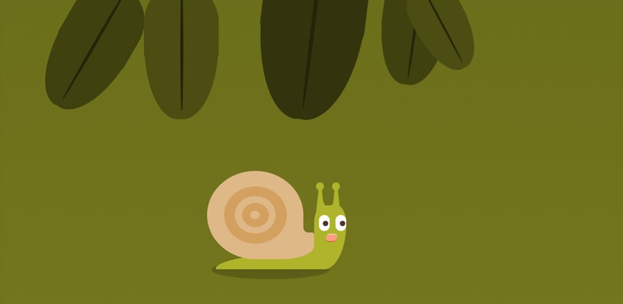 Анимация улитки на чистом CSS
HTML
<html>
  <body>
    <div id='illustration'>
      <div class="snail-container">
        <div class="snail">
          <div class="shell">
            <div class="main">
              <div class="spiral">
                <div class="outer-outer">
                  <div class="outer-inner">
                    <div class="inner-outer">
                      <div class="inner-inner">

                      </div>
                    </div>
                  </div>
                </div>
              </div>
            </div>
            <div class="opening">
              <div class="concave-cut-out-bg"></div>
              <div class="concave-cut-out-shape"></div>
            </div>
          </div>
          <div class="body">
            <div class="head">
              <div class="face">
                <div class="eyes">
                  <div class="left"><span></span></div>
                  <div class="right"><span></span></div>
                </div>
                <div class="mouth">
                  <div class="innermouth">

                  </div>

                </div>
              </div>
                            <div class="antennas">
                            <div class="left"><div class="slope"></div></div>
                            <div class="right"><div class="slope"></div></div>
                        </div>
            </div>

            <div class="lower-body"></div>
          </div>
        </div>
      </div>

    </div>
            <div class="grass">
                <div class="blade  foliage"><span></span></div>
                <div class="blade foliage "><span></span></div>
                <div class="blade foliage"><span></span></div>
                <div class="blade foliage"><span></span></div>
                <div class="blade foliage"><span></span></div>
                <div class="blade foliage"><span></span></div>
                <div class="blade foliage"><span></span></div>
                <div class="blade foliage"><span></span></div>
                <div class="blade"><span></span></div>
                <div class="blade"><span></span></div>
                <div class="blade"><span></span></div>
                <div class="blade"><span></span></div>
                <div class="blade"><span></span></div>
                <div class="blade"><span></span></div>
                <div class="blade"><span></span></div>
                <div class="blade"><span></span></div>
            </div>

    <style>

    </style>
  </body>
</html>
SCSS
$snailSkin: #afb42b;
$shell: burlywood;
$eye: #4e342e;
$bg:darken( $snailSkin, 15%);
$bg-gradient: linear-gradient(darken($bg, 2%) 1%, $bg 99%);

$foliage:darken($snailSkin, 25%);
.darkenFoliage{
    background:darken($foliage,3%);
        span{
            background:darken($foliage,3%);
            &:after,&:before{
                background:darken($foliage,3%);
            }
        }
}
.furtherDarkenFoliage{
    background:darken($foliage,6%);
        span{
            background:darken($foliage,6%);
            &:after,&:before{
                background:darken($foliage,6%);
            }
        }
}
//animation timing
$snailWalkTime: 4s;

body,
html {
    box-sizing: border-box;
    margin: 0;
    padding: 0;
    font-size: 10px;
    font-family: -apple-system, BlinkMacSystemFont, "Segoe UI", Roboto, Oxygen,
        Ubuntu, Cantarell, "Open Sans", "Helvetica Neue", sans-serif;
}
body * {
    box-sizing: inherit;
}
body{
    width:100vw;
    height:100vh;
    overflow:hidden;
        background-image: $bg-gradient;
}
#illustration {
    display: flex;
    z-index: -5;
    height: 100vh;
    width: 100vw;
    justify-content: flex-start;
    overflow: hidden;
    align-items: center;
}
.snail-container {
    animation: snailMovement 40s infinite;
    position: relative;
    width: 400px !important;
    height: 400px;
    .snail {
        bottom: 0;
        height: 75%;
        width: 100%;
        position: absolute;
        &:after{
            content:"";
            width:60%;
            height:8%;
            background:rgba(0,0,0,0.2);
            bottom:-4.5%;
            right:22%;
            position:absolute;
            border-radius:50%;
            z-index:-1;
            animation:snailShadow 4s infinite;
        }
    }
}
.shell {
    height: 55%;
    position: absolute;
    width: 50%;
    bottom: 3%;
    animation: snailShell 4s infinite;
    z-index: 5;
    right: 29%;
    .main {
        background: $shell;
        width: 90%;
        height: 100%;
        border-bottom-left-radius: 50%;
        border-bottom-right-radius: 30%;
        border-top-left-radius: 50%;
        border-top-right-radius: 50%;
        display: flex;
        justify-content: center;
        align-items: center;
        .spiral {
            position: relative;
            width: 65%;
            height: 65%;
            background: darken($shell, 10%);
            z-index: 3;
            border-radius: 50%;
        }
        .outer-outer {
            background: $shell;
            width: 65%;
            height: 65%;
            position: absolute;
            border-radius: 50%;
            left: 17.5%;
            top: 17.5%;
            z-index: 4;
        }
        .outer-inner {
            background: darken($shell, 10%);
            width: 65%;
            height: 65%;
            position: absolute;
            border-radius: 50%;
            left: 17.5%;
            top: 17.5%;
            z-index: 4;
        }
        .inner-outer {
            background: $shell;
            width: 35%;
            height: 35%;
            position: absolute;
            border-radius: 50%;
            left: 32.5%;
            top: 32.5%;
            z-index: 4;
        }
    }
    .opening {
        width: 60%;
        height: 30%;
        background: $shell;
        position: absolute;
        bottom: 0%;
        border-bottom-right-radius: 50%;
        border-top-right-radius: 0.5rem;
        right: 0;
        .concave-cut-out-bg {
            width: 25%;
            height: 60%;
            position: absolute;
            bottom: 68%;
            left: 68%;
            transform: rotate(-45deg);
            background: $shell;
        }
        .concave-cut-out-shape {
            width: 14.5%;
            height: 40%;
            right: 2%;
            border-bottom-left-radius: 50%;
            bottom: 100%;
            background: $bg;
            position: absolute;
        }
    }
}
.body {
    .head {
        &:after {
            content: "";
            z-index: 1;
            background: $bg;
            width: 60%;
            height: 30%;
            position: absolute;
            bottom: 38.66%;
            border-radius: 50%;
            left: -59.6%;
        }
        &:before {
            content: "";
            z-index: 0;
            background: $snailSkin;
            width: 90%;
            height: 50%;
            position: absolute;
            bottom: 0;
            border-radius: 20px;
            left: -50%;
        }
        position: absolute;
        background: $snailSkin;
        width: 15%;
        animation: snailHead $snailWalkTime infinite;
        height: 40%;
        right: 14%;
        bottom: 0%;
        border-top-left-radius: 50%;
        border-top-right-radius: 50%;
        border-bottom-right-radius: 120%;
        z-index: 2;
        .face {
            position: absolute;
            top: 0;
            width: 85%;
            border-radius: 50%;
            height: 60%;
            left: 15%;
            .eyes {
                .left,
                .right {
                    position: absolute;
                    top: 25%;
                    background: #ffffff;
                    border-radius: 5rem;
                    width: 2rem;
                    height: 3rem;
                    span {
                        width: 1rem;
                        top: 35.5%;
                        left: 39%;
                        height: 1rem;
                        position: absolute;
                        border-radius: 50%;
                        background: $eye;
                    }
                }
                .right {
                    right: 0;
                }
                .left {
                    left: 0;
                }
            }
            .mouth {
                .innermouth {
                    position: absolute;
                    bottom: 5%;
                    left: 14px;
                    width: 40%;
                    animation: snailMouth $snailWalkTime infinite;
                    height: 20%;
                    background: #ff9e80;
                    border-radius: 0.6rem;
                    transform: skewx(-10deg);
                    z-index: 4;
                    border-bottom: 1px solid #bf360c;
                    border-top: 1px solid #fff;
                }
            }
        }
        .antennas {
            width: 50px;
            height: 50px;
            position: absolute;
            top: -30%;
            z-index: -10;

            right: 10%;
            .left,
            .right {
                border-bottom: 5rem solid $snailSkin;
                border-left: 0.5rem solid transparent;
                border-right: 0.5rem solid transparent;
                height: 0;
                width: 30%;
                position: absolute;
                top: 0;
                &:before {
                    background: $snailSkin;
                    border-radius: 50%;
                    width: 275%;
                    height: 1.5rem;
                    top: -0.7rem;
                    left: -0.5em;
                    position: absolute;
                    content: "";
                }
                .slope {
                    background: $snailSkin;
                    width: 155%;
                    height: 1.5rem;
                    bottom: -4rem;
                    left: 0.1rem;
                    position: absolute;
                    transform: rotate(-25deg);
                }
            }
            .right {
                right: 10%;
                .slope {
                    left: -0.4rem;
                    transform: rotate(25deg);
                }
            }
        }
    }

    .lower-body {
        background: $snailSkin;
        position: absolute;
        height: 11%;
        width: 65%;
        border-top-left-radius: 290%;
        border-bottom-left-radius: 2px;
        border-bottom-right-radius: 50px;
        bottom: 0;
        right: 20%;
        animation: snailTail $snailWalkTime infinite;
    }
}

@keyframes snailMovement {
    0% {
        transform: translate3d(0vw, 0, 0);
    }
    5% {
        transform: translate3d(10vw, 0, 0);
    }
    10% {
        transform: translate3d(10vw, 0, 0);
    }
    15% {
        transform: translate3d(20vw, 0, 0);
    }
    20% {
        transform: translate3d(20vw, 0, 0);
    }
    25% {
        transform: translate3d(30vw, 0, 0);
    }
    30% {
        transform: translate3d(30vw, 0, 0);
    }
    35% {
        transform: translate3d(40vw, 0, 0);
    }
    40% {
        transform: translate3d(40vw, 0, 0);
    }
    45% {
        transform: translate3d(50vw, 0, 0);
    }
    50% {
        transform: translate3d(50vw, 0, 0);
    }
    55% {
        transform: translate3d(60vw, 0, 0);
    }
    60% {
        transform: translate3d(60vw, 0, 0);
    }
    65% {
        transform: translate3d(70vw, 0, 0);
    }
    70% {
        transform: translate3d(70vw, 0, 0);
    }
    75% {
        transform: translate3d(80vw, 0, 0);
    }
    80% {
        transform: translate3d(80vw, 0, 0);
    }
    85% {
        transform: translate3d(90vw, 0, 0);
    }
    90% {
        transform: translate3d(90vw, 0, 0);
    }
    95% {
        transform: translate3d(100vw, 0, 0);
    }
    100% {
        transform: translate3d(100vw, 0, 0);
    }
}

@keyframes snailTail {
    0% {
        width: 55%;
    }
    50% {
        width: 65%;
    }
    100% {
        width: 55%;
    }
}
@keyframes snailHead {
    0% {
        transform: rotate(0deg) translate3d(0rem, 0, 0);
    }
    50% {
        transform: rotate(3deg) translate3d(1rem, 0, 0);
    }
    100% {
        transform: rotate(0deg) translate3d(0rem, 0, 0);
    }
}
@keyframes snailShell {
    0% {
        transform: translate3d(0, -1rem, 0) rotate(0deg);
    }
    50% {
        transform: translate3d(0, 0, 0) rotate(1deg);
    }
    100% {
        transform: translate3d(0, -1rem, 0) rotate(0deg);
    }
}
@keyframes snailMouth {
    0% {
        width: 40%;
        left: 14px;
    }
    50% {
        width: 20%;
        left: 20px;
    }

    100% {
        width: 40%;
        left: 14px;
    }
}
@keyframes snailShadow{
    0%{
        width:55%;
        transform:translate3d(0rem, 0 , 0) scaleY(1.5)
    }
    50%{
        width:65%;
        transform:translate3d(.5rem, 0 , 0) scaleY(1);
    }
    100%{
        width:55%;
        transform:translate3d(0rem, 0 , 0) scaleY(1.5)
    }
}
.grass{
    width:100%;
    height:100%;
    position:absolute;
    top:0;
    left:0;
    .blade:nth-child(2){
        transform: rotate(0deg);
        left:28%;

    }
    .blade:nth-child(3){
        transform: scale(.7) translate3d(0,-3rem,0) rotate(-20deg);
    }
    .blade:nth-child(4){
        left:90%;
        transform: scale(1.4) translate3d(0,-1rem,0) rotate(20deg);
        background:darken($foliage,3%);
        span{
            background:darken($foliage,3%);
            &:after,&:before{
                background:darken($foliage,3%);
            }
        }
    }
    .blade:nth-child(5){
        left:85%;
        transform: translate3d(0,-2rem,0) rotate(28deg);
    }
    .blade:nth-child(6){
        left:55%;
        z-index:1;
        transform:scale(.7) translate3d(0,-4rem,0) rotate(-28deg);
    }
    .blade:nth-child(7){
        left:55%;
        z-index:0;
        transform:scale(.9) translate3d(-3rem,-5rem,0) rotate(8deg);
        @extend .darkenFoliage;
    }
    .blade:nth-child(8){
        left:45%;
        z-index:-1;
        transform:scale(1.4) translate3d(-3rem,-5rem,0) rotate(7deg);
        @extend .furtherDarkenFoliage;
    }
    .blade:nth-child(1){
        transform: rotate(30deg);
        left:20%;
        background:darken($foliage,3%);
        span{
            background:darken($foliage,3%);
            &:after,&:before{
                background:darken($foliage,3%);
            }
        }
    }
    .foliage{

        width:14rem;
        height:15rem;
        border-radius:20px;
        border-top-left-radius:50%;
        border-top-right-radius:50%;
        &:after{
            content:'';
            position:absolute;
            width:.5rem;
            border-radius:50%;
            left:49%;
            z-index:9;
            height:160%;
            background:darken($foliage, 10%);
        }
        span{
            position:absolute;
            width:10%;
            height:100%;
            bottom:-70%;

            background:$foliage;
            left:45%;
            &:before, &:after{
                content:"";
                height:15rem;
                width:7.0rem;
                background:$foliage;
                position:absolute;
                top:0rem;
                left:.8rem;
                transform:rotate(-1deg);
                border-bottom-right-radius:250%;
            }
            &:before{
                content:"";
                left:-6.4rem;
                width:6.6rem;
                transform:rotate(1deg);
                border-bottom-right-radius:0%;
                border-bottom-left-radius:250%;

                z-index:1;
            }
        }

        background:$foliage;
        position:absolute;
        top:-2rem;
    }
}