Svg morphing
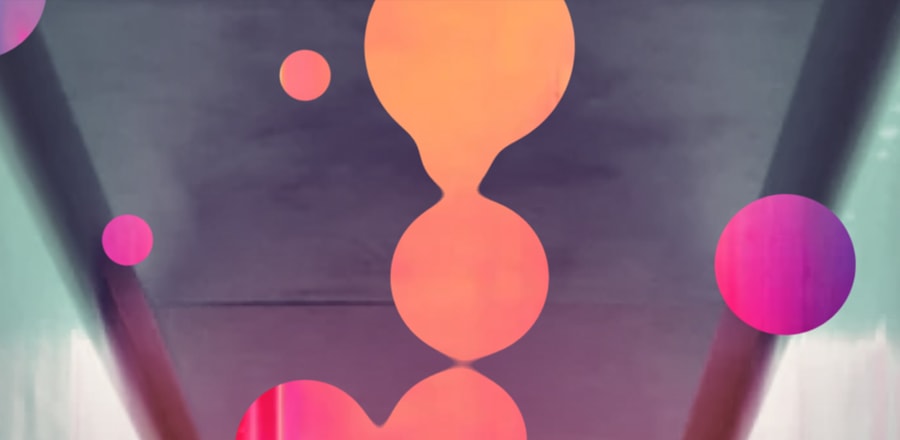
 Преобразование одной SVG фигуры в другую с плавной анимацией. На заднем фоне видео. Анимируются красные многоугольники.
HTML
<video autoplay loop muted>
  <source src="https://d3macfshcnzosd.cloudfront.net/010918145_main_xxl.mp4">
</video>
<svg id="pieces" class="section1">
  <defs>
    <linearGradient id="fill1">
      <stop class="stop1" offset="0%"></stop>
      <stop class="stop2" offset="100%"></stop>
    </linearGradient>
    <linearGradient id="fill2">
      <stop class="stop1" offset="0%"></stop>
      <stop class="stop2" offset="100%"></stop>
    </linearGradient>
  </defs>
  <polygon id="path1" points="0,0 174,0 609,578 0,578 " fill="url(#fill1)"></polygon>
  <polygon id="path2" points="0,0 0,0 870,578 0,578 " fill="url(#fill2)"></polygon>
</svg>

<button class="btn">change</button>


<svg width="93" height="18" viewBox="0 0 93 18"  class="logo">
      <path fill="#fff" d="M82.664 6.228h2.9c3.535 0 6.718 1.102 6.694 5.337 0 4.025-3.583 5.43-6.6 5.43-3.82 0-6.732-1.38-6.744-5.267v-.538h3.63v.538h.002c0 1.477 1.696 2.038 3.063 2.038.896 0 3.017-.327 3.017-2.2.023-1.826-1.956-2.2-3.064-2.2h-6.32V.426h12.094v3.276h-8.673v2.526zm-16.02 10.555h-6.768V.403h6.767c5.68 0 8.203 3.788 8.203 8.073 0 4.283-2.428 8.307-8.203 8.307zm0-13.08h-3.138v9.712h3.137c3.583 0 4.574-2.623 4.574-4.985 0-2.364-1.132-4.728-4.574-4.728zm-23.28 4.382v8.698H39.69V.18l.516-.09 9.99 8.956V.403h3.677V17.06l-.383.066-10.125-9.04zm-17.036 9.1c-5.28 0-8.913-3.257-8.913-8.592 0-5.337 3.632-8.59 8.913-8.59 5.28 0 8.912 3.253 8.912 8.59 0 5.335-3.63 8.59-8.912 8.59zm0-13.906c-3.137 0-5.307 2.34-5.307 5.313 0 3.066 2.17 5.29 5.308 5.29 3.206 0 5.305-2.248 5.305-5.29 0-2.997-2.1-5.314-5.305-5.314zM7.77 12.15H5.515V8.805H7.77c1.77 0 2.64-1.148 2.64-2.458 0-1.31-.895-2.482-2.64-2.482h-4.1v12.918H-.01V.403h7.78c4.22 0 6.315 2.713 6.315 5.874 0 3.275-2.122 5.827-6.316 5.873z"></path>
</svg>
CSS
body {
  background-color: #fff;
  margin: 0;
  padding: 0;
  overflow: hidden;
}

video {
  position: absolute;
  z-index: 1;
  top: 50%;
  left: 50%;
  min-width: 100%;
  min-height: 100%;
  width: auto;
  height: auto;
  -webkit-transform: translate(-50%, -50%);
          transform: translate(-50%, -50%);
}

svg {
  position: absolute;
  z-index: 2;
  width: 100vw;
  height: 100vh;
  mix-blend-mode: multiply;
}

#path1, #path2 {
  mix-blend-mode: multiply;
}

#path2 {
  opacity: .7;
}

linearGradient stop {
  transition: all .4s ease-in-out;
}

.section1 #fill1 .stop1 {
  stop-color: #f23b3e;
}
.section1 #fill1 .stop2 {
  stop-color: #6d3a83;
}
.section1 #fill2 .stop1 {
  stop-color: #ee3a9e;
}
.section1 #fill2 .stop2 {
  stop-color: #2f7ebf;
}

.section2 #fill1 .stop1 {
  stop-color: #713a80;
}
.section2 #fill1 .stop2 {
  stop-color: #cc3b58;
}
.section2 #fill2 .stop1 {
  stop-color: #b13496;
}
.section2 #fill2 .stop2 {
  stop-color: #4a4587;
}

.section3 #fill1 .stop1 {
  stop-color: #f33b47;
}
.section3 #fill1 .stop2 {
  stop-color: #bb3b60;
}
.section3 #fill2 .stop1 {
  stop-color: #2c94c6;
}
.section3 #fill2 .stop2 {
  stop-color: #39449c;
}

/* Button */
button.btn {
  color: #fff;
  font-size: 14px;
  font-weight: 600;
  letter-spacing: 2px;
  cursor: pointer;
  position: relative;
  z-index: 1;
  padding: 15px 30px;
  border: none;
  border-radius: 4px;
  box-shadow: 0px 16px 47px -15px #80101a;
  background: none;
  transition: box-shadow .2s ease-in-out;
  overflow: hidden;
  position: absolute;
  bottom: 20px;
  right: 20px;
  z-index: 3;
  outline: none;
}
button.btn span {
  position: relative;
  z-index: 2;
}
button.btn:before, button.btn:after {
  content: '';
  z-index: -1;
  background: #e23b48;
  content: '';
  position: absolute;
  top: 0;
  left: 0;
  width: 100%;
  height: 100%;
}
button.btn:after {
  background: #23467a;
  -webkit-transform: scaleY(0);
          transform: scaleY(0);
  -webkit-transform-origin: top;
          transform-origin: top;
  transition: -webkit-transform .2s ease-in-out;
  transition: transform .2s ease-in-out;
  transition: transform .2s ease-in-out, -webkit-transform .2s ease-in-out;
  transition-delay: .1s;
}
button.btn:hover {
  box-shadow: 0px 16px 47px -15px #08162b;
}
button.btn:hover:after {
  -webkit-transform: scaleY(1);
          transform: scaleY(1);
  -webkit-transform-origin: bottom;
          transform-origin: bottom;
  transition-delay: 0s;
}

.logo {
  position: absolute;
  top: 50%;
  left: 50%;
  z-index: 100;
  width: 50%;
  height: auto;
  -webkit-transform: translate(-50%, -50%);
          transform: translate(-50%, -50%);
  fill: #fff;
  mix-blend-mode: normal;
  opacity: .9;
  -webkit-filter: drop-shadow(0 3px 7px rgba(64, 34, 100, 0.4));
          filter: drop-shadow(0 3px 7px rgba(64, 34, 100, 0.4));
}
JS
Дополнительные библиотекиhttps://cdnjs.cloudflare.com/ajax/libs/jquery/3.1.1/jquery.min.js
https://cdnjs.cloudflare.com/ajax/libs/gsap/1.19.1/TweenMax.min.js
https://s3-us-west-2.amazonaws.com/s.cdpn.io/81395/CustomEase.min.jsvar w = $(window).width(),
h = $(window).height(),
totalSection = 3,
actualSection = 1,
path1,
path2,
section1,
section2,
section3;
function sections(){
w = $(window).width();
h = $(window).height();
section1 = {
path1: [
{ x: 0, y: 0 },
{ x: w * 0.2, y: 0 },
{ x: w * 0.7, y: h },
{ x: 0, y: h }
],
path2: [
{ x: -w * 0.2, y: h * 0.2 },
{ x: 0, y: 0 },
{ x: w, y: h },
{ x: 0, y: h }
]
}
section2 = {
path1: [
{ x: w * 0.15, y: 0 },
{ x: w, y: 0 },
{ x: w, y: h },
{ x: w * 0.65, y: h }
],
path2: [
{ x: w, y: h * 0.3 },
{ x: w * 2, y: h * 0.3 },
{ x: w, y: h },
{ x: w * 0.45, y: h }
]
}
section3 = {
path1: [
{ x: w * 0.1, y: 0 },
{ x: w, y: 0 },
{ x: w * 1.1, y: h * 0.7 },
{ x: w, y: h * 0.95 }
],
path2: [
{ x: w * 0.18, y: 0 },
{ x: w, y: 0 },
{ x: w * 0.95, y: h },
{ x: w * 0.55, y: h }
]
}
}
// Cambio section al click
$('button').click(function(){
actualSection = (actualSection >= totalSection) ? 1 : ++actualSection;
$('#pieces').removeAttr('class').addClass('section' + actualSection);
morphingPaths(actualSection);
});
// window resize
$(window).on('resize', function(){
morphingPaths(actualSection);
}).resize();
// Morphing Paths
function morphingPaths(section) {
sections();
var $path1 = $('#path1'),
$path2 = $('#path2');
switchToPath($path1, section, 'path1');
setTimeout(function(){
switchToPath($path2, section, 'path2');
}, 200);
}
function switchToPath($path, section, sectionPath) {
var pathPoints = eval('section' + section)[sectionPath];
var points = '';
window[sectionPath] = []; // reset var path1/path2
actualPoints = $path.attr('points').split(' '); // punti corretti dell'svg
// creo un oggetto path1 / path2 che abbia i punti iniziali e finali
for (var i = 0; i < pathPoints.length; i++) {
actualPoint = actualPoints[i].split(',');
obj = {
x: actualPoint[0],
endX: pathPoints[i].x,
y: actualPoint[1],
endY: pathPoints[i].y
}
// path1 / path2
window[sectionPath].push(obj);
}
// animo con GSAP
for (var i = 0; i < window[sectionPath].length; i++) {
p = window[sectionPath][i];
console.log(p.x);
TweenMax.to(p, 1, {
x: p.endX,
y: p.endY,
ease: Expo.easeInOut,
delay: i * .25,
onUpdate: function(){
animatePath($path, window[sectionPath]);
}
}, .2);
}
function animatePath($path, path) {
var points = '';
for (var i = 0; i < path.length; i++) {
var point = path[i].x + ',' + path[i].y;
points += point + ' ';
}
$path.attr('points', points);
}
}