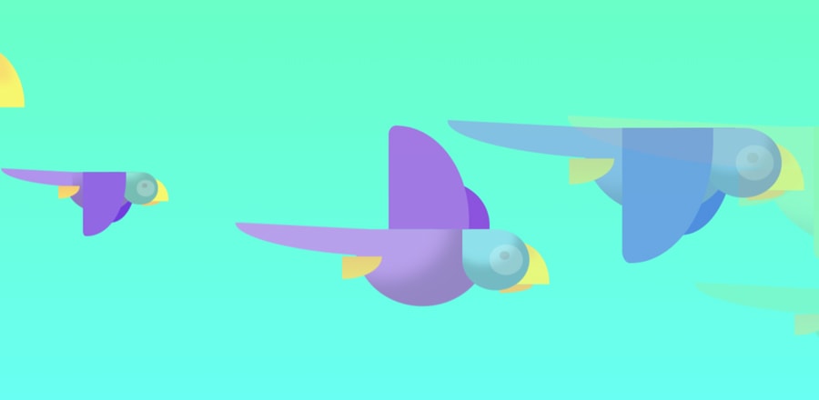
Эффект Боке на CSS
 Эффект Боке, который попробовали повторить на CSS
HTML
<div class="background">
  <span></span>
  <span></span>
  <span></span>
  <span></span>
  <span></span>
  <span></span>
  <span></span>
  <span></span>
  <span></span>
  <span></span>
  <span></span>
  <span></span>
  <span></span>
  <span></span>
  <span></span>
  <span></span>
  <span></span>
  <span></span>
  <span></span>
  <span></span>
</div>
CSS
body {
  margin: 0;
  overflow: hidden;
}

.background {
  width: 100vw;
  height: 100vh;
  background: #3E1E68;
}

.background span {
  width: 20vmin;
  height: 20vmin;
  border-radius: 20vmin;
  backface-visibility: hidden;
  position: absolute;
  animation-name: move;
  animation-duration: 6s;
  animation-timing-function: linear;
  animation-iteration-count: infinite;
}
.background span:nth-child(1) {
  color: #E45A84;
  top: 45%;
  left: 2%;
  animation-duration: 11.7s;
  animation-delay: -5.8s;
  transform-origin: 6vw -20vh;
  box-shadow: -40vmin 0 5.0921863008vmin currentColor;
}
.background span:nth-child(2) {
  color: #583C87;
  top: 36%;
  left: 13%;
  animation-duration: 12s;
  animation-delay: -4.2s;
  transform-origin: 1vw -10vh;
  box-shadow: 40vmin 0 10.9409999648vmin currentColor;
}
.background span:nth-child(3) {
  color: #E45A84;
  top: 56%;
  left: 16%;
  animation-duration: 12.7s;
  animation-delay: -2.5s;
  transform-origin: 5vw -3vh;
  box-shadow: -40vmin 0 12.4090339269vmin currentColor;
}
.background span:nth-child(4) {
  color: #E45A84;
  top: 41%;
  left: 44%;
  animation-duration: 11s;
  animation-delay: -0.9s;
  transform-origin: -12vw 12vh;
  box-shadow: 40vmin 0 12.2879599461vmin currentColor;
}
.background span:nth-child(5) {
  color: #FFACAC;
  top: 28%;
  left: 48%;
  animation-duration: 10.4s;
  animation-delay: -9.4s;
  transform-origin: -5vw -2vh;
  box-shadow: -40vmin 0 7.731701539vmin currentColor;
}
.background span:nth-child(6) {
  color: #E45A84;
  top: 38%;
  left: 15%;
  animation-duration: 13.8s;
  animation-delay: -11.6s;
  transform-origin: -24vw 19vh;
  box-shadow: 40vmin 0 5.4262539875vmin currentColor;
}
.background span:nth-child(7) {
  color: #E45A84;
  top: 4%;
  left: 34%;
  animation-duration: 14.4s;
  animation-delay: -5.6s;
  transform-origin: -18vw -11vh;
  box-shadow: 40vmin 0 7.6590140898vmin currentColor;
}
.background span:nth-child(8) {
  color: #583C87;
  top: 70%;
  left: 73%;
  animation-duration: 11.3s;
  animation-delay: -2.6s;
  transform-origin: -23vw -17vh;
  box-shadow: -40vmin 0 11.2497805682vmin currentColor;
}
.background span:nth-child(9) {
  color: #FFACAC;
  top: 70%;
  left: 72%;
  animation-duration: 14.1s;
  animation-delay: -12.4s;
  transform-origin: 4vw 12vh;
  box-shadow: 40vmin 0 14.3220649947vmin currentColor;
}
.background span:nth-child(10) {
  color: #FFACAC;
  top: 54%;
  left: 39%;
  animation-duration: 12.7s;
  animation-delay: -11.9s;
  transform-origin: 9vw 21vh;
  box-shadow: -40vmin 0 9.1885915789vmin currentColor;
}
.background span:nth-child(11) {
  color: #583C87;
  top: 2%;
  left: 100%;
  animation-duration: 11.2s;
  animation-delay: -12s;
  transform-origin: -1vw 0vh;
  box-shadow: -40vmin 0 11.7437883946vmin currentColor;
}
.background span:nth-child(12) {
  color: #E45A84;
  top: 63%;
  left: 58%;
  animation-duration: 15.8s;
  animation-delay: -12.5s;
  transform-origin: -17vw 5vh;
  box-shadow: 40vmin 0 12.6600434277vmin currentColor;
}
.background span:nth-child(13) {
  color: #583C87;
  top: 22%;
  left: 31%;
  animation-duration: 12.1s;
  animation-delay: -4.3s;
  transform-origin: -8vw -18vh;
  box-shadow: -40vmin 0 13.5079047709vmin currentColor;
}
.background span:nth-child(14) {
  color: #E45A84;
  top: 44%;
  left: 25%;
  animation-duration: 13.6s;
  animation-delay: -11.5s;
  transform-origin: 22vw 3vh;
  box-shadow: 40vmin 0 5.9097250286vmin currentColor;
}
.background span:nth-child(15) {
  color: #E45A84;
  top: 69%;
  left: 14%;
  animation-duration: 12.4s;
  animation-delay: -1.2s;
  transform-origin: 23vw -7vh;
  box-shadow: 40vmin 0 9.1220215972vmin currentColor;
}
.background span:nth-child(16) {
  color: #E45A84;
  top: 27%;
  left: 8%;
  animation-duration: 13.8s;
  animation-delay: -7.9s;
  transform-origin: -2vw -6vh;
  box-shadow: -40vmin 0 12.1250672114vmin currentColor;
}
.background span:nth-child(17) {
  color: #FFACAC;
  top: 40%;
  left: 75%;
  animation-duration: 11.2s;
  animation-delay: -14.6s;
  transform-origin: 15vw 0vh;
  box-shadow: -40vmin 0 14.3353883486vmin currentColor;
}
.background span:nth-child(18) {
  color: #E45A84;
  top: 8%;
  left: 6%;
  animation-duration: 11.4s;
  animation-delay: -2.9s;
  transform-origin: -13vw -8vh;
  box-shadow: -40vmin 0 5.7868773981vmin currentColor;
}
.background span:nth-child(19) {
  color: #FFACAC;
  top: 46%;
  left: 1%;
  animation-duration: 11.4s;
  animation-delay: -10.6s;
  transform-origin: 12vw 2vh;
  box-shadow: -40vmin 0 11.8942773609vmin currentColor;
}
.background span:nth-child(20) {
  color: #E45A84;
  top: 60%;
  left: 70%;
  animation-duration: 10.5s;
  animation-delay: -0.6s;
  transform-origin: 6vw -11vh;
  box-shadow: 40vmin 0 5.3894453998vmin currentColor;
}

@keyframes move {
  100% {
    transform: translate3d(0, 0, 1px) rotate(360deg);
  }
}