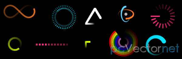
Элементы загрузки на CSS3

Очередные элементы загрузки сделанные только на CSS3. Изображения в трех приведенных примерах не используются.
HTML
Как можно увидеть в разметке три наших загрузочных элемента выполненных ввиде трех дивов с несколькими вложенными дивами в каждом:
<div class="main_body">
    <div class="element">
        <div class="loading1">
            <div></div>
            <div></div>
            <div></div>
            <div></div>
            <div></div>
            <div></div>
            <div></div>
            <div></div>
        </div>
    </div>
    <div class="element">
        <div class="loading2">
            <div></div>
            <div></div>
            <div></div>
            <div></div>
            <div></div>
            <div></div>
            <div></div>
            <div></div>
        </div>
    </div>
    <div class="element">
        <div class="loading3">
            <div></div>
            <div></div>
            <div></div>
            <div></div>
            <div></div>
        </div>
    </div>
</div>
CSS
А теперь стили для каждого из загрузочных элементов, сначала для первого:
.loading1 {
    height:100px;
    position:relative;
    width:80px;
}
.loading1 > div {
    background-color:#FFFFFF;
    height:30px;
    position:absolute;
    width:12px;

    /* css3 radius */
    -moz-border-radius:5px;
    -webkit-border-radius:5px;
    border-radius:5px;

    /* css3 transform - scale */
    -webkit-transform:scale(0.4);
    -moz-transform:scale(0.4);
    -o-transform:scale(0.4);

    /* css3 animation */
    -webkit-animation-name:loading1;
    -webkit-animation-duration:1.04s;
    -webkit-animation-iteration-count:infinite;
    -webkit-animation-direction:linear;
    -moz-animation-name:loading1;
    -moz-animation-duration:1.04s;
    -moz-animation-iteration-count:infinite;
    -moz-animation-direction:linear;
    -o-animation-name:loading1;
    -o-animation-duration:1.04s;
    -o-animation-iteration-count:infinite;
    -o-animation-direction:linear;
}
.loading1 > div:nth-child(1) {
    left:0;
    top:36px;

    /* css3 transform - rotate */
    -webkit-transform:rotate(-90deg);
    -moz-transform:rotate(-90deg);
    -o-transform:rotate(-90deg);

    /* css3 animation */
    -webkit-animation-delay:0.39s;
    -moz-animation-delay:0.39s;
    -o-animation-delay:0.39s;
}

.loading1 > div:nth-child(2) {
    left:10px;
    top:13px;

    /* css3 transform - rotate */
    -webkit-transform:rotate(-45deg);
    -moz-transform:rotate(-45deg);
    -o-transform:rotate(-45deg);

    /* css3 animation */
    -webkit-animation-delay:0.52s;
    -moz-animation-delay:0.52s;
    -o-animation-delay:0.52s;
}

.loading1 > div:nth-child(3) {
    left:34px;
    top:4px;

    /* css3 transform - rotate */
    -webkit-transform:rotate(0deg);
    -moz-transform:rotate(0deg);
    -o-transform:rotate(0deg);

    /* css3 animation */
    -webkit-animation-delay:0.65s;
    -moz-animation-delay:0.65s;
    -o-animation-delay:0.65s;
}

.loading1 > div:nth-child(4) {
    right:10px;
    top:13px;

    /* css3 transform - rotate */
    -webkit-transform:rotate(45deg);
    -moz-transform:rotate(45deg);
    -o-transform:rotate(45deg);

    /* css3 animation */
    -webkit-animation-delay:0.78s;
    -moz-animation-delay:0.78s;
    -o-animation-delay:0.78s;
}
.loading1 > div:nth-child(5) {
    right:0;
    top:36px;

    /* css3 transform - rotate */
    -webkit-transform:rotate(90deg);
    -moz-transform:rotate(90deg);
    -o-transform:rotate(90deg);

    /* css3 animation */
    -webkit-animation-delay:0.91s;
    -moz-animation-delay:0.91s;
    -o-animation-delay:0.91s;
}
.loading1 > div:nth-child(6) {
    right:10px;
    bottom:9px;

    /* css3 transform - rotate */
    -webkit-transform:rotate(135deg);
    -moz-transform:rotate(135deg);
    -o-transform:rotate(135deg);

    /* css3 animation */
    -webkit-animation-delay:1.04s;
    -moz-animation-delay:1.04s;
    -o-animation-delay:1.04s;
}
.loading1 > div:nth-child(7) {
    bottom:0;
    left:34px;

    /* css3 transform - rotate */
    -webkit-transform:rotate(180deg);
    -moz-transform:rotate(180deg);
    -o-transform:rotate(180deg);

    /* css3 animation */
    -webkit-animation-delay:1.17s;
    -moz-animation-delay:1.17s;
    -o-animation-delay:1.17s;
}
.loading1 > div:nth-child(8) {
    left:10px;
    bottom:9px;

    /* css3 transform - rotate */
    -webkit-transform:rotate(-135deg);
    -moz-transform:rotate(-135deg);
    -o-transform:rotate(-135deg);

    /* css3 animation */
    -webkit-animation-delay:1.3s;
    -moz-animation-delay:1.3s;
    -o-animation-delay:1.3s;
}

/* css3 keyframes - loading1 */
@-webkit-keyframes loading1 {
    0%{ background-color:#000000 }
    100%{ background-color:#FFFFFF }
}
@-moz-keyframes loading1 {
    0%{ background-color:#000000 }
    100%{ background-color:#FFFFFF }
}
@-o-keyframes loading1 {
    0%{ background-color:#000000 }
    100%{ background-color:#FFFFFF }
}
Теперь для второго:
.loading2 {
    height:140px;
    position:relative;
    width:140px;

    /* css3 transform - scale */
    -webkit-transform:scale(0.6);
    -moz-transform:scale(0.6);
    -o-transform:scale(0.6);
}
.loading2 > div {
    background-color:#FFFFFF;
    height:25px;
    position:absolute;
    width:25px;

    /* css3 radius */
    -moz-border-radius:15px;
    -webkit-border-radius:15px;
    border-radius:15px;

    /* css3 animation */
    -webkit-animation-name:loading2;
    -webkit-animation-duration:1.04s;
    -webkit-animation-iteration-count:infinite;
    -webkit-animation-direction:linear;
    -moz-animation-name:loading2;
    -moz-animation-duration:1.04s;
    -moz-animation-iteration-count:infinite;
    -moz-animation-direction:linear;
    -o-animation-name:loading2;
    -o-animation-duration:1.04s;
    -o-animation-iteration-count:infinite;
    -o-animation-direction:linear;
}
.loading2 > div:nth-child(1) {
    left:0;
    top:57px;

    /* css3 animation */
    -webkit-animation-delay:0.39s;
    -moz-animation-delay:0.39s;
    -o-animation-delay:0.39s;
}
.loading2 > div:nth-child(2) {
    left:17px;
    top:17px;

    /* css3 animation */
    -webkit-animation-delay:0.52s;
    -moz-animation-delay:0.52s;
    -o-animation-delay:0.52s;
}
.loading2 > div:nth-child(3) {
    left:57px;
    top:0;

    /* css3 animation */
    -webkit-animation-delay:0.65s;
    -moz-animation-delay:0.65s;
    -o-animation-delay:0.65s;
}
.loading2 > div:nth-child(4) {
    right:17px;
    top:17px;

    /* css3 animation */
    -webkit-animation-delay:0.78s;
    -moz-animation-delay:0.78s;
    -o-animation-delay:0.78s;
}
.loading2 > div:nth-child(5) {
    right:0;
    top:57px;

    /* css3 animation */
    -webkit-animation-delay:0.91s;
    -moz-animation-delay:0.91s;
    -o-animation-delay:0.91s;
}
.loading2 > div:nth-child(6) {
    right:17px;
    bottom:17px;

    /* css3 animation */
    -webkit-animation-delay:1.04s;
    -moz-animation-delay:1.04s;
    -o-animation-delay:1.04s;
}
.loading2 > div:nth-child(7) {
    left:57px;
    bottom:0;

    /* css3 animation */
    -webkit-animation-delay:1.17s;
    -moz-animation-delay:1.17s;
    -o-animation-delay:1.17s;
}
.loading2 > div:nth-child(8) {
    left:17px;
    bottom:17px;

    /* css3 animation */
    -webkit-animation-delay:1.3s;
    -moz-animation-delay:1.3s;
    -o-animation-delay:1.3s;
}

/* css3 keyframes - loading2 */
@-webkit-keyframes loading2 {
    0%{ background-color:#000000 }
    100%{ background-color:#FFFFFF }
}
@-moz-keyframes loading2 {
    0%{ background-color:#000000 }
    100%{ background-color:#FFFFFF }
}
@-o-keyframes loading2 {
    0%{ background-color:#000000 }
    100%{ background-color:#FFFFFF }
}
И для третьего элемента:
.loading3 > div {
    background-color:#FFFFFF;
    border:1px solid #000000;
    float:left;
    height:114px;
    margin-left:5px;
    width:30px;
    opacity:0.1;

    /* css3 transform - scale */
    -webkit-transform:scale(0.8);
    -moz-transform:scale(0.8);
    -o-transform:scale(0.8);

    /* css3 animation */
    -webkit-animation-name:loading3;
    -webkit-animation-duration:1.2s;
    -webkit-animation-iteration-count:infinite;
    -webkit-animation-direction:linear;
    -moz-animation-name:loading3;
    -moz-animation-duration:1.2s;
    -moz-animation-iteration-count:infinite;
    -moz-animation-direction:linear;
    -o-animation-name:loading3;
    -o-animation-duration:1.2s;
    -o-animation-iteration-count:infinite;
    -o-animation-direction:linear;
}
.loading3 > div:nth-child(1) {
    /* css3 animation */
    -webkit-animation-delay:0.24s;
    -moz-animation-delay:0.24s;
    -o-animation-delay:0.24s;
}
.loading3 > div:nth-child(2) {
    /* css3 animation */
    -webkit-animation-delay:0.48s;
    -moz-animation-delay:0.48s;
    -o-animation-delay:0.48s;
}
.loading3 > div:nth-child(3) {
    /* css3 animation */
    -webkit-animation-delay:0.72s;
    -moz-animation-delay:0.72s;
    -o-animation-delay:0.72s;
}
.loading3 > div:nth-child(4) {
    /* css3 animation */
    -webkit-animation-delay:0.96s;
    -moz-animation-delay:0.96s;
    -o-animation-delay:0.96s;
}
.loading3 > div:nth-child(5) {
    /* css3 animation */
    -webkit-animation-delay:1.2s;
    -moz-animation-delay:1.2s;
    -o-animation-delay:1.2s;
}

/* css3 keyframes - loading3 */
@-webkit-keyframes loading3 {
    0% {
        -webkit-transform:scale(1.2);
        opacity:1;
    }
    100% {
        -webkit-transform:scale(0.7);
        opacity:0.1;
    }
}
@-moz-keyframes loading3 {
    0% {
        -moz-transform:scale(1.2);
        opacity:1;
    }
    100% {
        -moz-transform:scale(0.7);
        opacity:0.1;
    }
}
@-o-keyframes loading3 {
    0% {
        -o-transform:scale(1.2);
        opacity:1;
    }
    100% {
        -o-transform:scale(0.7);
        opacity:0.1;
    }
}Ссылки