Breadcrumb на CSS3 без изображений
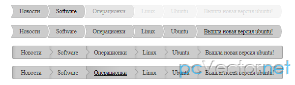
Два варианта создания хлебных крошек с использованием CSS3.
Работает в Firefox 3.0+, Chrome 5+, IE9, Safari 4+, Opera 11.
HTML
Разметка общая для двух вариантов, если не считать название идентификатора у списка:
    <ul id="breadcrumb">
        <li><a href="#">Новости</a></li>
        <li><a href="#">Software</a></li>
        <li><a href="#">Операционки</a></li>
        <li><a href="#">Linux</a></li>
        <li><a href="#">Ubuntu</a></li>
        <li><a href="#">Вышла новая версия ubuntu!</a></li>
    </ul>
CSS
Для первого варианта хлебных крошек.
Где используется:
- border-radius на правом краю
- transparent radial-gradient на левом краю
- одноуровневый селектор (~) при hover
#breadcrumb {
        margin: 0; padding: 0;
      }
#breadcrumb li {
        display: inline-block; /* affichage horizontal */
        position: relative;
        -webkit-transition: opacity 1s;
        -moz-transition: opacity 1s;
        -o-transition: opacity 1s;
        transition: opacity 1s;
      }
#breadcrumb li + li {
    margin-left: -8px;
}
#breadcrumb a {
        display: inline-block;
        padding: 8px 28px;
        margin: 0;
        color: #333;
        border: 1px solid #bbb; border-left: none;
        text-decoration: none;
        text-shadow: 1px 1px 1px rgba(255,255,255,0.5);
        -webkit-border-radius: 0 17px 17px 0 / 0 35px 35px 0;
        -moz-border-radius: 0 17px 17px 0 / 0 35px 35px 0;
        border-radius: 0 17px 17px 0 / 0 35px 35px 0;
        background: #ccc;
      }
#breadcrumb li:hover ~ li  {
        opacity: 0.5;
}
#breadcrumb li:hover ~ li + li  {
        opacity: 0.2;
}
#breadcrumb a {
    background: -webkit-radial-gradient(-24px center, circle , transparent 30px, #ccc 32px);
    background: -moz-radial-gradient(-24px center, circle , transparent 30px, #ccc 32px);
    background: -o-radial-gradient(-24px center, circle , transparent 30px, #ccc 32px);
    background: radial-gradient(-24px center, circle , transparent 30px, #ccc 32px);
}
#breadcrumb a:hover, #breadcrumb a:focus {
        color: #000;
        text-decoration: underline;
}Где используется:
- :before и :after + rotate для создания стрелок
- linear-gradient для background
#breadcrumb2 {
        margin: 50px 0 0 0; padding: 0;
      }
#breadcrumb2 li {
        display: inline-block; /* affichage horizontal */
        position: relative;
        background: #ccc;
        background-image: -webkit-linear-gradient(left, #bbb, #ccc 12px);
        background-image: -moz-linear-gradient(left, #bbb, #ccc 12px);
        background-image: -ms-linear-gradient(left, #bbb, #ccc 12px);
        background-image: -o-linear-gradient(left, #bbb, #ccc 12px);
        background-image: linear-gradient(left, #bbb, #ccc 12px);
        border: 1px solid #999;
        -webkit-transition: opacity 1s;
        -moz-transition: opacity 1s;
        -o-transition: opacity 1s;
        transition: opacity 1s;
      }
#breadcrumb2 li + li {margin-left: -5px}
#breadcrumb2 li:nth-child(7) {z-index: 1}
#breadcrumb2 li:nth-child(6) {z-index: 2}
#breadcrumb2 li:nth-child(5) {z-index: 3}
#breadcrumb2 li:nth-child(4) {z-index: 4}
#breadcrumb2 li:nth-child(3) {z-index: 5}
#breadcrumb2 li:nth-child(2) {z-index: 6}
#breadcrumb2 li:first-child {z-index: 7}
#breadcrumb2 a {
        display: inline-block;
        position: relative;
        padding: 8px 28px;
        margin: 0;
        color: #333;
        text-decoration: none;
        text-shadow: 1px 1px 1px rgba(255,255,255,0.5);
      }
#breadcrumb2 li:first-child {
        -webkit-border-radius: 5px 0 0 5px;
        -moz-border-radius: 5px 0 0 5px;
        border-radius: 5px 0 0 5px;
}
#breadcrumb2 li:last-child {
        -webkit-border-radius: 0 5px 5px 0;
        -moz-border-radius: 0 5px 5px 0;
        border-radius: 0 5px 5px 0;
}
#breadcrumb2 li:not(:last-child):before {
        content: "";
        position: absolute;
        right: 0px; top: 4px;
        width: 20px; height: 31px;
        background: #ccc;
        z-index: 10;
}
#breadcrumb2 li:not(:last-child):after {
        content: "";
        position: absolute;
        right: -8px; top: 10px;
        width: 15px; height: 15px;
        background: #ccc;
        border: 1px solid #999;
        -webkit-transform: rotate(45deg);
        -moz-transform: rotate(45deg);
        -ms-transform: rotate(45deg);
        -o-transform: rotate(45deg);
        transform: rotate(45deg);
}
#breadcrumb2 li:hover {
        background-image: -webkit-linear-gradient(left, #bbb, #ccc 70%);
        background-image: -moz-linear-gradient(left, #bbb, #ccc 70%);
        background-image: -ms-linear-gradient(left, #bbb, #ccc 70%);
        background-image: -o-linear-gradient(left, #bbb, #ccc 70%);
        background-image: linear-gradient(left, #bbb, #ccc 70%);
}
#breadcrumb2 a:hover, #breadcrumb2 a:focus {
        color: #000;
        text-decoration: underline;
}Ссылки