Пиво на CSS
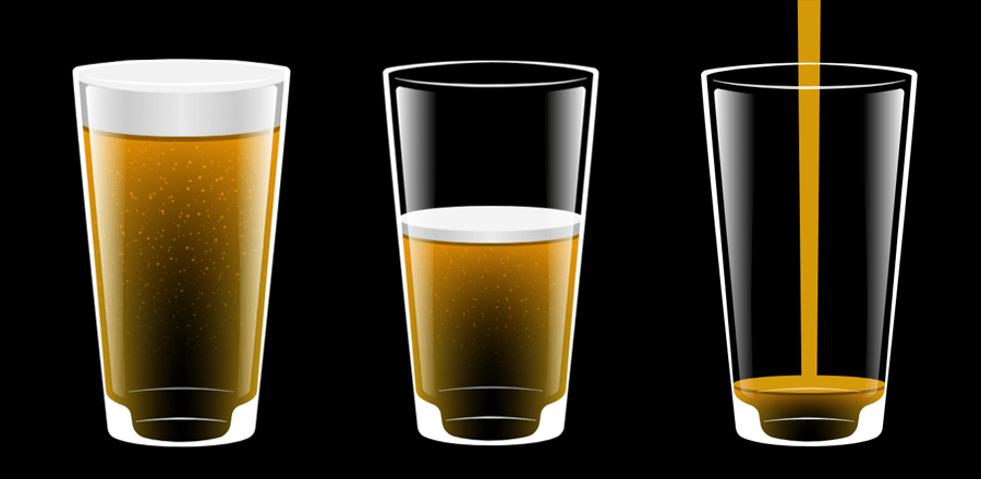 Кружка пива, которая наполняется пивом. Сделано на CSS и с использованием SVG.
HTML
<div class="glass">
  <div class="wrapper">
    <div class="pour">
      <div class="stream"></div>
    </div>
    <div class="contents">
      <div class="beer">
        <div class="bubbles">
          <div class="layer"></div>
          <div class="layer more"></div>
        </div>
        <div class="surface">
          <div class="head"></div>
        </div>
      </div>
    </div>
  </div>
  <svg viewBox="0 0 550 980">
    <style type="text/css">
      .st0{fill:url(#SVGID_1_);}
      .st1{fill:#FFFFFF;}
      .st2{opacity:0.85;fill:#FFFFFF;}
      .st3{opacity:0.86;fill:#FFFFFF;}
      .st4{opacity:0.5;fill:#FFFFFF;}
      .st5{fill:url(#SVGID_2_);}
    </style>
    <linearGradient id="SVGID_1_" gradientUnits="userSpaceOnUse" x1="399.6879" y1="462.5569" x2="516.6628" y2="462.5569">
      <stop  offset="0.1021" style="stop-color:#FFFFFF;stop-opacity:0"/>
      <stop  offset="1" style="stop-color:#FFFFFF"/>
    </linearGradient>
    <path class="st0" d="M399.69,81.11c39.58-2.26,83.23-10.35,104.66-14.72c6.71-1.37,12.84,4.07,12.28,10.89
      c-11.21,135.24-66.63,741.35-68.14,757c-1.57,16.27-35.15,24.66-35.15,24.66C439.56,549.38,399.69,81.11,399.69,81.11z"/>
    <path class="st1" d="M507.67,73.32"/>
    <path class="st2" d="M519.05,43.86c-19.85,4.57-40.18,6.98-60.48,8.99c-20.32,1.97-40.7,3.3-61.1,4.29
      c-40.79,1.98-85.04,2.97-122.48,2.97s-81.69-1-122.48-2.97c-20.39-0.99-40.78-2.32-61.1-4.29c-20.3-2.02-40.62-4.42-60.48-8.99
      l-0.42,1.67c19.92,5.04,40.25,9.5,60.57,11.97c20.34,2.41,40.74,4.2,61.16,5.63C193.11,66,235.57,67.88,275,67.88
      c39.43,0,81.89-1.88,122.74-4.75c20.42-1.43,40.83-3.22,61.16-5.63c20.32-2.47,40.65-6.92,60.57-11.97L519.05,43.86z"/>
    <path class="st3" d="M333.03,908.96c-19.07-1.51-41.93-2.67-58.03-2.67s-38.96,1.16-58.03,2.67c-19.06,1.52-38.08,3.67-56.93,6.86
      l0.22,1.39c18.88-2.59,37.89-4.14,56.92-5.05c19.03-0.91,34.61-0.87,57.82-0.87s38.79-0.04,57.82,0.87
      c19.03,0.92,38.04,2.47,56.92,5.05l0.22-1.39C371.11,912.64,352.09,910.48,333.03,908.96z"/>
    <path class="st4" d="M275,829.75c-32.91,0-89.08,3.57-132.66,10.66l0.21,1.39c43.66-5.88,95.72-7.05,132.45-7.05
      s88.79,1.17,132.45,7.05l0.21-1.39C364.08,833.32,307.91,829.75,275,829.75z"/>
    <linearGradient id="SVGID_2_" gradientUnits="userSpaceOnUse" x1="1108.0135" y1="462.5569" x2="1224.9884" y2="462.5569" gradientTransform="matrix(-1 0 0 1 1258.3256 0)">
      <stop  offset="0.1021" style="stop-color:#FFFFFF;stop-opacity:0"/>
      <stop  offset="1" style="stop-color:#FFFFFF"/>
    </linearGradient>
    <path class="st5" d="M150.31,81.11c-39.58-2.26-83.23-10.35-104.66-14.72c-6.71-1.37-12.84,4.07-12.28,10.89
      c11.21,135.24,66.63,741.35,68.14,757c1.57,16.27,35.15,24.66,35.15,24.66C110.44,549.38,150.31,81.11,150.31,81.11z"/>
    <path class="st1" d="M42.33,73.32"/>
    <path class="st1" d="M549.97,30.97c-0.02-0.6-0.13-1.13-0.27-1.67c-0.14-0.52-0.29-1.11-0.48-1.54c-0.38-0.87-0.85-1.8-1.32-2.4
      c-0.24-0.33-0.48-0.67-0.73-0.98l-0.71-0.77c-1.93-1.96-3.7-3.02-5.41-4C539.34,18.67,444.21,0,275,0S10.66,18.67,8.96,19.62
      c-1.7,0.98-3.47,2.04-5.41,4l-0.71,0.77c-0.25,0.3-0.49,0.65-0.73,0.98c-0.47,0.6-0.94,1.52-1.32,2.4c-0.2,0.43-0.35,1.02-0.48,1.54
      c-0.14,0.53-0.25,1.07-0.27,1.67C0,31.52-0.01,32.21,0.01,32.65l0.05,0.58l0.37,4.63l1.47,18.54c3.96,49.44,8.46,98.83,13.02,148.18
      c2.26,24.68,4.6,49.35,7,74.01l7.16,73.99l7.19,73.99l7.37,73.97L51,574.5l7.52,73.95l7.57,73.95l7.76,73.93l7.75,73.93l6.73,62.36
      c1.21,11.23,8.21,21.08,18.52,25.69C134.4,970.62,193.09,980,275,980s140.6-9.38,168.15-21.69c10.31-4.61,17.31-14.45,18.52-25.69
      l6.73-62.36l7.75-73.93l7.76-73.93l7.57-73.95L499,574.5l7.37-73.97l7.37-73.97l7.19-73.99l7.16-73.99c2.4-24.66,4.74-49.33,7-74.01
      c4.57-49.35,9.06-98.73,13.02-148.18l1.47-18.54l0.37-4.63l0.05-0.58C550.01,32.21,550,31.52,549.97,30.97z M13.75,33.43
      c-0.01,0.02-0.04,0.04-0.05,0.04C13.72,33.45,13.74,33.44,13.75,33.43C13.76,33.42,13.75,33.43,13.75,33.43z M14.16,31.57
      c0.01,0.04,0.03,0.2,0.03,0.35L14.16,31.57z M535.45,36.78l-1.42,18.52c-3.84,49.36-8.21,98.69-12.66,148.04l-13.3,148.05
      l-6.66,74.03l-6.51,74.05l-6.51,74.05l-6.36,74.06l-6.31,74.07l-6.11,74.08l-3.39,41.09h0c-1.33,16.12-11.67,26.49-44.15,38.94
      c-10.73,4.12-18.37,13.78-19.84,25.18c-1.01,7.86-2.1,15.18-3.42,22.87c-2.81,16.42-15.03,29.62-31.19,33.64
      c-24.33,6.05-58.46,10.27-92.61,10.27s-68.29-4.22-92.61-10.27c-16.16-4.02-28.38-17.22-31.19-33.64
      c-1.32-7.69-2.41-15.02-3.42-22.87c-1.46-11.4-9.1-21.06-19.84-25.18c-32.48-12.46-42.82-22.82-44.15-38.94h0l-3.39-41.09
      l-6.11-74.08l-6.31-74.07l-6.36-74.06l-6.51-74.05l-6.51-74.05l-6.66-74.03l-13.3-148.05c-4.45-49.35-8.83-98.68-12.66-148.04
      l-1.42-18.52l-0.29-3.8c0.39-0.31,0.96-0.69,1.59-1.05c1-0.57,2.2-1.12,3.43-1.65c5.05-2.08,10.86-3.66,16.67-5.03
      c5.84-1.38,11.81-2.52,17.81-3.56c12.03-2.02,24.18-3.78,36.39-5.25c12.21-1.5,24.48-2.66,36.76-3.85
      C176.07,8.05,226.65,4.23,275,4.23s98.93,3.82,148.08,8.36c12.28,1.19,24.55,2.35,36.76,3.85c12.21,1.47,24.37,3.24,36.39,5.25
      c6,1.04,11.97,2.19,17.81,3.56c5.81,1.37,11.62,2.95,16.67,5.03c1.23,0.53,2.43,1.07,3.43,1.65c0.63,0.36,1.2,0.74,1.59,1.05
      L535.45,36.78z M535.82,31.92c0-0.15,0.01-0.31,0.03-0.35L535.82,31.92z M536.25,33.43C536.25,33.43,536.24,33.42,536.25,33.43
      c0.01,0.01,0.03,0.02,0.05,0.04C536.29,33.47,536.25,33.45,536.25,33.43z"/>
  </svg>
</div>

<div class="instructions">and<br/>hold to pour</div>
CSS
html {
  height: 100%;
}

body {
  background: black;
  height: 100%;
  display: flex;
  align-items: center;
  justify-content: center;
  margin: 0;
  overflow: hidden;
}

/* GLASS */
.glass {
  position: relative;
  width: 40vmin;
  outline: none;
  cursor: pointer;
  user-select: none;
  -webkit-user-select: none;
  -webkit-tap-highlight-color: rgba(0,0,0,0);
}

.glass svg {
  position: relative;
  z-index: 1;
  display: block;
  transform: translateZ(100vmin);
}

.glass .wrapper {
  position: absolute;
  left: 10.5%;
  right: 10.5%;
  top: 5%;
  bottom: -15%;
  transform: perspective(96vmin) rotateX(-30.8deg);
}

.glass .contents {
  position: absolute;
  left: 0;
  right: 0;
  top: 0;
  bottom: 0;
  border-radius: 0 0 25% 25% / 0 0 10% 10%;
  overflow: hidden;
}


/* BEER */
.glass .beer {
  position: absolute;
  left: 0;
  right: 0;
  bottom: 0;
  height: 0;
  background-size: 100% 100%;
  animation-name: fill;
  background-image: url('https://s3-us-west-2.amazonaws.com/s.cdpn.io/1526092/beer.png');
  /* Had to use an image for the gradient because css linear gradients don't create a smooth enough ramp between stops for my liking. */
}

.glass .surface {
  position: absolute;
  left: 0;
  right: 0;
  bottom: 100%;
  transform: scale(0);
  opacity: 1;
  animation-name: surface;
}

.glass .surface::before {
  content: "";
  position: absolute;
  left: 0;
  right: 0;
  padding-bottom: 15%;
  margin-top: -5%;
  border-radius: 50%;
  background: #000;
  opacity: 0.35;
}

.glass .surface::after {
  content: "";
  position: absolute;
  left: 0;
  right: 0;
  padding-bottom: 15%;
  margin-top: -7.5%;
  border-radius: 50%;
  background: #d39909;
}

@keyframes fill {
  0% {
    height: 0%;
  }
  100% {
    height: 89%;
  }
}

@keyframes surface {
  0% {
    transform: scale(0);
    opacity: 0;
  }
  10%, 100% {
    transform: scale(1);
    opacity: 1;
  }
}


/* BUBBLES */
.glass .bubbles {
  position: absolute;
  left: 0;
  right: 0;
  top: 0;
  bottom: 0;
  overflow: hidden;
}

.glass .bubbles .layer {
  position: absolute;
  left: 0;
  right: 0;
  bottom: 10%;
  padding-bottom: 200%;
  background-size: 100% auto;
  background-image: url('https://s3-us-west-2.amazonaws.com/s.cdpn.io/1526092/bubbles.png');
  background-repeat: repeat-y;
  -webkit-mask-image: linear-gradient(to top, transparent 20%, black 100%);
  animation-name: bubbly;
  animation-duration: 3s;
  animation-timing-function: linear;
  animation-iteration-count: infinite;
}

.glass .bubbles .layer.more {
  transform: rotate(180deg);
  -webkit-mask-image: linear-gradient(to bottom, transparent 40%, black 100%);
  animation-direction: reverse;
  animation-duration: 3.5s;
  opacity: 0.65;
}

@keyframes bubbly {
  from {
    background-position-y: 100%
  }
}


/* HEAD */
.glass .head {
  position: absolute;
  z-index: 1;
  left: 0;
  right: 0;
  bottom: 100%;
  padding-bottom: 0%;
  opacity: 0;
  animation-name: fill-head;
  background: linear-gradient(to right, rgba(178,178,178,1) 0%,rgba(235,235,235,1) 50%,rgba(178,178,178,1) 100%);
}

.glass .head::before {
  content: "";
  position: absolute;
  left: 0;
  right: 0;
  bottom: 0;
  padding-bottom: 15%;
  border-radius: 50%;
  margin-bottom: -7.5%;
  background: linear-gradient(to right, rgba(178,178,178,1) 0%,rgba(235,235,235,1) 50%,rgba(178,178,178,1) 100%);
}

.glass .head::after {
  content: "";
  position: absolute;
  left: 0;
  right: 0;
  top: 0;
  padding-bottom: 15%;
  margin-top: -7.5%;
  border-radius: 50%;
  background: #f4f4f4;
}

@keyframes fill-head {
  0% {
    padding-bottom: 0%;
    opacity: 0;
  }
  35% {
    padding-bottom: 0%;
    opacity: 0;
  }
  45% {
    opacity: 1;
  }
  100% {
    opacity: 1;
    padding-bottom: 20.5%;
  }
}


/* POUR */

.pour {
  position: absolute;
  z-index: 2;
  left: 50%;
  bottom: 0;
  width: 0;
  opacity: 0;
  height: 200%;
  transform: translateX(-50%);
  animation-name: pour-position;
  transition: 200ms;
}

.pour .stream {
  content: "";
  position: absolute;
  left: 50%;
  right: 0;
  top: 0;
  bottom: 0;
  transform: translateX(-50%);
  background: linear-gradient(to bottom, rgba(211,153,9,0) 0%,rgba(211,153,9,1) 20%,rgba(211,153,9,1) 100%);
  animation-name: pour-opacity;
}

.pour .stream::before {
  content: "";
  position: absolute;
  left: 0;
  right: 0;
  bottom: 0;
  padding-bottom: 25%;
  border-radius: 50%;
  background: #d39909;
  transform: translateY(50%);
}

@keyframes pour-position {
  0% {
    bottom: 0;
    margin-bottom: 0%;
    height: 200%;
  }
  35% {
    margin-bottom: 0%;
  }
  100% {
    bottom: 89%;
    margin-bottom: 20.5%;
    height: 50%;
  }
}

@keyframes pour-opacity {
  0%,96% {
    opacity: 1;
    width: 100%;
  }
  100% {
    opacity: 0;
    width: 0;
  }
}


/* INSTRUCTIONS */
.instructions {
  position: fixed;
  left: 50%;
  top: 50%;
  color: #fff;
  text-align: center;
  font-family: sans-serif;
  font-size: 3vmin;
  opacity: 0.5;
  text-transform: uppercase;
  transform: translate(-50%,-50%);
  animation-name: instructions;
}

@media (pointer: fine) {
  .instructions::before {
    content: "Click ";
  }
}

@media (pointer: coarse) {
  .instructions::before {
    content: "Tap ";
  }
}

@keyframes instructions {
  0%, 15% {
    opacity: 0.5;
  }
  20%, 100% {
    opacity: 0;
  }
}


/* DEFINE ANIMATION */

.glass .beer,
.glass .head,
.glass .surface,
.glass .pour,
.glass .pour .stream,
.instructions {
  animation-timing-function: cubic-bezier(.2,0,.4,1);
  animation-duration: 4s;
  animation-fill-mode: forwards;
  animation-play-state: paused;
}


/* ANIMATE FILL */
@media (pointer: fine) {
  .glass:active .beer,
  .glass:active .head,
  .glass:active .surface,
  .glass:active .pour,
  .glass:active .pour .stream,
  .glass:active ~ .instructions {
    animation-play-state: running;
  }

  .glass:active .pour {
    width: 10%;
    opacity: 1;
  }
}

@media (pointer: coarse) {
  .glass:hover .beer,
  .glass:hover .head,
  .glass:hover .surface,
  .glass:hover .pour,
  .glass:hover .pour .stream,
  .glass:hover ~ .instructions {
    animation-play-state: running;
  }

  .glass:hover .pour {
    width: 10%;
    opacity: 1;
  }
}