Рентген кашалота
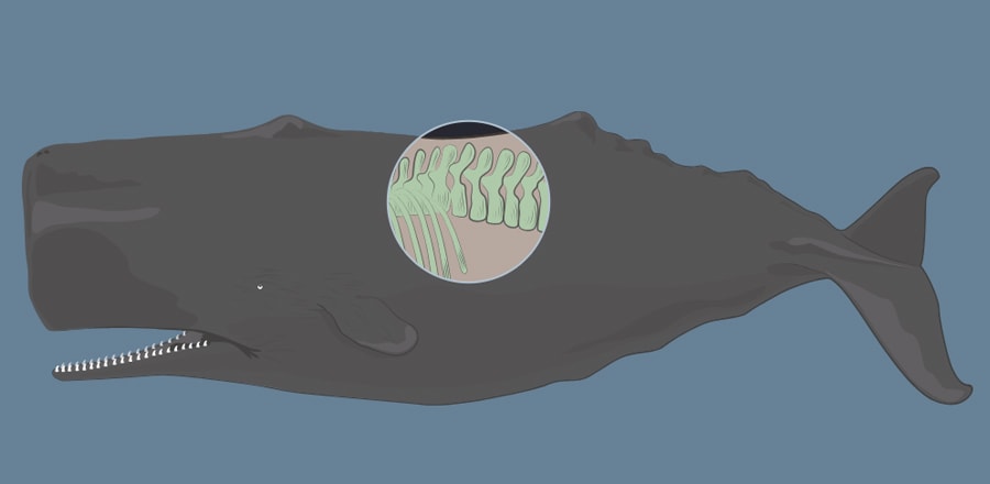 SVG маска, которая позволяет создать интересный эффект "просвечивания" кашалота, как на рентгене
 HTML
<svg xmlns="http://www.w3.org/2000/svg" xmlns:xlink="http://www.w3.org/1999/xlink">
  <rect width="100%" height="100%" fill="#678196"/>
    <image xmlns:xlink="http://www.w3.org/1999/xlink" xlink:href="https://druart.github.io/web/images/svg/cachalote.svg" width="100%" height="100%"/>
</svg>

<svg xmlns="http://www.w3.org/2000/svg" xmlns:xlink="http://www.w3.org/1999/xlink">
  <defs>
    <clipPath id="mask">
      <circle id="mask-circle" cx="50%" cy="50%" r="10%" style="fill:#fff"/>
    </clipPath>
  </defs>
  <g clip-path="url(#mask)">
    <rect width="100%" height="100%" fill="#272730"/>
    <image xmlns:xlink="http://www.w3.org/1999/xlink" xlink:href="https://druart.github.io/web/images/svg/cachalote_xrays.svg" width="100%" height="100%"/>
  </g>
  <circle id="circle-border" cx="50%" cy="50%" r="10%" style="stroke:#b2c3d1; fill:transparent; stroke-width:2;"/>
</svg>
CSS
body {
    height: 100vh;
    margin: 0;
    padding: 0;
    -webkit-text-size-adjust: 100%;
    -webkit-font-smoothing: antialiased;
    box-shadow: 0 0 8px rgba(0,0,0,0.4);
}

svg {
    position: absolute;
    top: 0;
    left: 0;
    right: 0;
    bottom: 0;
    display: block;
    width: 100vw;
    height: 100vh;
}
JS
var svgElement = document.querySelector('svg');
var maskedElement = document.querySelector('#mask-circle');
var circleFeedback = document.querySelector('#circle-border');
var svgPoint = svgElement.createSVGPoint();

function cursorPoint(e, svg) {
    svgPoint.x = e.clientX;
    svgPoint.y = e.clientY;
    return svgPoint.matrixTransform(svg.getScreenCTM().inverse());
}

function update(svgCoords) {
    maskedElement.setAttribute('cx', svgCoords.x);
    maskedElement.setAttribute('cy', svgCoords.y);
    circleFeedback.setAttribute('cx', svgCoords.x);
    circleFeedback.setAttribute('cy', svgCoords.y);
}

window.addEventListener('mousemove', function(e) {
  update(cursorPoint(e, svgElement));
}, false);

document.addEventListener('touchmove', function(e) {
    e.preventDefault();
    var touch = e.targetTouches[0];
    if (touch) {
        update(cursorPoint(touch, svgElement));
    }
}, false);
