Анимация смены дня и ночи
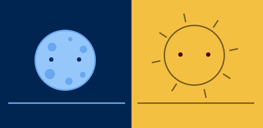 Анимация смены дня и ночи в режиме реального времени, так и с ползунком, который ускорит этот процесс. Луна и ночь сменяются солнцем и днем.
 HTML
<div id="world">
    <div id="sun">
        <div class="sunbeams">
          <div class="beam beam1"></div>
          <div class="beam beam2"></div>
          <div class="beam beam3"></div>
          <div class="beam beam4"></div>
          <div class="beam beam5"></div>
          <div class="beam beam6"></div>
          <div class="beam beam7"></div>
          <div class="beam beam8"></div>
        </div>
        <div class="eyes">
            <div class="eyes-l"></div>
            <div class="eyes-r"></div>
        </div>
    </div>
    <div id="moon">
        <div class="crater crater1"></div>
        <div class="crater crater2"></div>
        <div class="crater crater3"></div>
        <div class="crater crater4"></div>
        <div class="crater crater5"></div>
        <div class="crater crater6"></div>
        <div class="eyes">
            <div class="eyes-l"></div>
            <div class="eyes-r"></div>
        </div>
    </div>
</div>

<div id="slidecontainer">
  <input type="range" min="0" max="24" value="1" class="slider" id="myRange">
  <p class="simtime">Simulated time: <span id="demo"></span>:00</p>
</div>

<div id="toggle-label-left">Real-time animation</div>
<div class="toggle">
  <div class="switch"></div>
</div>
<div id="toggle-label-right">Slider-based animation</div>
CSS
body {
    width:100%;
  height:100%;
    margin:0;
    padding:0;
    background-color:#eee;
  transition: background-color 0.5s ease;
  padding-bottom:100px;
  text-align:center;
}
#world {
    width:400px;
    height:400px;
    display: inline-block;
    position:relative;
    overflow:hidden;
    border-bottom: 5px solid #7a6021;
    transition: border 0.5s ease;
}
#sun {
    height: 200px;
    width: 200px;
    background-color: #f4c042;
    border-radius: 50%;
    display: inline-block;
    position:absolute;
    top:50px;
    left:90px;
    border:5px solid #7a6021;
    transition: top 0.1s ease;
}
#moon {
    height: 200px;
    width: 200px;
    background-color: #95c7fa;
    border-radius: 50%;
    display: inline-block;
    position:absolute;
    top:50px;
    left:90px;
    border:5px solid #67a8f1;
    transition: top 0.1s ease;
}
.crater {
    position:absolute;
    border-radius:50%;
    background:#67a8f1;
}
.crater1 {
    width:30px;
    height:30px;
    top:40px;
    left:40px;
}
.crater2 {
    width: 15px;
    height: 15px;
    top: 20px;
    left: 110px;
}
.crater3 {
    width: 25px;
    height: 25px;
    top: 50px;
    left: 150px;
}
.crater4 {
    width: 35px;
    height: 35px;
    top: 130px;
    left: 30px;
}
.crater5 {
    width: 25px;
    height: 25px;
    top: 160px;
    left: 100px;
}
.crater6 {
    width: 20px;
    height: 20px;
    top: 140px;
    left: 150px;
}
.beam {
    width:5px;
    height:30px;
    background:#7a6021;
    position:absolute;
}

.beam1 {
    transform: rotate(0deg);
    top:-20px;
    left:120px;
}
.beam2 {
    transform: rotate(45deg);
    top:20px;
    left:220px;
}
.beam3 {
    transform: rotate(90deg);
    top:110px;
    left:250px;
}
.beam4 {
    transform: rotate(135deg);
    top:200px;
    left:220px;
}
.beam5 {
    transform: rotate(180deg);
    top:240px;
    left:120px;
}
.beam6 {
    transform: rotate(225deg);
    top:200px;
    left:20px;
}
.beam7 {
    transform: rotate(270deg);
    top:110px;
    left:-10px;
}
.beam8 {
    transform: rotate(315deg);
    top:20px;
    left:20px;
}
.sunbeams {
    width: 250px;
    height: 250px;
    position: absolute;
    top: -25px;
    left: -25px;
    animation: spin 28s linear 0s infinite;
}
@keyframes spin {
    from { transform: rotate(0deg); }
    to { transform: rotate(360deg); }
}
@keyframes blink {
    0% { height: 15px; top:0; }
    99% { height: 15px; top:0; }
    100% { height: 0px; top:7px; }
}
.eyes {
    position: absolute;
    width: 110px;
    height: 20px;
    top: 90px;
    left: 45px;
}
.eyes-l {
    width:15px;
    height:15px;
    border-radius:50%;
    position:absolute;
    top:0;
    left:0;
    animation: blink 7s linear 0s infinite;
}
.eyes-r {
    width:15px;
    height:15px;
    border-radius:50%;
    position:absolute;
    top:0;
    right:0;
    animation: blink 7s linear 0s infinite;
}
#moon .eyes-l, #moon .eyes-r {
    background:#0f2964;
}
#sun .eyes-l, #sun .eyes-r {
    background:#4f0504;
}
/* Slider */
#slidecontainer {
    margin-top: 30px;
    margin-bottom: 30px;
    width: 100%;
    height: auto;
    max-height: 0px;
    overflow:hidden;
    transition: max-height 0.8s ease;
}
.slider {
    -webkit-appearance: none;
    width: 90%;
    max-width:650px;
    height: 4px;
    background: #d3d3d3;
    outline: none;
    opacity: 0.7;
    -webkit-transition: .2s;
    transition: opacity .2s;
}
.slider:hover {
    opacity: 1;
}
.slider::-webkit-slider-thumb {
    -webkit-appearance: none;
    appearance: none;
    width: 25px;
    height: 25px;
    background: lightblue;
    cursor: pointer;
    border-radius:50%;
}
.slider::-moz-range-thumb {
    width: 25px;
    height: 25px;
    background: lightblue;
    cursor: pointer;
}
.simtime {
    color: #d3d3d3;
    font-family: sans-serif;
    font-weight: bold;
    text-transform: uppercase;
    letter-spacing: 1px;
    font-size: 90%;
}
/* Toggle switch */
.toggle {
    background-color: #eee;
    border: 1px solid #fff;
    border-radius: 42px;
    box-shadow: 0 0 5px #ddd;
    box-sizing: border-box;
    height: 42px;
    transition: 400ms cubic-bezier(0, 0, 0, 1);
    width: 70px;
    display: inline-block;
    vertical-align: middle;
}
.toggle.on {
    background: lightblue;
    padding-left: 28px;
}
.switch {
    background: #fff;
    border: 1px solid gray;
    border-radius: 100%;
    height: 36px;
    margin: 2px;
    position: relative;
    width: 36px;
    z-index: 9;
}
#toggle-label-left, #toggle-label-right {
    display: inline;
    color: #d3d3d3;
    font-family: sans-serif;
    font-weight: bold;
    text-transform: uppercase;
    letter-spacing: 1px;
    font-size: 90%;
    margin:0 10px;
}
#toggle-label-right {
    opacity:0.2;
}
JS
//this for slider based - setting up slider
var slider = document.getElementById("myRange");
var output = document.getElementById("demo");
output.innerHTML = slider.value;

slider.oninput = function() {
  output.innerHTML = this.value;
}

//Get time funtion - it passes time to the animation control function gettimeofday
function updatetime() {
    var now = new Date();
    gettimeofday(now.getHours());
    //reset the slider to the actual time
    slider.value = now.getHours();
    output.innerHTML = now.getHours();
}

//Animation control function - you could split these into rise and set funtions but I have'nt done that yet
function gettimeofday(now) {
    hour = now;
    if (hour >= 0 && hour < 5) {
        timeofdaypercent = hour - 0;
        timeofdaypercent = (timeofdaypercent / 4) * 100;
        var moon = document.getElementById('moon');
        var moonheight = (timeofdaypercent * 2.5) + 50;
        moon.style.top = moonheight + "px";
        var sun = document.getElementById('sun');
        sun.style.top = "450px";
        document.body.style.backgroundColor = "#002551";
        var world = document.getElementById('world');
        world.style.borderBottom = "5px solid #67a8f1";
        document.getElementById('toggle-label-left').style.color = "#d3d3d3";
        document.getElementById('toggle-label-right').style.color = "#d3d3d3";
        document.getElementsByClassName('simtime')[0].style.color = "#d3d3d3";
    }
    if (hour >= 5 && hour < 12) {
        timeofdaypercent = hour - 5;
        timeofdaypercent = (timeofdaypercent / 7) * 100;
        var sun = document.getElementById('sun');
        var sunheight = 300 - (timeofdaypercent * 2.9);
        sun.style.top = sunheight + "px";
        var moon = document.getElementById('moon');
        moon.style.top = "400px";
        document.body.style.backgroundColor = "#f4c042";
        var world = document.getElementById('world');
        world.style.borderBottom = "5px solid #7a6021";
        document.getElementById('toggle-label-left').style.color = "#7a6021";
        document.getElementById('toggle-label-right').style.color = "#7a6021";
        document.getElementsByClassName('simtime')[0].style.color = "#7a6021";
    }
    if (hour >= 12 && hour < 19) {
        timeofdaypercent = hour - 12;
        timeofdaypercent = (timeofdaypercent / 7) * 100;
        var sun = document.getElementById('sun');
        var sunheight = (timeofdaypercent * 2.9) + 50;
        sun.style.top = sunheight + "px";
        var moon = document.getElementById('moon');
        moon.style.top = "400px";
        document.body.style.backgroundColor = "#f4c042";
        var world = document.getElementById('world');
        world.style.borderBottom = "5px solid #7a6021";
        document.getElementById('toggle-label-left').style.color = "#7a6021";
        document.getElementById('toggle-label-right').style.color = "#7a6021";
        document.getElementsByClassName('simtime')[0].style.color = "#7a6021";
    }
    if (hour >= 19 && hour <= 24) {
        timeofdaypercent = hour - 20;
        timeofdaypercent = (timeofdaypercent / 5) * 100;
        var moon = document.getElementById('moon');
        var moonheight = 200 - (timeofdaypercent * 2.5) + 50;
        moon.style.top = moonheight + "px";
        var sun = document.getElementById('sun');
        sun.style.top = "450px";
        document.body.style.backgroundColor = "#002551";
        var world = document.getElementById('world');
        world.style.borderBottom = "5px solid #67a8f1";
        document.getElementById('toggle-label-left').style.color = "#d3d3d3";
        document.getElementById('toggle-label-right').style.color = "#d3d3d3";
        document.getElementsByClassName('simtime')[0].style.color = "#d3d3d3";
    }
}


//Start the loop going based of real time
updatetime();
var timeloop = setInterval(updatetime, 1000);

//Toggle switch functions
var togglestate=0;
document.getElementsByClassName('toggle')[0].onclick = function() {
  this.classList.toggle('on');
  if (togglestate == 0) {
      togglestate = 1;
      clearInterval(timeloop);
      slider.oninput = function() {
      output.innerHTML = this.value;
      gettimeofday(this.value);
    }
    document.getElementById('slidecontainer').style.maxHeight = "300px";
    document.getElementById('toggle-label-left').style.opacity = "0.2";
    document.getElementById('toggle-label-right').style.opacity = "1";
  } else if (togglestate == 1) {
      togglestate = 0;
      updatetime();
      timeloop = setInterval(updatetime, 1000);
      slider.oninput = null;
    document.getElementById('slidecontainer').style.maxHeight = "0px";
    document.getElementById('toggle-label-left').style.opacity = "1";
    document.getElementById('toggle-label-right').style.opacity = "0.2";
  }
}