Динамический 3D текст
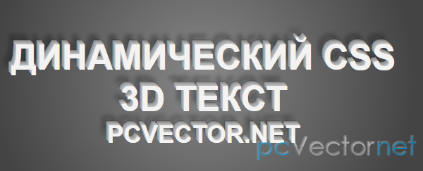
В статье посмотрим как можно сделать динамический (изменяющийся) 3D текст в зависимости от положения курсора мыши.
HTML
<div id="text">
    <h1>Динамический CSS 3D текст</h1>
    <h2>pcvector.net</h2>
</div>
CSS
#text {
    position:absolute;
    width:600px;
    height:120px;
    left:50%;
    top:50%;
    margin-left:-300px;
    margin-top:-60px;
    text-align:center;
    text-transform:uppercase;
    -webkit-tranform:translateZ(0);
    -webkit-transition-duration:0.05s;
    -moz-tranform:translateZ(0);
    color:#f3f3f3;
    text-shadow:0 0 1px rgba(0,0,0,.2);
}
JS
<script type="text/jаvascript">
var text = document.getElementById('text'),
    body = document.body,
    steps = 7;
function threedee (e) {
    var x = Math.round(steps / (window.innerWidth / 2) * (window.innerWidth / 2 - e.clientX)),
        y = Math.round(steps / (window.innerHeight / 2) * (window.innerHeight / 2 - e.clientY)),
        shadow = '',
        color = 190,
        radius = 3,
        i;

    for (i=0; i<steps; i++) {
        tx = Math.round(x / steps * i);
        ty = Math.round(y / steps * i);
        if (tx || ty) {
            color -= 3 * i;
            shadow += tx + 'px ' + ty + 'px 0 rgb(' + color + ', ' + color + ', ' + color + '), ';
        }
    }
    shadow += x + 'px ' + y + 'px 1px rgba(0,0,0,.2), ' + x*2 + 'px ' + y*2 + 'px 6px rgba(0,0,0,.3)';

    text.style.textShadow = shadow;
    text.style.webkitTransform = 'translateZ(0) rotateX(' + y*1.5 + 'deg) rotateY(' + -x*1.5 + 'deg)';
    text.style.MozTransform = 'translateZ(0) rotateX(' + y*1.5 + 'deg) rotateY(' + -x*1.5 + 'deg)';
}
document.addEventListener('mousemove', threedee, false);
</script>
И в итоге получим 3D эффект, который работает в Chrome и Safari, а также в Firefox.
Ссылки