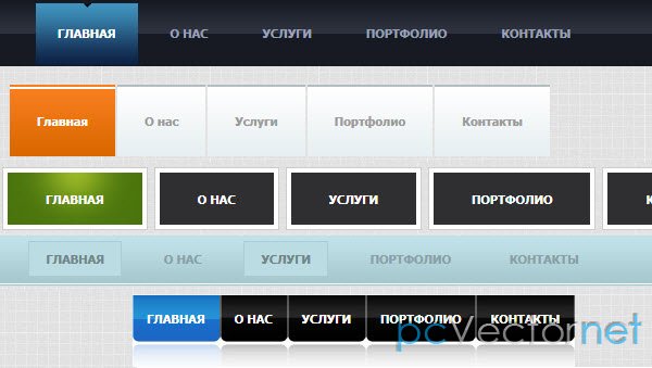
Улетное куфонизированное меню
Непугайтесь. Меню использующее шрифты с помощью cufon-yui.js, но с очень классным уплывающим (улетающим) эффектом на всю страницу.
HTML
Создадим ненумерованный список и DIV-ы для описания пунктов меню.
<div id="slidingMenuDesc" class="slidingMenuDesc">
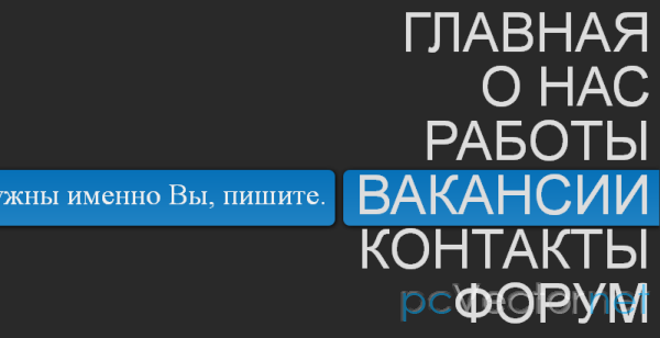
<div><span>Вся наша история.</span></div>
<div><span>Посмотрите наше портфолио и сделайте свой выбор.</span></div>
<div><span>Нам нужны именно Вы, пишите.</span></div>
<div><span>Свяжитесь с нами и мы не подведем. </span></div>
<div><span>На форуме мы ответим на любые ваши вопросы. </span></div>
</div>
<ul id="slidingMenu" class="slidingMenu">
<li><a href="#">Главная</a></li>
<li><a href="#">О нас</a></li>
<li><a href="#">Работы</a></li>
<li><a href="#">Вакансии</a></li>
<li><a href="#">Контакты</a></li>
<li><a href="#">Форум</a></li>
</ul>CSS
.slidingMenu {
    position: absolute;
    height:410px;
    width: 410px;
    top:40px;
    overflow:hidden;
    right:1px;
    font-family: Arial, Helvetica, sans-serif;
}
.slidingMenu li {
    display:block;
    float:right;
    clear:both;
    position:relative;
    overflow:hidden;
}
.slidingMenu li.move {
    width: 9px;
    height: 68px;
    right:0px;
    padding-right:10px;
    margin-top:2px;
    z-index: 8;
    position: absolute;
    background: #2183c4;
    background:
        -webkit-gradient(
            linear,
            left top,
            left bottom,
            from(#0771b8),
            to(#2183c4)
        );
    background:
        -moz-linear-gradient(
            top,
            #0771b8,
            #2183c4
        );
    -moz-border-radius: 8px 0px 0px 8px;
    -webkit-border-top-left-radius: 8px;
    -webkit-border-bottom-left-radius: 8px;
    border-top-left-radius: 8px;
    border-bottom-left-radius: 8px;
    -moz-box-shadow:1px 1px 5px #000;
    -webkit-box-shadow:1px 1px 5px #000;
    box-shadow:1px 1px 5px #000;
    }
.slidingMenu li a {
    font-size:66px;
    text-transform:uppercase;
    text-decoration: none;
    color: #ddd;
    outline: none;
    text-indent:5px;
    z-index: 10;
    display: block;
    float: right;
    height: 66px;
    line-height: 66px;
    position: relative;
    overflow: hidden;
    padding-right:10px;
}
/* Descriptions */
.slidingMenuDesc{
    margin-top:40px;
    position:relative;
}
.slidingMenuDesc div{
    background: #2183c4;
    background:
        -webkit-gradient(
            linear,
            left top,
            left bottom,
            from(#0771b8),
            to(#2183c4)
        );
    background:
        -moz-linear-gradient(
            top,
            #0771b8,
            #2183c4
        );
    height: 68px;
    padding-right:5px;
    left:-5px;
    width:0px;
    margin-top:2px;
    overflow:hidden;
    position:absolute;
    -moz-box-shadow:1px 1px 5px #000;
    -webkit-box-shadow:1px 1px 5px #000;
    box-shadow:1px 1px 5px #000;
    -moz-border-radius: 0px 8px 8px 0px;
    -webkit-border-top-right-radius: 8px;
    -webkit-border-bottom-right-radius: 8px;
    border-top-right-radius: 8px;
    border-bottom-right-radius: 8px;
}
.slidingMenuDesc div span {
    font-size:36px;
    color: #f0f0f0;
    text-indent:5px;
    z-index: 10;
    display: block;
    height: 66px;
    line-height: 66px;
    position:absolute;
    right:10px;
    margin-left:5px;
    top:-3px;
}
JS
В шапке подключаем jQuery, easing (для эффектов) и скрипт cufon генерирующий наш кириллический шрифт PragmaticaCTT
<script type="text/jаvascript" src="http://ajax.googleapis.com/ajax/libs/jquery/1.5.2/jquery.min.js"></script>
<script src="jquery.easing.1.3.js" type="text/jаvascript"></script>
<script src="cufon-yui.js" type="text/jаvascript"></script>
<script src="PragmaticaCTT_400.font.js" type="text/jаvascript"></script>$(function() {
Cufon.replace('a, span').CSS.ready(function() {
var $menu = $("#slidingMenu");
/**
* первый пункт меню,
* который выбран по умолчанию
*/
var $selected = $menu.find('li:first');
/**
* это абсолютный элемент,
* который будет перемещаться по пунктам меню
* Он будет иметь ширину выбранного элемента
* и параметр top - расстояние до пункта над ним
*/
var $moving = $('<li />',{
className : 'move',
top : $selected[0].offsetTop + 'px',
width : $selected[0].offsetWidth + 'px'
});
/**
* каждый скользящий div (с описаниями) будет иметь тот же top
* как и соответсвующий пункт меню
*/
$('#slidingMenuDesc > div').each(function(i){
var $this = $(this);
$this.css('top',$menu.find('li:nth-child('+parseInt(i+2)+')')[0].offsetTop + 'px');
});
/**
* добавляем абсолютный div к меню;
* когда мы отводим мышь с меню
* абсолютный div перемещается вверх (как при инициализации);
*/
$menu.bind('mouseleave',function(){
moveTo($selected,400);
})
.append($moving)
.find('li')
.not('.move')
.bind('mouseenter',function(){
var $this = $(this);
var offsetLeft = $this.offset().left - 20;
//slide in the description
$('#slidingMenuDesc > div:nth-child('+ parseInt($this.index()) +')').stop(true).animate({'width':offsetLeft+'px'},400, 'easeOutExpo');
//move the absolute div to this item
moveTo($this,400);
})
.bind('mouseleave',function(){
var $this = $(this);
var offsetLeft = $this.offset().left - 20;
//slide out the description
$('#slidingMenuDesc > div:nth-child('+ parseInt($this.index()) +')').stop(true).animate({'width':'0px'},400, 'easeOutExpo');
});;
/**
* двигаем абсолютный div,
* с определенной скоростью,
* на позицию $elem
*/
function moveTo($elem,speed){
$moving.stop(true).animate({
top : $elem[0].offsetTop + 'px',
width : $elem[0].offsetWidth + 'px'
}, speed, 'easeOutExpo');
}
}) ;
});Ссылки