Пользовательское оформление input
Плагин customInput позволит оформить тег input так, как вздумается дизайнеру.
HTML
Пример разметки взят из файла index.html:
<form action="#" method="post">
<fieldset>
<legend>Какой жанр Вы предпочитаете?</legend>
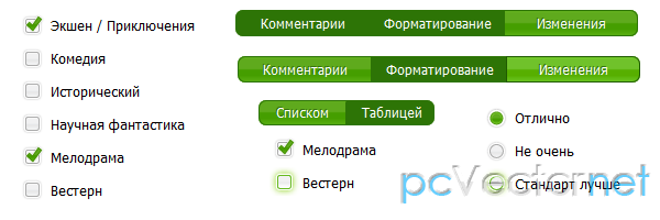
<input type="checkbox" name="genre" id="action" value="action" />
<label for="action">Экшен / Приключения</label>
<input type="checkbox" name="genre" id="comedy" value="comedy" />
<label for="comedy">Комедия</label>
<input type="checkbox" name="genre" id="check-3" value="epic" />
<label for="check-3">Исторический</label>
<input type="checkbox" name="genre" id="science" value="science" />
<label for="science">Научная фантастика</label>
<input type="checkbox" name="genre" id="romance" value="romance" />
<label for="romance">Мелодрама</label>
<input type="checkbox" name="genre" id="western" value="western" />
<label for="western">Вестерн</label>
</fieldset>
<fieldset>
<legend>Как вам пользовательское оформление input?</legend>
<input type="radio" name="opinions" id="totally" value="totally" />
<label for="totally">Отлично</label>
<input type="radio" name="opinions" id="no-way" value="no-way" />
<label for="no-way">Не очень</label>
<input type="radio" name="opinions" id="whats-caddyshack" value="whats-caddyshack" />
<label for="whats-caddyshack">Стандарт лучше</label>
</fieldset>
<fieldset>
<input type="submit" name="submit" value="Сбросить" />
</fieldset>
</form>CSS
Стили из файла enhanced.css:
/* page styles */
	body {
	    font-size:62.5%;
	    margin:100px!important;
	}
	fieldset {
	    padding:1em 15px;
	}
	legend {
	    font-size:1.4em;
	    font-weight:bold;
	    padding:.2em 5px;
	}
	/* Custom checkboxes,radios */
	/* wrapper divs */
	.custom-checkbox,.custom-radio {
	    position:relative;
	}
	/* input,label positioning */
	.custom-checkbox input,.custom-radio input {
	    position:absolute;
	    left:2px;
	    top:2px;
	    margin:0;
	}
	.custom-checkbox label,.custom-radio label {
	    display:block;
	    position:relative;
	    font-size:1.3em;
	    padding-right:1em;
	    line-height:1;
	    padding:.5em 0 .5em 30px;
	    margin:0 0 .3em;
	    cursor:pointer;
	}
	/* states */
	.custom-checkbox label {
	    background:url(../images/checkbox.gif) no-repeat;
	}
	.custom-radio label {
	    background:url(../images/radiobutton.gif) no-repeat;
	}
	.custom-checkbox label,.custom-radio label {
	    background-position:-10px -14px;
	}
	.custom-checkbox label.hover,.custom-checkbox label.focus,.custom-radio label.hover,.custom-radio label.focus {
	    background-position:-10px -114px;
	}
	.custom-checkbox label.checked,.custom-radio label.checked {
	    background-position:-10px -214px;
	}
	.custom-checkbox label.checkedHover,.custom-checkbox label.checkedFocus {
	    background-position:-10px -314px;
	}
	.custom-checkbox label.focus,.custom-radio label.focus {
	    outline:1px dotted #ccc;
	}
	/*toggle button examples*/
	#view {
	    width:160px;
	    display:block;
	}
	#view .custom-checkbox,#view .custom-radio {
	    width:50%;
	    float:left;
	}
	#show {
	    width:370px;
	    display:block;
	    clear:left;
	}
	#show .custom-checkbox,#show .custom-radio {
	    width:33%;
	    float:left;
	}
	.toggle label {
	    border-collapse:collapse;
	}
	.toggle .custom-checkbox label,.toggle .custom-radio label {
	    padding:.4em 1em;
	    border:1px solid #aaa;
	    background-color:#eee;
	    text-align:center;
	    cursor:pointer;
	    font-size:1.2em;
	    width:auto;
	    overflow:visible;
	    background:#459e00 url(../images/button-green.gif) no-repeat left center;
	    color:#fff;
	    border-color:#2d7406;
	    text-shadow:-1px -1px 0 #37730e;
	}
	.toggle .custom-checkbox label.hover,.toggle .custom-checkbox label.focus,.toggle .custom-radio label.hover,.toggle .custom-radio label.focus {
	    background-position:right center;
	    border-color:#205b00;
	}
	.toggle .custom-checkbox label.checked,.toggle .custom-radio label.checked,.toggle .custom-checkbox label.checkedHover,.toggle .custom-checkbox label.checkedFocus {
	    background:#2d7406;
	    border-color:#2d7406;
	}
	.toggle .first label {
	    -moz-border-radius-bottomleft:7px;
	    -webkit-border-bottom-left-radius:7px;
	    border-bottom-left-radius:7px;
	    -moz-border-radius-topleft:7px;
	    -webkit-border-top-left-radius:7px;
	    border-top-left-radius:7px;
	}
	.toggle .last label {
	    -moz-border-radius-bottomright:7px;
	    -webkit-border-bottom-right-radius:7px;
	    border-bottom-right-radius:7px;
	    -moz-border-radius-topright:7px;
	    -webkit-border-top-right-radius:7px;
	    border-top-right-radius: 7px;
	}
JS
Скрипты на странице мы подгружаем с помощью js фреймворка enhance.js, которая сначала проводит тест браузера на поддержку jаvascript и CSS, до того, как будут загружены на страницу дополнительные скрипты и стили:
    <script type="text/jаvascript" src="js/enhance.js"></script>
	    <script type="text/jаvascript">
	        // Run capabilities test
	        enhance({
	            loadScripts: [
	                'js/jquery.min.js',
	                'js/jQuery.customInput.js',
	                'js/example.js'
	            ],
	            loadStyles: ['css/enhanced.css']
	        });
	    </script>
Если тест пройден, то грузим jquery, плагин customInput и скрипт инициализации плагина, затем грузится стиль нашего меню.
Содержимое файла example.js:
$(function(){
	    $('input').customInput();

	    $('.toggle').each(function(){
	        $('div:first',this).addClass('first');
	        $('div:last',this).addClass('last');
	    });

	});