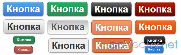
CSS3 кнопки с бликом
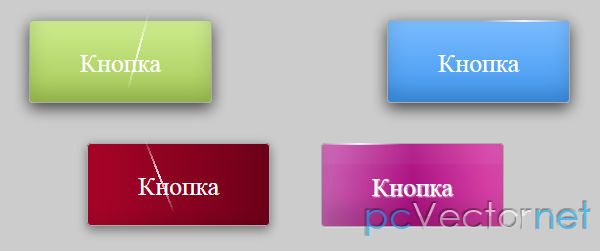
CSS3 кнопки для сайта объединяющие в себе свойства box-shadow, border-radius и анимацию для создания эффекта блеска при наведении мышки. Снова замечу, что в старых браузерах должным образом этот эффект не будет.
HTML
Начнем с разметки наших кнопок:<a href="#" class="button green"><div class="light"></div>Кнопка</a>
<a href="#" class="button red"><div class="light"></div>Кнопка</a>
<a href="#" class="button blue"><div class="light"></div>Кнопка</a>
<a href="#" class="button yellow"><div class="light"></div>Кнопка</a>
<a href="#" class="button grey"><div class="light"></div>Кнопка</a>
<a href="#" class="button black"><div class="light"></div>Кнопка</a>
<a href="#" class="button brown"><div class="light"></div>Кнопка</a>
<a href="#" class="button darkred"><div class="light"></div>Кнопка</a>
<a href="#" class="button purple"><div class="light"></div>Кнопка</a>Также, каждая из кнопок имеет ещё один DIV блок внутри анкора, который будет отвечать за блеск.
CSS
Данный класс писывает общие черты всех кнопок: отступы, размеры, границы, тени, анимацию и т.д.:hover - свойства для кнопки при наведении на неё курсора.
:active - свойства для кнопки в нажатом состоянии.
.button{
	height:2em;
	padding:15px 50px;
	margin:20px 40px;
	cursor:pointer;
	display:inline-block;
	color:#FFF;
	font-size:1em;
	border:1px solid #eee;
	background:#eee;
	border-radius:4px;
	line-height:2em;
	border:1px solid #aaa;
	text-decoration:none;

	-webkit-transition: all 0.3s linear;
     -khtml-transition: all 0.3s linear;
       -moz-transition: all 0.3s linear;
         -o-transition: all 0.3s linear;
            transition: all 0.3s linear;
}
.button:hover{
	-webkit-box-shadow:rgba(0,0,0,0.7) 0px 5px 15px, inset rgba(0,0,0,0.15) 0px -10px 20px;
     -khtml-box-shadow:rgba(0,0,0,0.7) 0px 5px 15px, inset rgba(0,0,0,0.15) 0px -10px 20px;
       -moz-box-shadow:rgba(0,0,0,0.7) 0px 5px 15px, inset rgba(0,0,0,0.15) 0px -10px 20px;
         -o-box-shadow:rgba(0,0,0,0.7) 0px 5px 15px, inset rgba(0,0,0,0.15) 0px -10px 20px;
            box-shadow:rgba(0,0,0,0.7) 0px 5px 15px, inset rgba(0,0,0,0.15) 0px -10px 20px;
}
.button:active {
    -webkit-box-shadow: rgba(255,255,255,0.25) 0px 1px 0px, inset rgba(255,255,255,0.03) 0px 20px 0px, inset rgba(0,0,0,0.15) 0px -20px 20px, inset rgba(255,255,255,0.05) 0px 20px 20px;
     -khtml-box-shadow: rgba(255,255,255,0.25) 0px 1px 0px, inset rgba(255,255,255,0.03) 0px 20px 0px, inset rgba(0,0,0,0.15) 0px -20px 20px, inset rgba(255,255,255,0.05) 0px 20px 20px;
       -moz-box-shadow: rgba(255,255,255,0.25) 0px 1px 0px, inset rgba(255,255,255,0.03) 0px 20px 0px, inset rgba(0,0,0,0.15) 0px -20px 20px, inset rgba(255,255,255,0.05) 0px 20px 20px;
         -o-box-shadow: rgba(255,255,255,0.25) 0px 1px 0px, inset rgba(255,255,255,0.03) 0px 20px 0px, inset rgba(0,0,0,0.15) 0px -20px 20px, inset rgba(255,255,255,0.05) 0px 20px 20px;
            box-shadow: rgba(255,255,255,0.25) 0px 1px 0px, inset rgba(255,255,255,0.03) 0px 20px 0px, inset rgba(0,0,0,0.15) 0px -20px 20px, inset rgba(255,255,255,0.05) 0px 20px 20px;
    text-shadow:1px 1px 1px #eee;
}/***********************************************************************
* Green Background
**********************************************************************/
.green{
background: #cdeb8e; /* Old browsers */
background: -moz-linear-gradient(top, #cdeb8e 0%, #a5c956 100%); /* FF3.6+ */
background: -webkit-gradient(linear, left top, left bottom, color-stop(0%,#cdeb8e), color-stop(100%,#a5c956)); /* Chrome,Safari4+ */
background: -webkit-linear-gradient(top, #cdeb8e 0%,#a5c956 100%); /* Chrome10+,Safari5.1+ */
background: -o-linear-gradient(top, #cdeb8e 0%,#a5c956 100%); /* Opera 11.10+ */
background: -ms-linear-gradient(top, #cdeb8e 0%,#a5c956 100%); /* IE10+ */
background: linear-gradient(top, #cdeb8e 0%,#a5c956 100%); /* W3C */
filter: progid:DXImageTransform.Microsoft.gradient( startColorstr='#cdeb8e', endColorstr='#a5c956',GradientType=0 ); /* IE6-9 */
}
/***********************************************************************
* Red Background
**********************************************************************/
.red{
background: #ff3019; /* Old browsers */
background: -moz-linear-gradient(top, #ff3019 0%, #cf0404 100%); /* FF3.6+ */
background: -webkit-gradient(linear, left top, left bottom, color-stop(0%,#ff3019), color-stop(100%,#cf0404)); /* Chrome,Safari4+ */
background: -webkit-linear-gradient(top, #ff3019 0%,#cf0404 100%); /* Chrome10+,Safari5.1+ */
background: -o-linear-gradient(top, #ff3019 0%,#cf0404 100%); /* Opera 11.10+ */
background: -ms-linear-gradient(top, #ff3019 0%,#cf0404 100%); /* IE10+ */
background: linear-gradient(top, #ff3019 0%,#cf0404 100%); /* W3C */
filter: progid:DXImageTransform.Microsoft.gradient( startColorstr='#ff3019', endColorstr='#cf0404',GradientType=0 ); /* IE6-9 */
}
/***********************************************************************
* Yellow Background
**********************************************************************/
.yellow{
background: #ffd65e; /* Old browsers */
background: -moz-linear-gradient(top, #ffd65e 0%, #febf04 100%); /* FF3.6+ */
background: -webkit-gradient(linear, left top, left bottom, color-stop(0%,#ffd65e), color-stop(100%,#febf04)); /* Chrome,Safari4+ */
background: -webkit-linear-gradient(top, #ffd65e 0%,#febf04 100%); /* Chrome10+,Safari5.1+ */
background: -o-linear-gradient(top, #ffd65e 0%,#febf04 100%); /* Opera 11.10+ */
background: -ms-linear-gradient(top, #ffd65e 0%,#febf04 100%); /* IE10+ */
background: linear-gradient(top, #ffd65e 0%,#febf04 100%); /* W3C */
filter: progid:DXImageTransform.Microsoft.gradient( startColorstr='#ffd65e', endColorstr='#febf04',GradientType=0 ); /* IE6-9 */
}
/***********************************************************************
* Grey Background
**********************************************************************/
.grey{
background: rgb(238,238,238); /* Old browsers */
background: -moz-linear-gradient(left, rgba(238,238,238,1) 0%, rgba(204,204,204,1) 100%); /* FF3.6+ */
background: -webkit-gradient(linear, left top, right top, color-stop(0%,rgba(238,238,238,1)), color-stop(100%,rgba(204,204,204,1))); /* Chrome,Safari4+ */
background: -webkit-linear-gradient(left, rgba(238,238,238,1) 0%,rgba(204,204,204,1) 100%); /* Chrome10+,Safari5.1+ */
background: -o-linear-gradient(left, rgba(238,238,238,1) 0%,rgba(204,204,204,1) 100%); /* Opera 11.10+ */
background: -ms-linear-gradient(left, rgba(238,238,238,1) 0%,rgba(204,204,204,1) 100%); /* IE10+ */
background: linear-gradient(left, rgba(238,238,238,1) 0%,rgba(204,204,204,1) 100%); /* W3C */
filter: progid:DXImageTransform.Microsoft.gradient( startColorstr='#eeeeee', endColorstr='#cccccc',GradientType=1 ); /* IE6-9 */
}
/***********************************************************************
* Black Background
**********************************************************************/
.black{
background: #7d7e7d; /* Old browsers */
background: -moz-linear-gradient(top, #7d7e7d 0%, #0e0e0e 100%); /* FF3.6+ */
background: -webkit-gradient(linear, left top, left bottom, color-stop(0%,#7d7e7d), color-stop(100%,#0e0e0e)); /* Chrome,Safari4+ */
background: -webkit-linear-gradient(top, #7d7e7d 0%,#0e0e0e 100%); /* Chrome10+,Safari5.1+ */
background: -o-linear-gradient(top, #7d7e7d 0%,#0e0e0e 100%); /* Opera 11.10+ */
background: -ms-linear-gradient(top, #7d7e7d 0%,#0e0e0e 100%); /* IE10+ */
background: linear-gradient(top, #7d7e7d 0%,#0e0e0e 100%); /* W3C */
filter: progid:DXImageTransform.Microsoft.gradient( startColorstr='#7d7e7d', endColorstr='#0e0e0e',GradientType=0 ); /* IE6-9 */
}
/***********************************************************************
* Brown Background
**********************************************************************/
.brown{
background: #f6e6b4; /* Old browsers */
background: -moz-linear-gradient(top, #f6e6b4 0%, #ed9017 100%); /* FF3.6+ */
background: -webkit-gradient(linear, left top, left bottom, color-stop(0%,#f6e6b4), color-stop(100%,#ed9017)); /* Chrome,Safari4+ */
background: -webkit-linear-gradient(top, #f6e6b4 0%,#ed9017 100%); /* Chrome10+,Safari5.1+ */
background: -o-linear-gradient(top, #f6e6b4 0%,#ed9017 100%); /* Opera 11.10+ */
background: -ms-linear-gradient(top, #f6e6b4 0%,#ed9017 100%); /* IE10+ */
background: linear-gradient(top, #f6e6b4 0%,#ed9017 100%); /* W3C */
filter: progid:DXImageTransform.Microsoft.gradient( startColorstr='#f6e6b4', endColorstr='#ed9017',GradientType=0 ); /* IE6-9 */
}
/***********************************************************************
* Blue Background
**********************************************************************/
.blue{
background: #7abcff; /* Old browsers */
background: -moz-linear-gradient(top, #7abcff 0%, #60abf8 44%, #4096ee 100%); /* FF3.6+ */
background: -webkit-gradient(linear, left top, left bottom, color-stop(0%,#7abcff), color-stop(44%,#60abf8), color-stop(100%,#4096ee)); /* Chrome,Safari4+ */
background: -webkit-linear-gradient(top, #7abcff 0%,#60abf8 44%,#4096ee 100%); /* Chrome10+,Safari5.1+ */
background: -o-linear-gradient(top, #7abcff 0%,#60abf8 44%,#4096ee 100%); /* Opera 11.10+ */
background: -ms-linear-gradient(top, #7abcff 0%,#60abf8 44%,#4096ee 100%); /* IE10+ */
background: linear-gradient(top, #7abcff 0%,#60abf8 44%,#4096ee 100%); /* W3C */
filter: progid:DXImageTransform.Microsoft.gradient( startColorstr='#7abcff', endColorstr='#4096ee',GradientType=0 ); /* IE6-9 */
}
/***********************************************************************
* Dark Red Background
**********************************************************************/
.darkred{
background: rgb(169,3,41); /* Old browsers */
background: -moz-linear-gradient(left, rgba(169,3,41,1) 0%, rgba(143,2,34,1) 44%, rgba(109,0,25,1) 100%); /* FF3.6+ */
background: -webkit-gradient(linear, left top, right top, color-stop(0%,rgba(169,3,41,1)), color-stop(44%,rgba(143,2,34,1)), color-stop(100%,rgba(109,0,25,1))); /* Chrome,Safari4+ */
background: -webkit-linear-gradient(left, rgba(169,3,41,1) 0%,rgba(143,2,34,1) 44%,rgba(109,0,25,1) 100%); /* Chrome10+,Safari5.1+ */
background: -o-linear-gradient(left, rgba(169,3,41,1) 0%,rgba(143,2,34,1) 44%,rgba(109,0,25,1) 100%); /* Opera 11.10+ */
background: -ms-linear-gradient(left, rgba(169,3,41,1) 0%,rgba(143,2,34,1) 44%,rgba(109,0,25,1) 100%); /* IE10+ */
background: linear-gradient(left, rgba(169,3,41,1) 0%,rgba(143,2,34,1) 44%,rgba(109,0,25,1) 100%); /* W3C */
filter: progid:DXImageTransform.Microsoft.gradient( startColorstr='#a90329', endColorstr='#6d0019',GradientType=1 ); /* IE6-9 */
}
/***********************************************************************
* Purple Background
**********************************************************************/
.purple{
background: rgb(203,96,179); /* Old browsers */
background: -moz-linear-gradient(left, rgba(203,96,179,1) 0%, rgba(173,18,131,1) 50%, rgba(222,71,172,1) 100%); /* FF3.6+ */
background: -webkit-gradient(linear, left top, right top, color-stop(0%,rgba(203,96,179,1)), color-stop(50%,rgba(173,18,131,1)), color-stop(100%,rgba(222,71,172,1))); /* Chrome,Safari4+ */
background: -webkit-linear-gradient(left, rgba(203,96,179,1) 0%,rgba(173,18,131,1) 50%,rgba(222,71,172,1) 100%); /* Chrome10+,Safari5.1+ */
background: -o-linear-gradient(left, rgba(203,96,179,1) 0%,rgba(173,18,131,1) 50%,rgba(222,71,172,1) 100%); /* Opera 11.10+ */
background: -ms-linear-gradient(left, rgba(203,96,179,1) 0%,rgba(173,18,131,1) 50%,rgba(222,71,172,1) 100%); /* IE10+ */
background: linear-gradient(left, rgba(203,96,179,1) 0%,rgba(173,18,131,1) 50%,rgba(222,71,172,1) 100%); /* W3C */
filter: progid:DXImageTransform.Microsoft.gradient( startColorstr='#cb60b3', endColorstr='#de47ac',GradientType=1 ); /* IE6-9 */
}.light {
display: block;
position: relative;
background: -moz-linear-gradient(left, rgba(255,255,255,0) 0%, rgba(255,255,255,0.9) 50%, rgba(255,255,255,0) 100%); /* FF3.6+ */
background: -webkit-gradient(linear, left top, right top, color-stop(0%,rgba(255,255,255,0)), color-stop(50%,rgba(255,255,255,0.9)), color-stop(100%,rgba(255,255,255,0))); /* Chrome,Safari4+ */
background: -webkit-linear-gradient(left, rgba(255,255,255,0) 0%,rgba(255,255,255,0.9) 50%,rgba(255,255,255,0) 100%); /* Chrome10+,Safari5.1+ */
background: -o-linear-gradient(left, rgba(255,255,255,0) 0%,rgba(255,255,255,0.9) 50%,rgba(255,255,255,0) 100%); /* Opera 11.10+ */
background: -ms-linear-gradient(left, rgba(255,255,255,0) 0%,rgba(255,255,255,0.9) 50%,rgba(255,255,255,0) 100%); /* IE10+ */
background: linear-gradient(left, rgba(255,255,255,0) 0%,rgba(255,255,255,0.9) 50%,rgba(255,255,255,0) 100%); /* W3C */
filter: progid:DXImageTransform.Microsoft.gradient( startColorstr='#00ffffff', endColorstr='#00ffffff',GradientType=1 ); /* IE6-9 */
padding: 1px 9px;
top: -16px;
left: -53px;
height: 0px;
}Для начала создадим DIV блок похожий на блеск света, для этого мы будем использовать CSS градиент фона - яркий в середине и постепенно затухающий на краях.
Теперь добавим анимацию блеска для DIV блока в состоянии наведения на него.
.button:hover .light{

	padding:1px 5px;

    -webkit-animation-name: shine;
    -webkit-animation-duration: 0.6s;
    -webkit-animation-timing-function: linear;
    -khtml-animation-name: shine;
    -khtml-animation-duration: 0.6s;
    -khtml-animation-timing-function: linear;
    -moz-animation-name: shine;
    -moz-animation-duration: 0.6s;
    -moz-animation-timing-function: linear;
    -o-animation-name: shine;
    -o-animation-duration: 0.6s;
    -o-animation-timing-function: linear;
    -webkit-animation-name: shine;
    -webkit-animation-duration: 0.6s;
    -webkit-animation-timing-function: linear;
    left:45px;
}@-webkit-keyframes shine {
0% { top: -15px; left: -48px; }
10% { top: -5px; }
20% { top: 5px; }
30% { top: 15px; }
40% { top: 25px; }
50% { top: 35px; }
60% { top: 25px; }
70% { top: 15px; }
80% { top: 5px; }
90% { top: -5px; }
100% { top:-15px; left:45px; -webkit-transform: rotate(-360deg); }
}
@-khtml-keyframes shine {
0% { top: -15px; left: -48px; }
10% { top: -5px; }
20% { top: 5px; }
30% { top: 15px; }
40% { top: 25px; }
50% { top: 35px; }
60% { top: 25px; }
70% { top: 15px; }
80% { top: 5px; }
90% { top: -5px; }
100% { top:-15px; left:45px; -khtml-transform: rotate(-360deg); }
}
@-moz-keyframes shine {
0% { top: -15px; left: -48px; }
10% { top: -5px; }
20% { top: 5px; }
30% { top: 15px; }
40% { top: 25px; }
50% { top: 35px; }
60% { top: 25px; }
70% { top: 15px; }
80% { top: 5px; }
90% { top: -5px; }
100% { top:-15px; left:45px; -moz-transform: rotate(-360deg); }
}
@-o-keyframes shine {
0% { top: -15px; left: -48px; }
10% { top: -5px; }
20% { top: 5px; }
30% { top: 15px; }
40% { top: 25px; }
50% { top: 35px; }
60% { top: 25px; }
70% { top: 15px; }
80% { top: 5px; }
90% { top: -5px; }
100% { top:-15px; left:45px; -o-transform: rotate(-360deg); }
}
@-keyframes shine {
0% { top: -15px; left: -48px; }
10% { top: -5px; }
20% { top: 5px; }
30% { top: 15px; }
40% { top: 25px; }
50% { top: 35px; }
60% { top: 25px; }
70% { top: 15px; }
80% { top: 5px; }
90% { top: -5px; }
100% { top:-15px; left:45px; transform: rotate(-360deg); }
}Ссылки