SVG morphing с anime.js
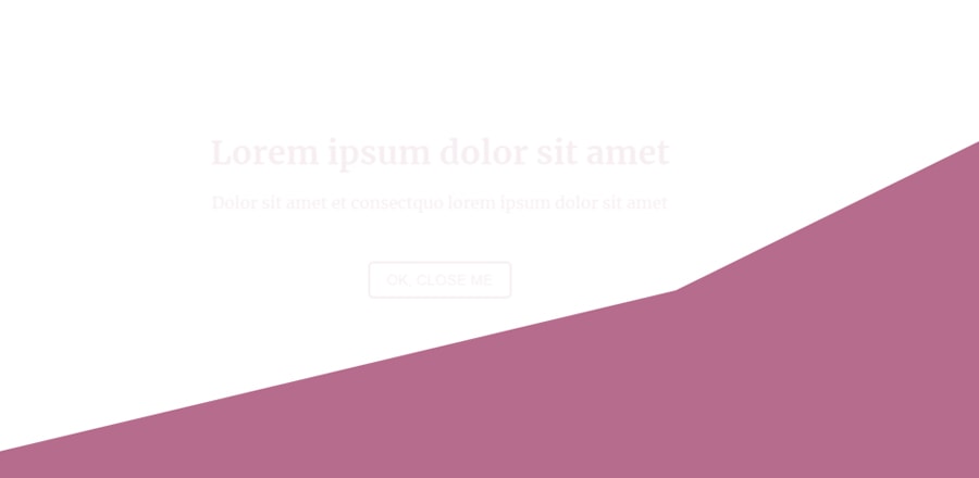 При клике по кнопке плавно из левого верхнего угла раскрывается новый блок. Анимация раскрытия сделана с использованием anime.js, которая анимирует svg
HTML
<section id="my-section">
  <div class="active" id="wrap-cta">
    <button id="cta">Click here, please!</button>
  </div>
  <svg viewBox="0 0 215 110" preserveAspectRatio="none">
    <polygon class="polymorph" points="215,110 0,110 0,0 215,0"></polygon>
  </svg>
  <div class="container">
    <div id="content">
      <h1>Lorem ipsum dolor sit amet</h1>
      <p>Dolor sit amet et consectquo lorem ipsum dolor sit amet</p>
      <button id="close">Ok, close me</button>
    </div>
  </div>
</section>
SCSS
// TYPOGRAPHY
@import url("https://fonts.googleapis.com/css?family=Merriweather:400,400i,700");
$main-font: Merriweather;

// COLORS
$white: #f2f2f2;
$primary: #B66C8D;

// GENERAL
body{
  font-family: $main-font;
  font-size: 16px;
}


// DEMO STYLES
#my-section{
  position: relative;
}

#wrap-cta{
  position: absolute;
  top: 50%;
  left: 50%;
  transform: translate(0, -50%);
  opacity: 0;
  &.active{
    z-index: 2;
    transform: translate(-50%, -50%);
    transition: transform .6s, opacity .6s;
    opacity: 1;
  }
  #cta{
    padding: 1rem 2rem;
    text-transform: uppercase;
    color: $white;
    background: transparent;
    border: 2px solid;
    border-radius: 5px;
    cursor: pointer;
    outline: none;
    -webkit-tap-highlight-color: transparent;
    transition: background .4s;
    &:hover{
      background: rgba($white, .1);
    }
  }
}

svg{
  display: block;
  width: 100%;
  height: 100vh;
  .polymorph {
    fill: $primary;
  }
}

.container{
  position: absolute;
  top: 50%;
  left: 50%;
  transform: translate(-50%, -50%);
  text-align: center;

  #content{
    transform: translateY(-50px);
    opacity: 0;
    color: $primary;
    transition: transform .6s .2s, opacity .6s .2s;
    #close{
      display: inline-block;
      margin-top: 2rem;
      padding: .5rem 1rem;
      text-transform: uppercase;
      font-size: .9em;
      color: $primary;
      background: transparent;
      border: 2px solid;
      border-radius: 5px;
      cursor: pointer;
      outline: none;
      -webkit-tap-highlight-color: transparent;
      transition: background .4s;
      &:hover{
        background: rgba($primary, .3);
      }
    }
    &.active{
      z-index: 4;
      transform: translateY(0);
      opacity: 1;
    }
  }
}
JS
Дополнительная библиотекаhttps://cdnjs.cloudflare.com/ajax/libs/animejs/2.2.0/anime.min.js/** Inspired by coursetro.com **/
// Refs
const wrapCta = document.querySelector('#wrap-cta'),
btnCta = document.querySelector('#cta'),
content = document.querySelector('#content'),
btnClose = document.querySelector('#close');
// Anime.js Commons Values for SVG Morph
const common = {
targets: '.polymorph',
easing: 'easeOutQuad',
duration: 600,
loop: false
};
// Show content
btnCta.addEventListener('click', () => {
// Elements apparence
wrapCta.classList.remove('active');
content.classList.add('active');
// Morph SVG
anime({
...common,
points: [
{ value: '215,110 0,110 186,86 215,0' }
],
});
});
// Hide content
btnClose.addEventListener('click', () => {
// Elements apparence
content.classList.remove('active');
wrapCta.classList.add('active');
// Morph SVG
anime({
...common,
points: [
{ value: '215,110 0,110 0,0 215,0' }
]
});
});