Радужный знак бесконечности на CSS
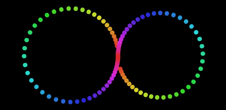
Анимация точек на CSS, каждая из которых имеет свой цвет. Все вместе точки образуют радужный градиент.
HTML
<div class="background">
  <span></span>
  <span></span>
  <span></span>
  <span></span>
  <span></span>
  <span></span>
  <span></span>
  <span></span>
  <span></span>
  <span></span>
  <span></span>
  <span></span>
  <span></span>
  <span></span>
  <span></span>
  <span></span>
  <span></span>
  <span></span>
  <span></span>
  <span></span>
  <span></span>
  <span></span>
  <span></span>
  <span></span>
  <span></span>
  <span></span>
  <span></span>
  <span></span>
  <span></span>
  <span></span>
  <span></span>
  <span></span>
  <span></span>
  <span></span>
  <span></span>
  <span></span>
  <span></span>
  <span></span>
  <span></span>
  <span></span>
  <span></span>
  <span></span>
  <span></span>
  <span></span>
  <span></span>
  <span></span>
  <span></span>
  <span></span>
  <span></span>
  <span></span>
  <span></span>
  <span></span>
  <span></span>
  <span></span>
  <span></span>
  <span></span>
  <span></span>
  <span></span>
  <span></span>
  <span></span>
  <span></span>
  <span></span>
  <span></span>
  <span></span>
  <span></span>
  <span></span>
  <span></span>
  <span></span>
  <span></span>
  <span></span>
  <span></span>
  <span></span>
  <span></span>
  <span></span>
  <span></span>
  <span></span>
  <span></span>
  <span></span>
  <span></span>
  <span></span>
  <span></span>
  <span></span>
  <span></span>
  <span></span>
  <span></span>
  <span></span>
  <span></span>
  <span></span>
  <span></span>
  <span></span>
  <span></span>
  <span></span>
  <span></span>
  <span></span>
  <span></span>
  <span></span>
  <span></span>
  <span></span>
  <span></span>
  <span></span>
</div>
CSS
body {
  margin: 0;
  overflow: hidden;
}

.background {
  width: 100vw;
  height: 100vh;
  background: #000000;
}

.background span {
  width: 3vmin;
  height: 3vmin;
  border-radius: 3vmin;
  position: absolute;
  animation-name: move;
  animation-duration: 4s;
  animation-timing-function: ease-in-out;
  animation-iteration-count: infinite;
  top: 50%;
  left: 50%;
}
.background span:nth-child(1) {
  animation-delay: 0.02s;
  transform-origin: -30vmin 0px;
  background: #d93126;
}
.background span:nth-child(2) {
  animation-delay: 0.04s;
  transform-origin: 30vmin 0px;
  background: #d93c26;
}
.background span:nth-child(3) {
  animation-delay: 0.06s;
  transform-origin: -30vmin 0px;
  background: #d94626;
}
.background span:nth-child(4) {
  animation-delay: 0.08s;
  transform-origin: 30vmin 0px;
  background: #d95126;
}
.background span:nth-child(5) {
  animation-delay: 0.1s;
  transform-origin: -30vmin 0px;
  background: #d95c26;
}
.background span:nth-child(6) {
  animation-delay: 0.12s;
  transform-origin: 30vmin 0px;
  background: #d96726;
}
.background span:nth-child(7) {
  animation-delay: 0.14s;
  transform-origin: -30vmin 0px;
  background: #d97126;
}
.background span:nth-child(8) {
  animation-delay: 0.16s;
  transform-origin: 30vmin 0px;
  background: #d97c26;
}
.background span:nth-child(9) {
  animation-delay: 0.18s;
  transform-origin: -30vmin 0px;
  background: #d98726;
}
.background span:nth-child(10) {
  animation-delay: 0.2s;
  transform-origin: 30vmin 0px;
  background: #d99126;
}
.background span:nth-child(11) {
  animation-delay: 0.22s;
  transform-origin: -30vmin 0px;
  background: #d99c26;
}
.background span:nth-child(12) {
  animation-delay: 0.24s;
  transform-origin: 30vmin 0px;
  background: #d9a726;
}
.background span:nth-child(13) {
  animation-delay: 0.26s;
  transform-origin: -30vmin 0px;
  background: #d9b126;
}
.background span:nth-child(14) {
  animation-delay: 0.28s;
  transform-origin: 30vmin 0px;
  background: #d9bc26;
}
.background span:nth-child(15) {
  animation-delay: 0.3s;
  transform-origin: -30vmin 0px;
  background: #d9c726;
}
.background span:nth-child(16) {
  animation-delay: 0.32s;
  transform-origin: 30vmin 0px;
  background: #d9d226;
}
.background span:nth-child(17) {
  animation-delay: 0.34s;
  transform-origin: -30vmin 0px;
  background: #d5d926;
}
.background span:nth-child(18) {
  animation-delay: 0.36s;
  transform-origin: 30vmin 0px;
  background: #cad926;
}
.background span:nth-child(19) {
  animation-delay: 0.38s;
  transform-origin: -30vmin 0px;
  background: #c0d926;
}
.background span:nth-child(20) {
  animation-delay: 0.4s;
  transform-origin: 30vmin 0px;
  background: #b5d926;
}
.background span:nth-child(21) {
  animation-delay: 0.42s;
  transform-origin: -30vmin 0px;
  background: #aad926;
}
.background span:nth-child(22) {
  animation-delay: 0.44s;
  transform-origin: 30vmin 0px;
  background: #a0d926;
}
.background span:nth-child(23) {
  animation-delay: 0.46s;
  transform-origin: -30vmin 0px;
  background: #95d926;
}
.background span:nth-child(24) {
  animation-delay: 0.48s;
  transform-origin: 30vmin 0px;
  background: #8ad926;
}
.background span:nth-child(25) {
  animation-delay: 0.5s;
  transform-origin: -30vmin 0px;
  background: #80d926;
}
.background span:nth-child(26) {
  animation-delay: 0.52s;
  transform-origin: 30vmin 0px;
  background: #75d926;
}
.background span:nth-child(27) {
  animation-delay: 0.54s;
  transform-origin: -30vmin 0px;
  background: #6ad926;
}
.background span:nth-child(28) {
  animation-delay: 0.56s;
  transform-origin: 30vmin 0px;
  background: #5fd926;
}
.background span:nth-child(29) {
  animation-delay: 0.58s;
  transform-origin: -30vmin 0px;
  background: #55d926;
}
.background span:nth-child(30) {
  animation-delay: 0.6s;
  transform-origin: 30vmin 0px;
  background: #4ad926;
}
.background span:nth-child(31) {
  animation-delay: 0.62s;
  transform-origin: -30vmin 0px;
  background: #3fd926;
}
.background span:nth-child(32) {
  animation-delay: 0.64s;
  transform-origin: 30vmin 0px;
  background: #35d926;
}
.background span:nth-child(33) {
  animation-delay: 0.66s;
  transform-origin: -30vmin 0px;
  background: #2ad926;
}
.background span:nth-child(34) {
  animation-delay: 0.68s;
  transform-origin: 30vmin 0px;
  background: #26d92d;
}
.background span:nth-child(35) {
  animation-delay: 0.7s;
  transform-origin: -30vmin 0px;
  background: #26d938;
}
.background span:nth-child(36) {
  animation-delay: 0.72s;
  transform-origin: 30vmin 0px;
  background: #26d943;
}
.background span:nth-child(37) {
  animation-delay: 0.74s;
  transform-origin: -30vmin 0px;
  background: #26d94e;
}
.background span:nth-child(38) {
  animation-delay: 0.76s;
  transform-origin: 30vmin 0px;
  background: #26d958;
}
.background span:nth-child(39) {
  animation-delay: 0.78s;
  transform-origin: -30vmin 0px;
  background: #26d963;
}
.background span:nth-child(40) {
  animation-delay: 0.8s;
  transform-origin: 30vmin 0px;
  background: #26d96e;
}
.background span:nth-child(41) {
  animation-delay: 0.82s;
  transform-origin: -30vmin 0px;
  background: #26d978;
}
.background span:nth-child(42) {
  animation-delay: 0.84s;
  transform-origin: 30vmin 0px;
  background: #26d983;
}
.background span:nth-child(43) {
  animation-delay: 0.86s;
  transform-origin: -30vmin 0px;
  background: #26d98e;
}
.background span:nth-child(44) {
  animation-delay: 0.88s;
  transform-origin: 30vmin 0px;
  background: #26d998;
}
.background span:nth-child(45) {
  animation-delay: 0.9s;
  transform-origin: -30vmin 0px;
  background: #26d9a3;
}
.background span:nth-child(46) {
  animation-delay: 0.92s;
  transform-origin: 30vmin 0px;
  background: #26d9ae;
}
.background span:nth-child(47) {
  animation-delay: 0.94s;
  transform-origin: -30vmin 0px;
  background: #26d9b9;
}
.background span:nth-child(48) {
  animation-delay: 0.96s;
  transform-origin: 30vmin 0px;
  background: #26d9c3;
}
.background span:nth-child(49) {
  animation-delay: 0.98s;
  transform-origin: -30vmin 0px;
  background: #26d9ce;
}
.background span:nth-child(50) {
  animation-delay: 1s;
  transform-origin: 30vmin 0px;
  background: #26d9d9;
}
.background span:nth-child(51) {
  animation-delay: 1.02s;
  transform-origin: -30vmin 0px;
  background: #26ced9;
}
.background span:nth-child(52) {
  animation-delay: 1.04s;
  transform-origin: 30vmin 0px;
  background: #26c3d9;
}
.background span:nth-child(53) {
  animation-delay: 1.06s;
  transform-origin: -30vmin 0px;
  background: #26b9d9;
}
.background span:nth-child(54) {
  animation-delay: 1.08s;
  transform-origin: 30vmin 0px;
  background: #26aed9;
}
.background span:nth-child(55) {
  animation-delay: 1.1s;
  transform-origin: -30vmin 0px;
  background: #26a3d9;
}
.background span:nth-child(56) {
  animation-delay: 1.12s;
  transform-origin: 30vmin 0px;
  background: #2698d9;
}
.background span:nth-child(57) {
  animation-delay: 1.14s;
  transform-origin: -30vmin 0px;
  background: #268ed9;
}
.background span:nth-child(58) {
  animation-delay: 1.16s;
  transform-origin: 30vmin 0px;
  background: #2683d9;
}
.background span:nth-child(59) {
  animation-delay: 1.18s;
  transform-origin: -30vmin 0px;
  background: #2678d9;
}
.background span:nth-child(60) {
  animation-delay: 1.2s;
  transform-origin: 30vmin 0px;
  background: #266ed9;
}
.background span:nth-child(61) {
  animation-delay: 1.22s;
  transform-origin: -30vmin 0px;
  background: #2663d9;
}
.background span:nth-child(62) {
  animation-delay: 1.24s;
  transform-origin: 30vmin 0px;
  background: #2658d9;
}
.background span:nth-child(63) {
  animation-delay: 1.26s;
  transform-origin: -30vmin 0px;
  background: #264ed9;
}
.background span:nth-child(64) {
  animation-delay: 1.28s;
  transform-origin: 30vmin 0px;
  background: #2643d9;
}
.background span:nth-child(65) {
  animation-delay: 1.3s;
  transform-origin: -30vmin 0px;
  background: #2638d9;
}
.background span:nth-child(66) {
  animation-delay: 1.32s;
  transform-origin: 30vmin 0px;
  background: #262dd9;
}
.background span:nth-child(67) {
  animation-delay: 1.34s;
  transform-origin: -30vmin 0px;
  background: #2a26d9;
}
.background span:nth-child(68) {
  animation-delay: 1.36s;
  transform-origin: 30vmin 0px;
  background: #3526d9;
}
.background span:nth-child(69) {
  animation-delay: 1.38s;
  transform-origin: -30vmin 0px;
  background: #3f26d9;
}
.background span:nth-child(70) {
  animation-delay: 1.4s;
  transform-origin: 30vmin 0px;
  background: #4a26d9;
}
.background span:nth-child(71) {
  animation-delay: 1.42s;
  transform-origin: -30vmin 0px;
  background: #5526d9;
}
.background span:nth-child(72) {
  animation-delay: 1.44s;
  transform-origin: 30vmin 0px;
  background: #5f26d9;
}
.background span:nth-child(73) {
  animation-delay: 1.46s;
  transform-origin: -30vmin 0px;
  background: #6a26d9;
}
.background span:nth-child(74) {
  animation-delay: 1.48s;
  transform-origin: 30vmin 0px;
  background: #7526d9;
}
.background span:nth-child(75) {
  animation-delay: 1.5s;
  transform-origin: -30vmin 0px;
  background: #8026d9;
}
.background span:nth-child(76) {
  animation-delay: 1.52s;
  transform-origin: 30vmin 0px;
  background: #8a26d9;
}
.background span:nth-child(77) {
  animation-delay: 1.54s;
  transform-origin: -30vmin 0px;
  background: #9526d9;
}
.background span:nth-child(78) {
  animation-delay: 1.56s;
  transform-origin: 30vmin 0px;
  background: #a026d9;
}
.background span:nth-child(79) {
  animation-delay: 1.58s;
  transform-origin: -30vmin 0px;
  background: #aa26d9;
}
.background span:nth-child(80) {
  animation-delay: 1.6s;
  transform-origin: 30vmin 0px;
  background: #b526d9;
}
.background span:nth-child(81) {
  animation-delay: 1.62s;
  transform-origin: -30vmin 0px;
  background: #c026d9;
}
.background span:nth-child(82) {
  animation-delay: 1.64s;
  transform-origin: 30vmin 0px;
  background: #ca26d9;
}
.background span:nth-child(83) {
  animation-delay: 1.66s;
  transform-origin: -30vmin 0px;
  background: #d526d9;
}
.background span:nth-child(84) {
  animation-delay: 1.68s;
  transform-origin: 30vmin 0px;
  background: #d926d2;
}
.background span:nth-child(85) {
  animation-delay: 1.7s;
  transform-origin: -30vmin 0px;
  background: #d926c7;
}
.background span:nth-child(86) {
  animation-delay: 1.72s;
  transform-origin: 30vmin 0px;
  background: #d926bc;
}
.background span:nth-child(87) {
  animation-delay: 1.74s;
  transform-origin: -30vmin 0px;
  background: #d926b1;
}
.background span:nth-child(88) {
  animation-delay: 1.76s;
  transform-origin: 30vmin 0px;
  background: #d926a7;
}
.background span:nth-child(89) {
  animation-delay: 1.78s;
  transform-origin: -30vmin 0px;
  background: #d9269c;
}
.background span:nth-child(90) {
  animation-delay: 1.8s;
  transform-origin: 30vmin 0px;
  background: #d92691;
}
.background span:nth-child(91) {
  animation-delay: 1.82s;
  transform-origin: -30vmin 0px;
  background: #d92687;
}
.background span:nth-child(92) {
  animation-delay: 1.84s;
  transform-origin: 30vmin 0px;
  background: #d9267c;
}
.background span:nth-child(93) {
  animation-delay: 1.86s;
  transform-origin: -30vmin 0px;
  background: #d92671;
}
.background span:nth-child(94) {
  animation-delay: 1.88s;
  transform-origin: 30vmin 0px;
  background: #d92667;
}
.background span:nth-child(95) {
  animation-delay: 1.9s;
  transform-origin: -30vmin 0px;
  background: #d9265c;
}
.background span:nth-child(96) {
  animation-delay: 1.92s;
  transform-origin: 30vmin 0px;
  background: #d92651;
}
.background span:nth-child(97) {
  animation-delay: 1.94s;
  transform-origin: -30vmin 0px;
  background: #d92646;
}
.background span:nth-child(98) {
  animation-delay: 1.96s;
  transform-origin: 30vmin 0px;
  background: #d9263c;
}
.background span:nth-child(99) {
  animation-delay: 1.98s;
  transform-origin: -30vmin 0px;
  background: #d92631;
}
.background span:nth-child(100) {
  animation-delay: 2s;
  transform-origin: 30vmin 0px;
  background: #d92626;
}

@keyframes move {
  1% {
    z-index: 100;
  }
  60%,
  100% {
    z-index: 0;
    transform: rotate(360deg);
  }
}