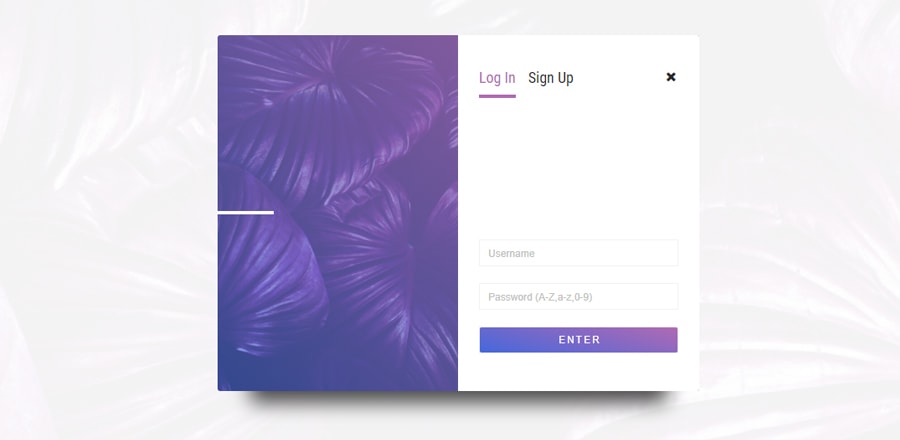
Эффект наведения на CSS
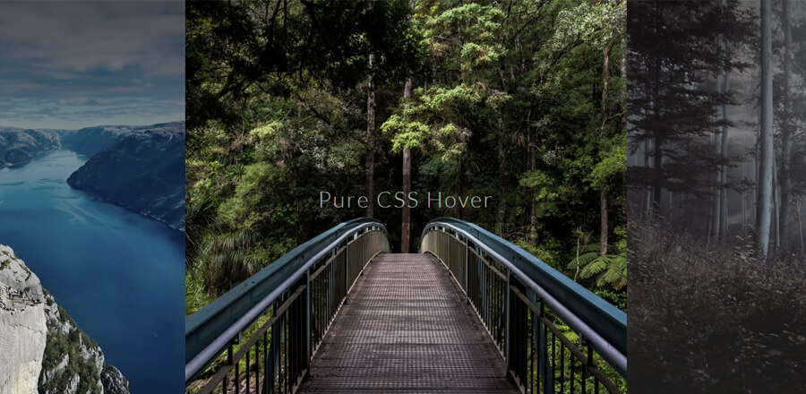 При наведении на элемент его размер по ширине увеличивается, размеры соседних элементов при этом уменьшаются. Так же дополнительно с элемента убираются наложенные, по умолчанию, эффекты: приглушение изображения за счет фильтра grayscale и небольшого прозрачного темного градиента.
 HTML
<div class="wrapper">
  <section class="sec01"></section>
  <section class="sec02"></section>
  <section class="sec03"></section>
</div>
CSS
@import 'https://fonts.googleapis.com/css?family=Lato:300';
body, html {
  margin: 0;
  padding: 0;
  height: 100%;
  background: black;
}

.wrapper {
  width: 100%;
  height: 100%;
}
.wrapper section {
  width: calc(100% / 3);
  height: 100%;
  float: left;
  -webkit-filter: grayscale(50%);
          filter: grayscale(50%);
  transition-duration: 0.5s;
  position: relative;
}
.wrapper section::before {
  content: "";
  position: absolute;
  width: 100%;
  height: 100%;
  background: linear-gradient(rgba(0, 0, 0, 0.6), transparent);
  opacity: 1;
  transition: 0.3s;
}
.wrapper section.sec01 {
  background: url("https://unsplash.it/1200/800?image=1015");
}
.wrapper section.sec02 {
  background: url("https://unsplash.it/1200/800?image=944");
}
.wrapper section.sec03 {
  background: url("https://unsplash.it/1200/800?image=877");
}
.wrapper section.sec01, .wrapper section.sec02, .wrapper section.sec03 {
  background-repeat: no-repeat;
  background-position: 50% 50%;
  background-size: cover;
}
.wrapper:hover section:hover {
  width: 40%;
  -webkit-filter: grayscale(0%);
          filter: grayscale(0%);
}
.wrapper:hover section:hover::before {
  opacity: 0;
}
.wrapper:hover section:not(:hover) {
  width: 30%;
}

.alternative {
  display: inline-block;
  top: 50%;
  left: 50%;
  position: absolute;
  -webkit-transform: translate(-50%, -50%);
          transform: translate(-50%, -50%);
  font-family: "Lato", Arial, sans-serif;
  letter-spacing: 0.08em;
  line-height: 1;
  font-size: 2.4rem;
  text-align: center;
  color: rgba(255, 255, 255, 0.6);
  background: rgba(0, 0, 0, 0.4);
  padding: 0.6em 1em;
}
.alternative a {
  margin-top: 15px;
  font-size: 1.2rem;
  display: block;
  padding: 0.6em 0;
  background: rgba(255, 255, 255, 0.2);
  color: rgba(255, 255, 255, 0.6);
  text-decoration: none;
  transition-duration: 0.3s;
}
.alternative a:hover {
  background: rgba(255, 255, 255, 0.6);
  color: #333;
}
Также есть вариант, где эффект создается с помощью TweenMax