Желеобразные кнопки
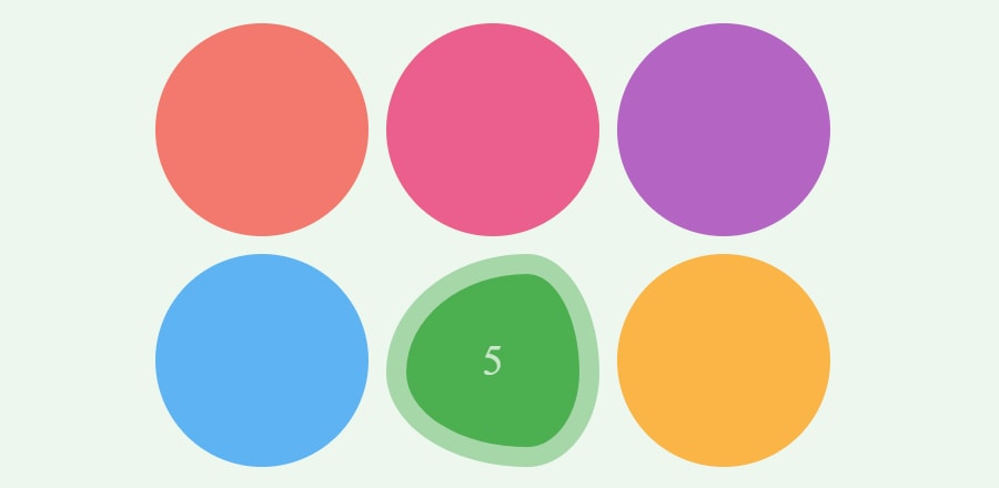 При наведении курсора на кнопку создается желеобразный эффект. Сделано на js.
HTML
<div id="boxes">
  <div style="--color: #f44336"></div>
  <div style="--color: #e91e63"></div>
  <div style="--color: #9c27b0"></div>
  <div style="--color: #2196f3"></div>
  <div style="--color: #4caf50"></div>
  <div style="--color: #ff9800"></div>
</div>
CSS
html, body {
  height: 100%;
  margin: 0;
}

body, #boxes div {
  display: flex;
  align-items: center;
  justify-content: center;
}

body:after {
  z-index: -1;
  content: '';
  position: absolute;
  top: 0;
  left: 0;
  width: 100%;
  height: 100%;
  transition: all .5s ease;
  background: var(--bg-color, #f44336);
  opacity: .1;
}

#boxes {
  counter-reset: number;
  display: grid;
  grid-template-columns: repeat(3, 1fr);
}

@media (max-width: 320px) {
  #boxes {
    grid-template-columns: repeat(2, 1fr);
  }
}

#boxes div {
  counter-increment: number;
  width: 10vw;
  height: 10vw;
  min-width: 5em;
  min-height: 5em;
  transition: .5s all ease;
  background: var(--color, #aaa);
  border: 0 solid transparent;
  box-sizing: border-box;
  border-radius: 50%;
  margin: .5em;
  opacity: .7;
  --dx: calc(var(--size) - var(--x));
  --dy: calc(var(--size) - var(--y));
}

body:not([style]) #boxes div:first-child {
  --x: 84;
  --y: 75;
  --size: 128;
}

body:not([style]) #boxes div:first-child,
#boxes div:hover {
  opacity: 1;
  cursor: pointer;
  border: calc(2px + .85vw) solid rgba(255, 255, 255, .5);
  transition:
    .5s background-color ease,
    .2s border ease;

  border-radius:
    calc(var(--x) / var(--size) * 100%)
    calc(var(--dx) / var(--size) * 100%)
    calc(var(--dx) / var(--size) * 100%)
    calc(var(--x) / var(--size) * 100%) /
    calc(var(--y) / var(--size) * 100%)
    calc(var(--y) / var(--size) * 100%)
    calc(var(--dy) / var(--size) * 100%)
    calc(var(--dy) / var(--size) * 100%)
}

body:not([style]) #boxes div:first-child:after,
#boxes div:after {
  content: counter(number);
  color: rgba(255, 255, 255, 0);
  font-size: calc(1vw + 1.2em);
  font-weight: 200;
  transition: all .2s ease;
  transition-delay: .1s;
  transform: translate3d(0, -.5em, 0);
}

body:not([style]) #boxes div:first-child:after,
#boxes div:hover:after {
  color: rgba(255, 255, 255, .7);
  transform: translate3d(0, 0, 0);
}
JS
var boxes = document.querySelectorAll('#boxes > div');
  [].forEach.call(boxes, box => {
    box.addEventListener('mousemove', e => {
      document.body.style.setProperty(
        '--bg-color',
        box.style.getPropertyValue('--color')
      );

      var size = parseInt(getComputedStyle(box).width);

      // scaling
      var x = size * .3 * .7 + .7 * e.offsetX;
      var y = size * .3 * .7 + .7 * e.offsetY;

      box.style.setProperty('--x', x);
      box.style.setProperty('--y', y);
      box.style.setProperty('--size', size);
    });
  });